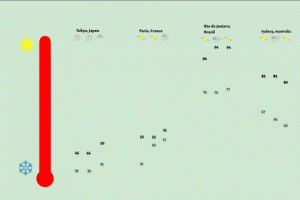
I greatly value the experience with this assignment as it is my first time working in After Effects and caused me for the first time to consider graphic design in motion rather than a stagnant image. I really enjoyed working on animating the things I had created in Illustrator as it reminded me of my work in highschool using 3D animation software. I feel that those experiences helped me greatly when it came to animating my work.
I think that what I did best in this assignment was creating an energetic and visually appealing motion in this work throughout all of the transitions, as well as being efficient and creative with the transitions themselves. I spent a lot of time focusing on how to use everything I had already introduced to introduce the next scene so that nothing would be wasted but to do this without making the transitions seem forced and unnatural. Although I am very happy with how the motion came out, I feel that some of the visuals and typography left something to be desired. I feel that the visuals fell off throughout the animation and that it made the work feel unfinished. Also the typographic choice was one I like at the beginning, but as the type got smaller for some scenes I realized it may not have been the best choice, but spent too much time on the motion of the work to go back and change it.
In the end I feel that this is what to take away from this experience. I was working on a project one piece at a time and so there was a much bigger picture that what I was working on at any one given time. And with this large picture there are many parts that all need attention. I should not focus primarily on one aspect of a work if it means that other aspects will suffer because of it. I need to cover all of my bases before I go and try to think outside the box in the future.
I feel that this map is one of my milestones in my growth as a Graphic Designer because it is the first polished piece of work that I feel I have created, one I feel that has a more professional and presentable look. I think with this map I finally cut out all the unnecessary and put in just what was needed to express my point without placing too much on the image that would end up making it too loud or distracting from my main point. I also feel that the color palette is soothing and goes well with itself, where as my other works in the past have had many loud clashing colors in them that took away from the image rather than added to it.
However even though I feel this piece is a sign of my visual improvement I also feel that there is still a lot left to be desired here. The typography is bland and neutral which can be seen as boring. At the time of making this map I was barely taking my first typography class and it was still a new concept in my mind, one that I did not yet consider in my other designing classes. Another thing is that I could have been more efficient and still offered a more varying color palette by having the people for each building be the color of the building they’re assigned to, and then gone farther by having the hue of their color be more prominent as the list of people grew.
I feel that this work is far from perfect, but it has left me always trying to consider if I have too much unnecessary visuals that may distract from the information I am trying to present. Overall I feel that this work in my first step in the right direction as a Graphic Designer.


