I like to think that as a designer I have grown quite a bit. I have no pretentions of being anywhere near masterful, but I do feel like I am starting to creep over the threshold of producing mostly sophisticated work more consistently. I still have a long way to go, but I am way more excited about the work I am doing now than I was when I first got into this program. On the whole I would say that my weaknesses in graphic design are definitely layout and proportion, and to a lesser extent typography. I say this because I have always had trouble gauging size and distance, and it seems that some of my peers know exactly where to place certain elements and how to size them properly to create an overall solid layout. For me I have to place the elements roughly and then mess about with them until I get something passable but that I am still not really pleased with. As for typography I think that I am good at picking display typefaces for a given project, but I often have trouble picking fonts for lager bodies of text, since to me the fonts used in these situations often look very similar. I have always had a more illustrative mind, I have always doodled, and admired drawings or illustrations. As such my number one strength is image making. Logo and graphic making has without a doubt always been fun and challenging to me. This ties in with what I feel is my other strength and that is thinking more uniquely. I do not mean to come off as a braggart, I just mean to say that I think I have a different set of inspirations than my peers and as such my works in different ways.
Here is one of my posters for my type specimen assignments. This was one of the first projects I remember feeling really proud of at the time. Maybe that was in part because I got to work with inspiration from my favorite book, or it was the simple joy of having created something. Looking back now however it is obviously very naïve work. Which is to be expected from a freshman level class. I remember agonizing over these posters for hours back then, and looking back now I could have done everything I had done then in the space of a few hours. The layout is painfully simple and the graphic at the bottom of this example is as well. Of course that is the benefit of hindsight, I am now much more proficient, and I know way more techniques for creating work.
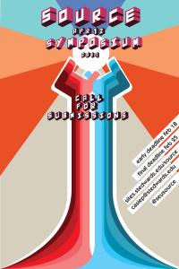
From right to left this is my decision map, and a close up of the flag graphics I was especially proud of, and finally an example of my current school work. As I hope it is clear I have gotten much more sophisticated at these points. Especially with my aforementioned strength of image making. I like to think my weaknesses have also become less weak, but I am still on the fence about layout with these. However I do think it is very apparent that I enjoy creating illustrations the most. I especially had fun with the flags as I thought their design was simple yet very effective. I remember thinking at the time that this map was my first pretty sophisticated piece, and I think in a way it does mark the turning point from naïve work to something approaching sophistication. The final design is my current work in progress poster for the Source assignment. I think this piece so far shows my increasing skill with illustration, and typography to an extent. On a final note the one overarching thing I have learned that has changed the way I design is simple. It is a piece of advice Tuan gave me, and that is to never leave anything default. This advice is so stunningly obvious and simple, but ever since I have tinkered with every aspect of my designs and in the end I think my work has become better for it.


