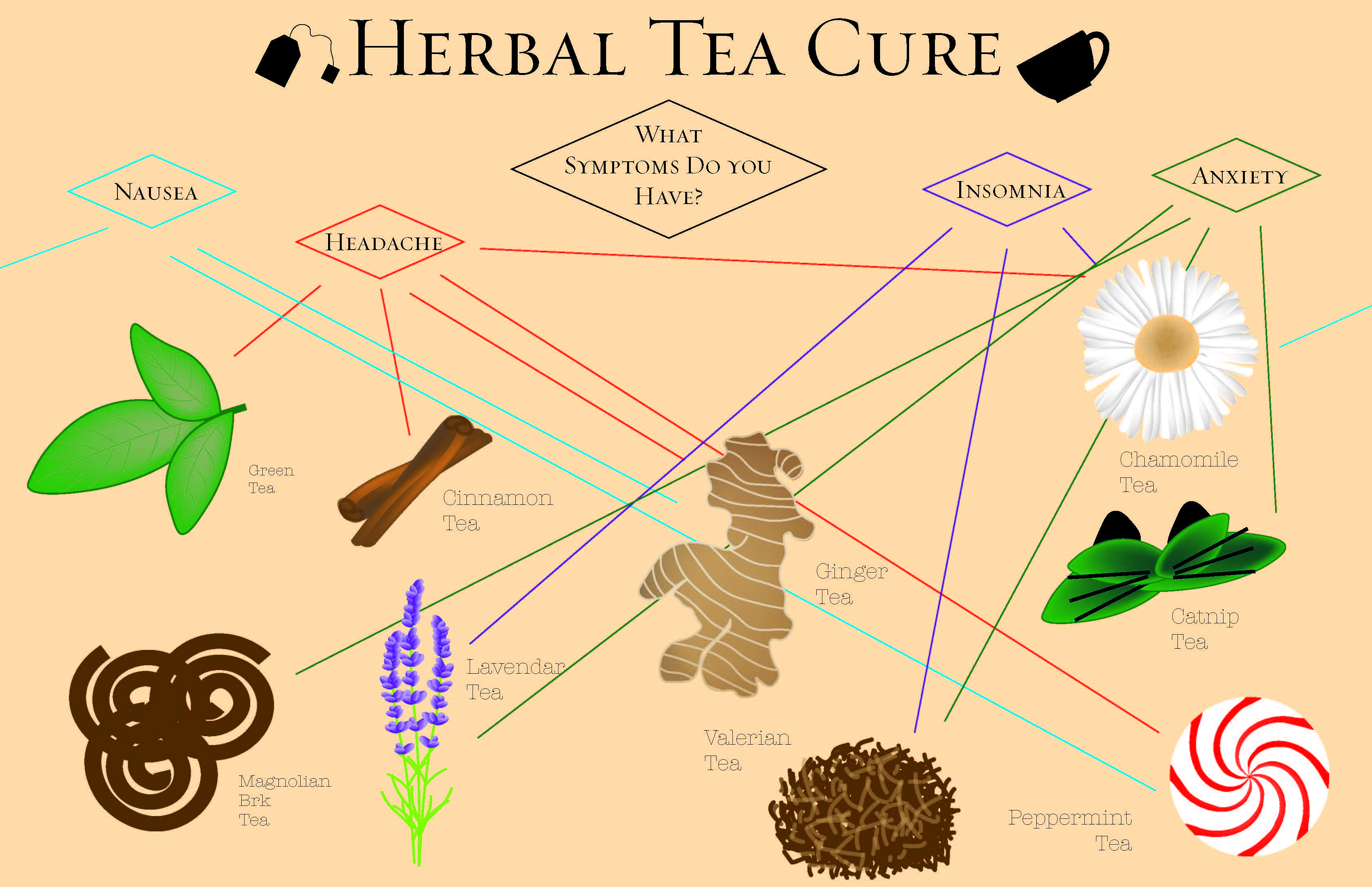
I took the direction of herbal teas and which can best ale your symptoms. It does not include many decisions other than which tea seems like the best fit for your list of symptoms and if it maybe even can help with some you do not possess yet.

I took the direction of herbal teas and which can best ale your symptoms. It does not include many decisions other than which tea seems like the best fit for your list of symptoms and if it maybe even can help with some you do not possess yet.


Comparing what all was bought as organic and not showed how healthy Tony Pierce was and also the percentage of what the persons diet was based on their groceries was deduced and shown in a simple pie graph, on of the easiest graphs to be able to compare sizes. The first proportion graph shows what nutritionists believe to be a healthy well balanced diet and Tony Pierce’s diet is found below.

Customized to me personally as this is the neighborhood I live in and are some of the most common walk routes I take my dogs. This map gives me the chance to best choose my route for the day and can compare the different advantages and disadvantages to each route and adding the distance for each was also helpful.

These symbols are wrapped around the idea of wildlife and wanting to preserve and protect nature as well. The first symbol strongly stands for that idea, as the wolf is encased around a protective coating and is preserved like an egg while the leaf is much more simple and the last one is more abstract.