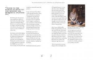
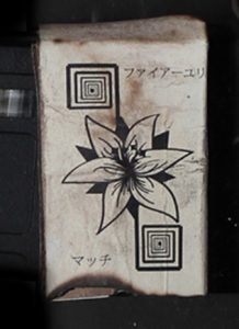
Throughout my so far year long experience at St. Edwards I feel I have already learned so much and begun to think about all things in a different kind of way, especially when I am designing. This can be seen most in these three different projects, the NY times pamphlet, the matchbook and in my mark.
 When I was creating the NY times pamphlet it made me really think hard about how I wanted the layout of the text, pullouts and the images to be. And I began to realize I was rather skilled at creating a repeating theme throughout the pamphlet with the images and placement and by bringing emphasis to certain pieces of the article. This one project in particular helped me to realize how much I actually enjoyed designing a layout for something that you hold in your hands and read.

For the matchbook project I became very focused on the backstory of my prop and how the design along was not all that was important to the matchbook but also the texture, the sturdiness and how the physical thing looked and felt and had been used. I created an entire story in my head to go along with the matchbook, from where it was purchased from and the name of the company that created it to the damage it had undergone and what hell it had gone through to get to its current position (which was on a post apocalyptic train 20 years in the future).
 Lastly I feel very strongly about my mark, which is the identity of the Barton Creek Greenbelt not because it is a good design but my idea and the message I have associated with the mark itself is strong. The design itself is not my best and has much room for improvement but my idea is strong and I believe in it and as long as I have a firm idea and direction I want to go I know I can make the mark just right.
