Ecological Marine Units: GIS provides better understanding of the Ocean Ecosystem

Ecological Marine Units (EMU) was created by ESRI and USGS in collaboration with other public and private organizations including NatureServe, The Marine Conservation Institute, University of Auckland, Duke University, GRID-Arendal, Woods Hole Oceanographic Institution, NIWA, NOAA, and NASA (ESRI, 2017). EMU was released in 2016 which establishes 3D point mesh framework with 52 million points and six variables of global measurement of the oceans column collected over 50-year period (ESRI, 2017).

EMU is a 3D marine ecological map that can be used to analyze the ocean floor features and ocean depth along with the ocean parameters such as salinity, dissolved oxygen, temperature, nitrate, phosphate, silicate, and sediment thickness (ESRI, 2017). These parameters can be used to understand niche for species, species distribution, seabed habitat and marine communities within an ecosystem and how it responds to changes in their environment.

EMU is especially important for the marine ecosystem conservation and management organizations. This map can help these organizations identify locations that will be best used for Marine Protected Areas by understanding the ocean depth, ocean floor sedimentation, temperature at different depth, physical and chemical components of the ocean setting. UMU is also available for the ArcGis desktop and could be a useful tool for analysis and basemap along with other layers of interest when construction maps such as MPA’s.

ESRI. (2017). Ecological Marine Units. Retrieved from esri: http://www.esri.com/ecological-marine-units


Sea Level Rise: A Peek into the Future

As a native Texan and beach-lover, I spent many days and nights adventuring the island and city of Galveston, Texas with friends and family.  For my individual project in our MSEM GIS course, I plan to analyze the data NOAA, the National Oceanic and Atmospheric Association, has provided regarding sea level rise to analyze its future impact on the island. Sea level rise is a real threat as climate change continues. In my future career, I would love to be a part of a team that collects the data required to inform the effective strategical management and city planning to adapt to our changing world. In this post, I present to you another dataset visualizing the phenomenon of sea level rise. NOAA, a U.S. Department of Commerce, is a scientific agency responsible for monitoring the world’s ocean and atmospheric conditions. This agency was formed 210 years ago, in 1807, and serves many purposes for the country, such as collecting and providing weather forecasts and warnings by the National Weather Service, regulating and managing fisheries and marine sanctuaries by the National Ocean Service and National Marine Fisheries Service, collecting environmental satellite data by the N, surveying land by the National Geodetic Survey, and many more. For more information regarding NOAA you can peruse their website: http://www.noaa.gov/.

The data NOAA provide are displayed in a visualizer (https://coast.noaa.gov/slr/) and show the area affected by sea level rise in terms of 0-6 feet in integral increments above mean higher high water (MHHW). MHHW means the average increase of sea level at high tide. NOAA explained they used high tide, or mean high tide where tides are diurnal (happening twice daily), as their reference point because that is the current extent of where the seawater travels and they are interested in how much further it will reach over time. They have made their data public; thankfully, also in GIS form (https://coast.noaa.gov/slrdata/). The files they have created are digital elevation models (DEMs), rasters showing the change of an attribute over space. This interactive map was a combination of many DEMs created from the best Lidar-based elevation data available; Lidar being radar sent down from planes detecting changes in elevation of the ground and bodies of water. These data show the slow invasion of sea water into the continental United States. Over time, the impacts this phenomenon are sure to affect millions of people and drastically change the environment and infrastructure on which they rely.

I will use these data to analyze the impact of sea level rise on the island of Galveston. Currently, I am still narrowing down what aspect of impact I would like to study: social, infrastructural, economic, etc. I should mention, the data NOAA provide for sea level rise have a limited accuracy, as they are predictions and have some uncertainty due to factors they admit they do not consider (erosion, some hydrological factors, storms, etc.). Nevertheless, you work with what you have and I plan to evaluate where the greatest risk lies in the island.


**If curious about the step-by-step map building processes proceed to this url: https://coast.noaa.gov/data/digitalcoast/pdf/slr-inundation-methods.pdf

Identifying CAPCOG

Capital Area Council of Governments is a voluntary association that provides regional level collaboration between the counties of Bastrop, Blanco, Burnet, Caldwell, Fayette, Hays, Lee, Llano, Travis, and Williamson of Data, Maps, and Reports that are useful for applying shapefiles to your map.

Some key details of the CAPCOG Free Regional Data page is organized by Data Category buttons such as Administrative Boundaries, Census & Statistical Areas (which does not work), Transportation, Property, Structures, Hydrography & Landscape, Floodplains & Hazard Risk, and Other Data (which unfortunately also does not link to anything). Data can also be found through the search bar and a full list of datasets. Obtaining data by using the “full list” is more user-friendly.

One area of interest is School Districts. Key details about this information are when selecting the data, it can be viewed, it is separated by details, table and, charts above the data attributes table. is the table because it is identifiable by school district names. You may also add filters to the data or download the file. The statistical and census data can be found under Central Texas Regional Map by counties. Ways to use this data is by incorporating census information, and GIS data for mapping and spatial analysis.

http://www.capcog.org/data-maps-and-reports/

Redefining the Grid

America’s main source of power for electricity comes from fossil fuels.  Lagging the in back is hydro, nuclear, solar, wind, natural gas and biomass power stations.  We, as environmentalists, know that the situation with power being harvested the way it primarily is now is a cause for concern. Partially because America is so greedy compared to other first world countries with how much power we use.

I highly recommend the following link to the map I showed in class and messing around with the details of it.  It details each state by what their primary source of power is and showing maps of what states are trying solar and wind power. I also recommend the NPR show that did a special on reengineering the grid.

http://www.npr.org/2009/04/24/110997398/visualizing-the-u-s-electric-grid


Using GIS to Predict Soil Erosion:

I chose the article “Soil Erosion Prediction Using Morgan-Morgan-Finney Model in a GIS Environment in Northern Ethiopia Catchment”, authored by Gebreyesus Brhane Tesfahunegn, Lulseged Tamene, and Paul L. G. Vlek and publishe din the Applied and Environmental Soil Science journal in April 2014.

This study designated a catchment area in Ethiopia that has historically been poorly managed and is heavily relied upon for agricultural purposes. Former studies have only used point observation data such as runoff plots which is inadequate to assess the spatial distribution of ecological problems.

The researchers chose the MMF model due to its simplicity and flexibility. Other process-based models require large amounts of information which is not available for developing regions such as this one. They incorporated a multitude of hydrophysical parameters that influence erosion rate which include both natural and man-made features.

The goal of the study was to create spatial maps that could be interpreted for prioritizing areas within the catchment that require immediate management measures. Data was collected for rainfall, land use, digital elevation  model, soil texture, soil moisture content, soil detachability, bulk density of soil, cohesion of soil surface, hydrological top soil depth, and ratio of actual to potential evapotranspiration.

The model predicted higher soil loss rates than the maximum tolerable soil loss rate and was able to designate hotspots that were most eroded with low soil quality and overgrazed due to poor land management practices. This study demonstrated the importance that GIS can bring for analyzing spatially distributed hydrophysical data to assess the effects and distribution of erosion. The following figures show the maps that were created of the catchment area using the MMF model:

How spatial analysis played a role in understanding Melioidosis

Burkholderia pseudomallei (B. pseudomallei) is a bacteria that causes Melioidosis. This infectious diseases causes numerous health problems and claims ~89,000 lives per year, making this disease and the bacteria subject of ecological and public health concerns.

This is a soil borne bacteria, yet, not a lot is known about the soil characteristics that dictate it’s presence, or just where exactly these microorganisms can be found. This is where spatial analysis comes into play.

Through the use of spatial analysis, randomized sampling, the scientists are able to compare various geographical, environmental and soil characteristics with the corresponding presence of B. pseudomallei to understand their relationship with these various factors.

Through this, they were able to find positive associations with the presence of B. pseudomallei and depletion of soil nutrients, and the amount of sand in the soil. There was also a negative association with the microbes presence, and the C:N ratio, and proportion of clay in the soil. Understanding these complex interactions is a crucial aspect in the education, prevention, and treatment of this harmful disease. I find it remarkable just how truly interdisciplinary science is, and how much we can accomplish using other’s work.

-JG

Congo Basin Gets Community-Built National Park

After many years, the Democratic Republic of the Congo receives a national park in July of 2016. The 3500 square mile park is located in the central region of the Congo Basin and houses numerous endangered and threatened species. ArcGIS was used to develop the needed mapping systems to enable this parks establishment.

The region has many obstacles that had to be overcome by the Lukuru Foundation. Little was known or documented of the forest composition or animal communities within the area. Expeditions were set out to perform on the ground field research; taking surveys, monitoring wildlife, and establishing boundaries. Due to the lack of accurate geospatial data for the area, much of the initial mission was based on a basic digital map. A basemap was created as the team gathered from the field boundaries, transportation routes and population centers. Open source databases were also scoured for any data available.

Well into the project, researchers continuously scrutinized and updated the mapping system. As wildlife or hidden populations were found, ArcGIS was used to document the locations, population density and range of wildlife in the area.

As the park came to life, the researchers used the data gathered to better equip the communities in conservation and monitoring of the species populations; this will be used going forward to better stop poaching efforts happening within the park boundaries.

Dye Tracing Results from the Arbor Trails Sinkhole, Barton Springs Segment of the Edwards Aquifer, Austin, Texas

Understanding groundwater flow patterns is critical in determining where potential contaminants are likely to be deposited from storm water runoff or potential industrial spill events.  In January 2012, a large sinkhole formed below the storm water retention pond at Arbor Trails, a commercial development within the City of Austin.  Nearly 7 million gallons of untreated water was absorbed into the local groundwater aquifer systems.  This study used dye tracing to answer the question of what pathways the water from this discharge event followed and what aquifer would be most likely be impacted by contaminants entering the groundwater system from that location in the future. 

Spatial methods that were used to address the question of groundwater flow from the ATS site included an overview map of the research area that included the Edwards Aquifer Recharge Zones with a scale feature; county lines, rivers and spring sites; and the location labeled within a state map of Texas.  Images in google earth were labeled with key features of the storm water retention pond and sinkhole at the Arbor Trails site location.  The dye tracing results were displayed on a scaled and contoured map that showed the test site along with 10 previous tests with inferred flow paths ending near the Barton Springs area. 

The Barton Springs section of the Edwards Aquifer was the expected location for dyes to be deposited and results confirmed that it takes approximately 4 days from the Arbor Trails location to reach this location.  Future data that confirms groundwater flow patterns in the region is needed.  This article and additional information can be found at https://www.researchgate.net/publication/265593023_Dye_Tracing_Results_from_the_Arbor_Trails_Sinkhole_Barton_Springs_Segment_of_the_Edwards_Aquifer_Austin_Texas


Determining Ocean Acidification from Space using Satellite-Based Assessment

“Increasingly evidence suggests that the physiology and behavior of calcifying and noncalcifying organisms can be impacted by increasing OA, with cascading effects on the food chain and protein supply for humans, and alterations to the functioning of ecosystems and feedbacks to our climate.”

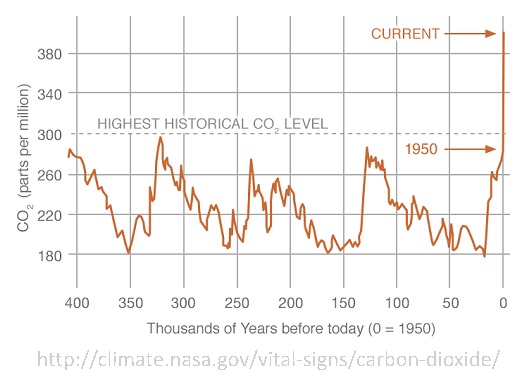
With the precipitous increase of carbon dioxide since the Industrial Revolution showing no sign of slowing down (shown in the figure below), the inhabitants of Earth are now facing climate change and its devastating effects. The world’s oceans are the largest “sink” of carbon dioxide; a sink being a recipient. With the absorption of carbon dioxide, the water undergoes a chemical reaction that increases the acidity while decreasing the carbonate concentration, also known as ocean acidification, OA. The change in water chemistry occurs first at the surface, then mixes down into the deeper layers via currents. Carbonate is an ion, or a molecule with an unequal number of negatively charged electrons and positive protons, giving it a net positive or negative charge. The importance of this molecule is that some marine organisms use it to create their shells, such as calcareous (calcium containing) oysters, corals, and coccolithophores (marine phytoplankton – tiny photosynthetic organisms).

The study by Land et al., published in 2015, attempted to determine if sea surface pH can be determined by satellite analysis in both spatial and temporal terms using parameters from the carbonate system as well as the physical properties of the water. Carbonate system parameters include total alkalinity (how well water can neutralize acid), dissolved inorganic carbon, pH, and fugacity of CO2 (how quickly it changes into another state) are driven by temperature, salinity, and biological activity. Sea surface temperature (SST), sea surface salinity (SSS) and chlorophyll-a, a pigment used by photosynthetic organisms, can be used to estimate carbonate parameters using empirical relationships derived from data in situ, or in its natural state or site. The benefits of using satellite analysis are that measurements are cost-effective, spatially broad, and can be almost continuously monitored. It is important to remember satellite analysis can be confounded by regional complexity (geography, freshwater runoff, particles suspended in water column) as well as cloud cover. This method, if successful, would work with the buoy monitoring systems in place as well as replace long, hard, expensive, sometimes dangerous, and spatially and temporally limited trips by research vessels. The researchers compared in situ data with their satellite data to determine if they could use those parameters as proxies to determine sea surface pH.

Fortunately, the study yielded promising results. The researchers found in situ data agreed with satellite data, suggesting the analysis is accurate and usable. Nevertheless, to have accurate analysis you need to incorporate regional algorithms to accommodate for different geography, freshwater runoff, and high chlorophyll-a concentration likely to disturb the carbonate systems. Those involved are also starting to combine their data from the satellite analysis with ocean circulation models to determine how this will affect the deep ocean layers. Obviously, there are uncertainties regarding this practice, but it is a ballpark idea of what we are facing in the future regarding the acidification of the ocean.

Works Cited:

Land, Peter E., Jamie D. Shutler, Helen S. Findlay, Fanny Girard-Ardhuin, Roberto Sabia, Nicolas Reul, Jean-Francois Piolle, Bertrand Chapron, Yves Quilfen, Joseph Salisbury, Douglas Vandemark, Richard Bellerby, and Punyasloke Bhadury. “Salinity from Space Unlocks Satellite-Based Assessment of Ocean Acidification.” Environmental Science & Technology 49.4 (2015): 1987-994.

Percent Change in Cumulative Zika cases by department, February 13 through March 26, 2016

Zika is a virus that is transmitted by a mosquito species Aedes. People infected with Zika have symptoms such as fever, rash, joint pain, conjunctivitis, muscle pain and joint pain. Symptoms lasts from several days up to two weeks. First reported Zika virus transmitted to humans was in late 1940’s in Uganda Africa. Zika virus came into the world spot light during the outbreak in Brazil right before the 2016 summer Olympics. What concerns most people is how Zika was linked to Microcephaly. Microcephaly is a birth defect where the baby’s head and brain is abnormally small. Pregnant woman infected with the Zika virus can transmit the virus to the fetus causing the baby to born with Microcephaly.

This map uses raster to indicated how the Zika spread from Africa in the 1940’s all the way to Oceania where over 30,000 cases were reported in 2013. It was believed that the Zika virus spread to Brazil by the members of the French Polynesia Olympic team. The Points indicate areas that had an outbreak while the polygons indicate countries with Zika virus presence.
During the Zika virus outbreak in 2016, the Pacific Disaster Center collected the weekly epidemiology on the Zika Virus in Columbia to create a map that will help those making decision understand the extend of the outbreak of the Zika Virus. Using polygons and lines to map out Columbia and its departments. Each department is colored depending on the percent change of new cases if Zika virus infection. The base data was collected on 13th February 2016 with a weekly updated up until 26 March.

The final analysis indicates that there in an increase of Zika virus in every department in Columbia. Most of the Columbia’s departments has increased over 100% in less than two months which can be very concerning. By contextualizing the data using special analysis, decision makers can visualize how quick the Zika virus can spread and multiply in a very short time.


Pacific Disaster Center Uses Esri to Monitor Disease. (2016). Columbia – Percent Change in Cumulative Zika cases by department, February 13 through March 26, 2016. Retrieved from ESRI: http://www.esri.com/esri-news/releases/16-2qtr/smart-maps-track-zika-outbreaks-globally

http://www.arcgis.com/apps/MapJournal/index.html?appid=9e9ca7c6957f4616a05a4331f99a0c22