Coming into this program I was not sure what to expect. I did not know much about Graphic Design and most of the work I produced was made purely because I thought it looked good or because I knew I wanted to do creative things with my life. Now I am at a place where I question every visual element on the page. When I start designing, I begin with what needs to be there and then only after I have assessed a visual elements value do I add it to the composition. I think of design as communication or a way of thinking, not necessarily a personal emotional outlet, which is how I used to treat it. I believe these three projects accurately highlight my transformation as a designer; my Gotham Type Specimen Booklet, my cognitive map, and my Word processing map.
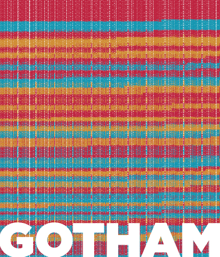
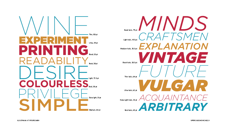
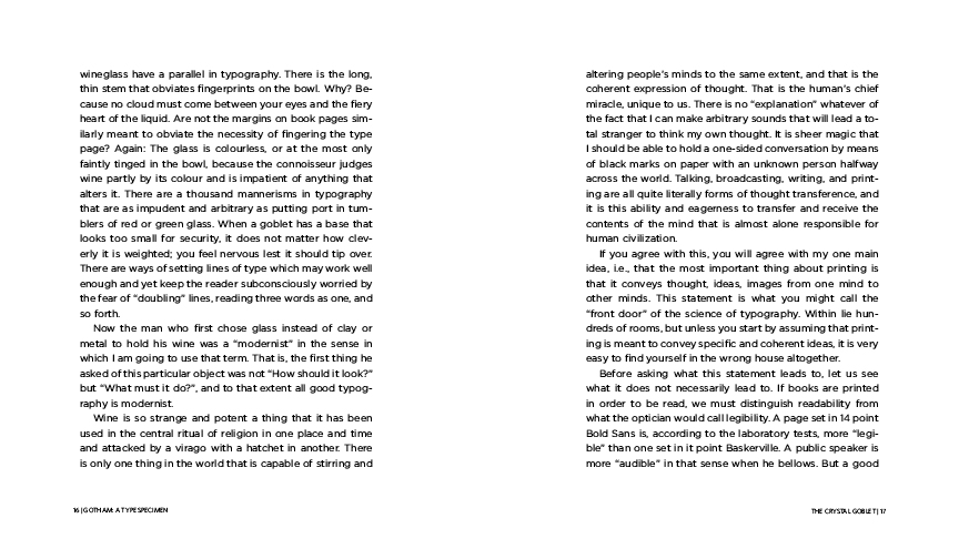
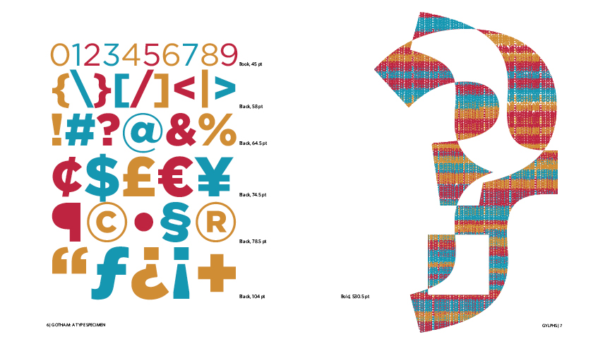
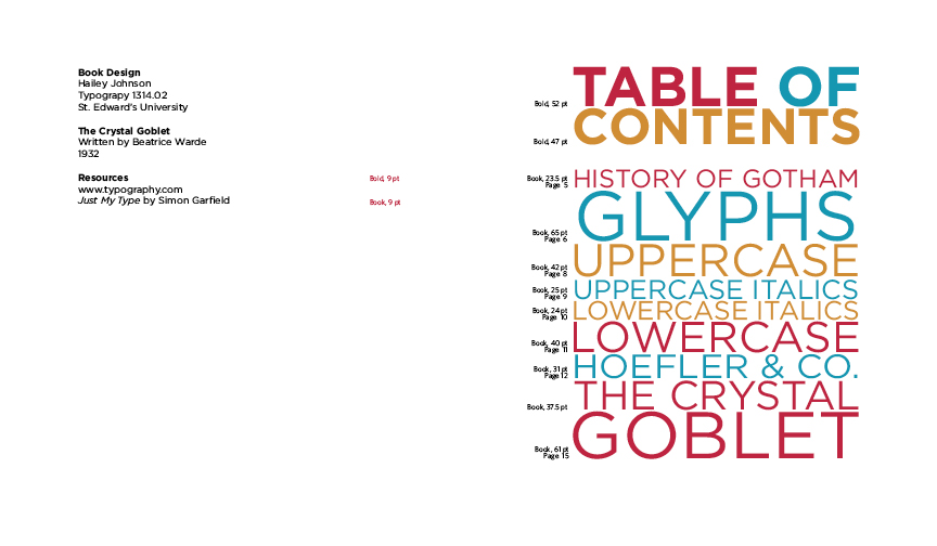
While designing the Gotham Type Specimen, I believe this was the first project in my graphic design education where I started to understand the concept of using graphic design as a tool to enhance the content for the viewer. I began designing this project with the idea that my first objective was to make Gotham look as good as possible. But once I started researching Gotham’s purpose and structure, I allowed myself to gain an acute understanding of the content I was originally just going to make ‘look good’. Ultimately, I learned that a well designed book or poster does not matter unless you designed it with the contents purpose and audience in mind. I worked to showcase Gotham’s best visual attributes as believed by the original designer. I chose this piece because this project was the first time I ever felt like I was designing something in contrast to just making pretty things.
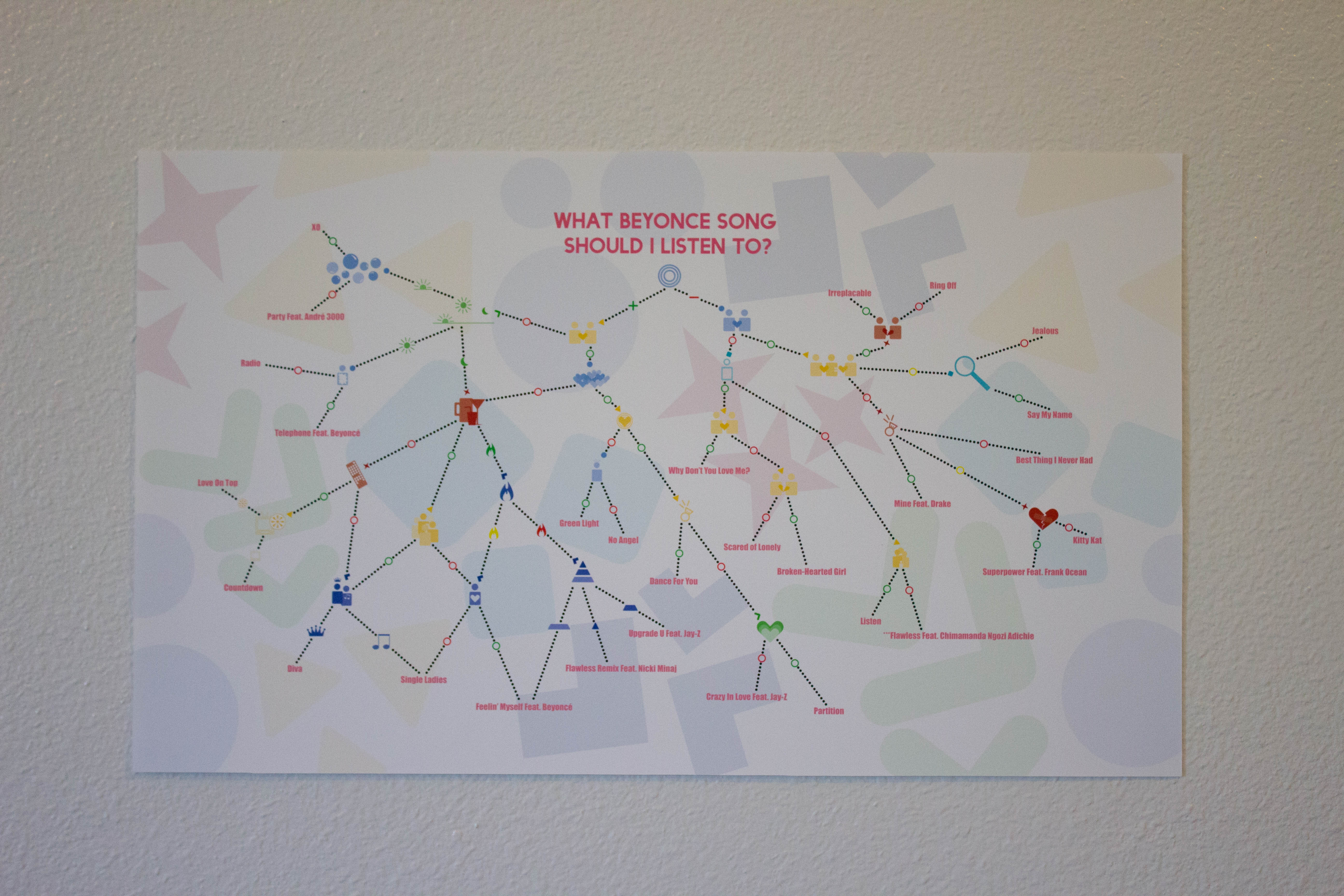
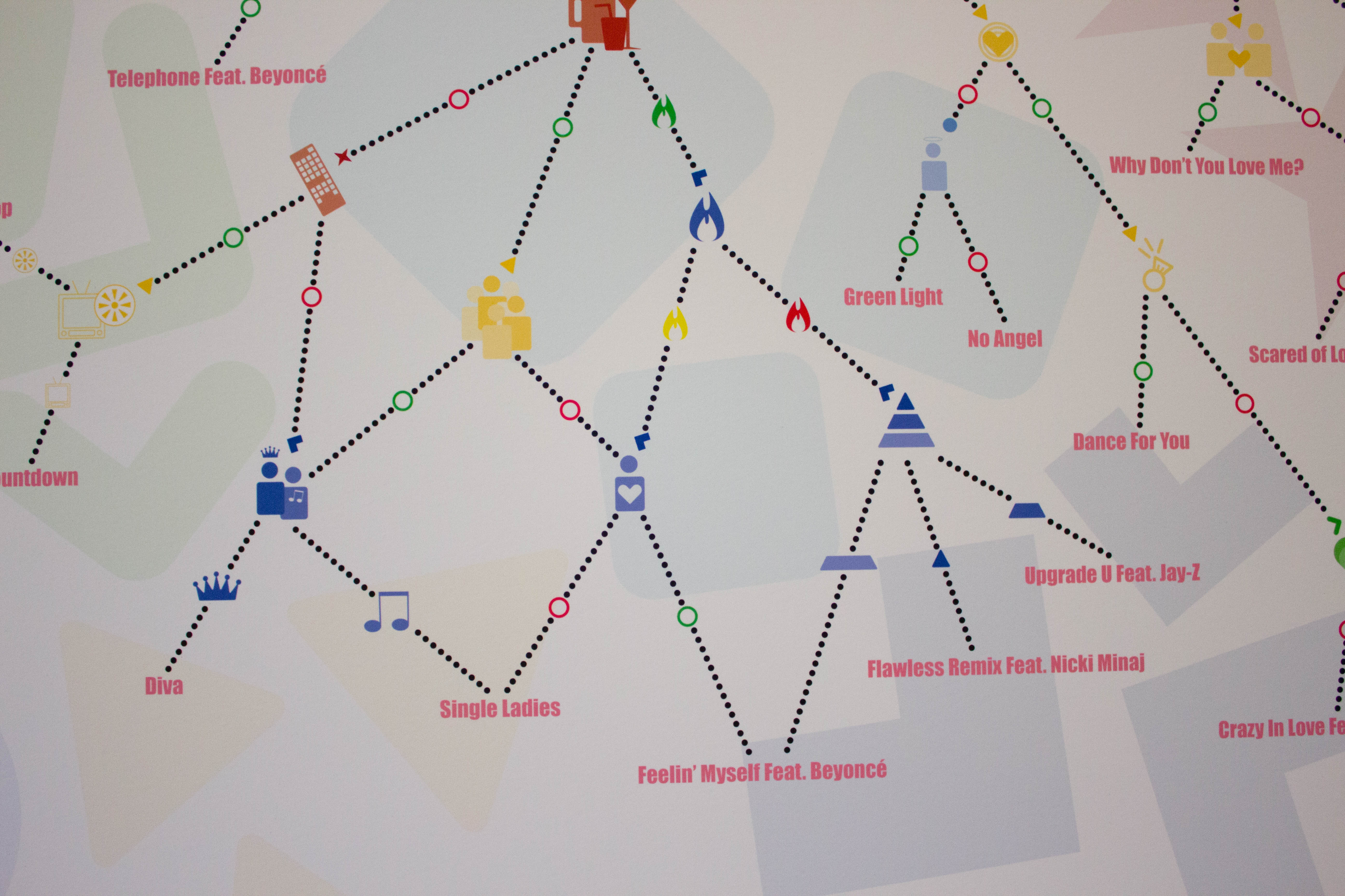
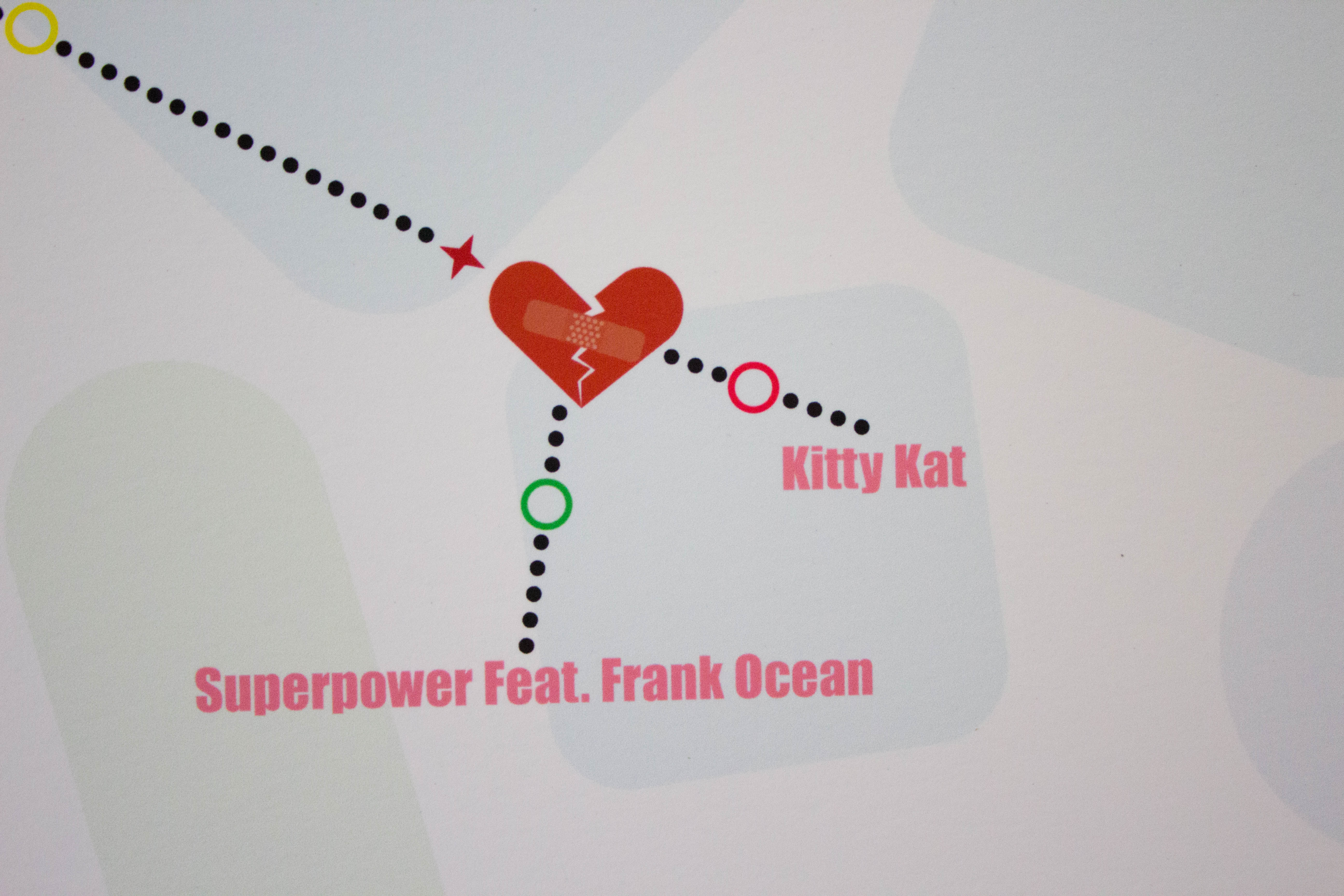
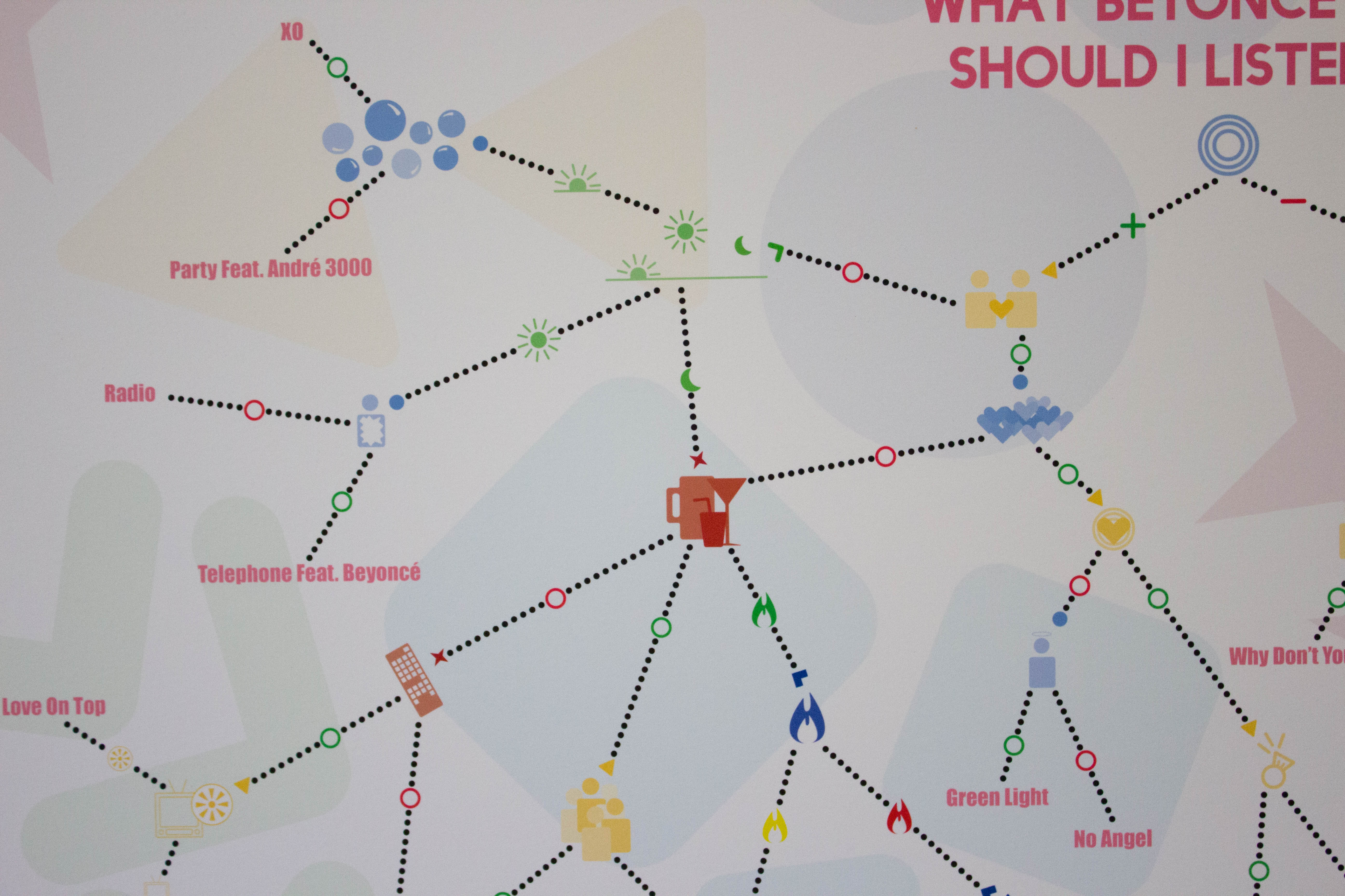
I am highlighting my cognitive map, because I believe it was one of the first projects that I actually felt challenged by. All of the projects we get are challenging but when I decided to only use symbols on the map instead of just writing out the questions, I felt myself struggling to bridge the gap between conceptual ideas and visual things. Before this project, I never forced myself to visualize love, moods, or choices. Through this project, I allowed myself to explore these concepts, experimenting with ways to communicate these ideas visually. Although not all of the symbols I made are easily recognizable, I believe I created a symbol system that can be easily learned.
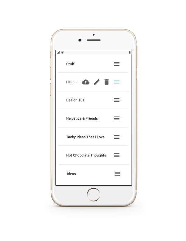
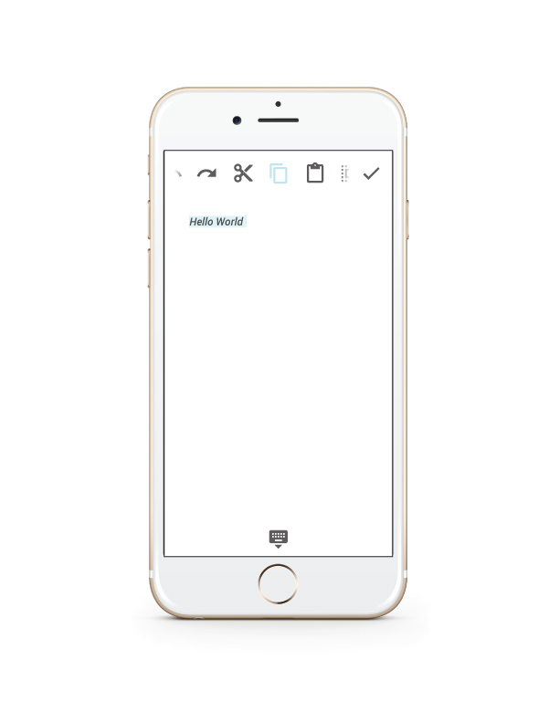
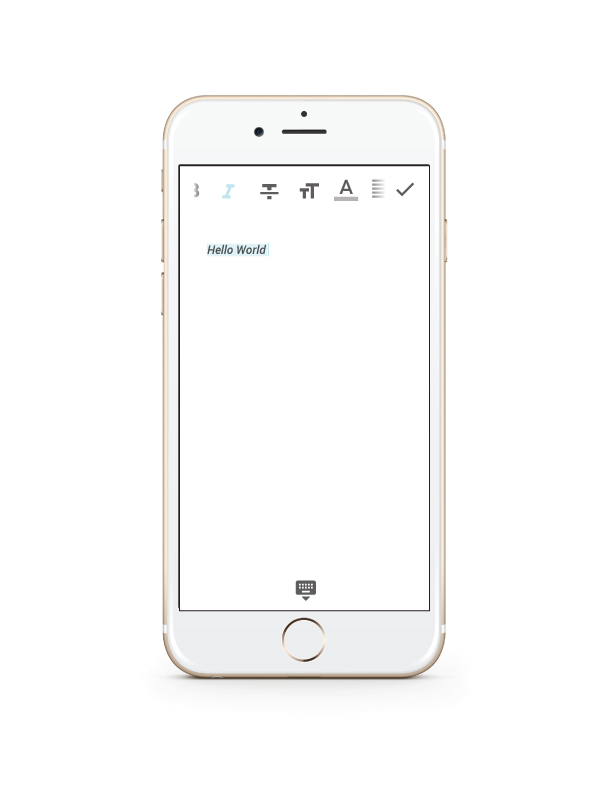
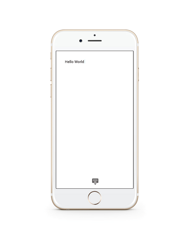
The word processing app that I designed was very important to my growth as a designer. We had to design a word processing app based off of the brand book that Google has made available to the public. I had to follow a set of rules, while allowing my own ideas and creativity guide the aesthetics of the app. This was the first project were I ever felt I had a style. I started with the bare minimal and worked in other visual elements, allowing the app to focus primarily on the act of writing down ideas with formatting being a secondary action to be performed. Designing this app always allowed me to understand that I do not just want to design interfaces. I want to be able to actually write the code for actually be involved in the whole process of designing apps or software. This realization has prompted me to double major in Graphic Design and Computer Science.
Overall, I feel my design education has been detrimental in my growth as a designer and as a person. I have learned to develop a critical eye, questioning everything I see. I find myself questioning the reasons why a logo is the way it is or why a billboard says the things it says. At the beginning of my education I found it hard to understand projects or to connect with them, but now I research my subjects intensively and understand them before I start. Because I have learned that if you do not understand what you are supposed to be designing it will probably not carry much meaning or be enriching for the viewer.