Diving into research for a single location was a very interesting experience. By creating an anthology of Zilker Park, including visual, audio, and written accounts, I was able to create a solid foundation from which to move forward. When I moved forward in creating an identity for the place, I was interested to see which parts of my research moved forward with me in the process and which served as background information. As I solidified my identity for Zilker Park, I drew more and more from my original investigation into Zilker to find evidence of what I was proposing to be true.
In order to showcase my work in an app form, I had to consider the way that people interact with interfaces. I spent a lot of time thinking about the ways that people navigate through apps, drawing from my own experience in the touch screen digital world. Taking my existing work, and designing an interface for people to view it was a very interesting process because it allowed me to spend more time thinking about the ways a viewer could get the most out of my work. An example of this is my choice to showcase my plotter designs in a scrolling gallery, acknowledging their sequential nature and how they exist as a whole collection, rather than individual pieces.


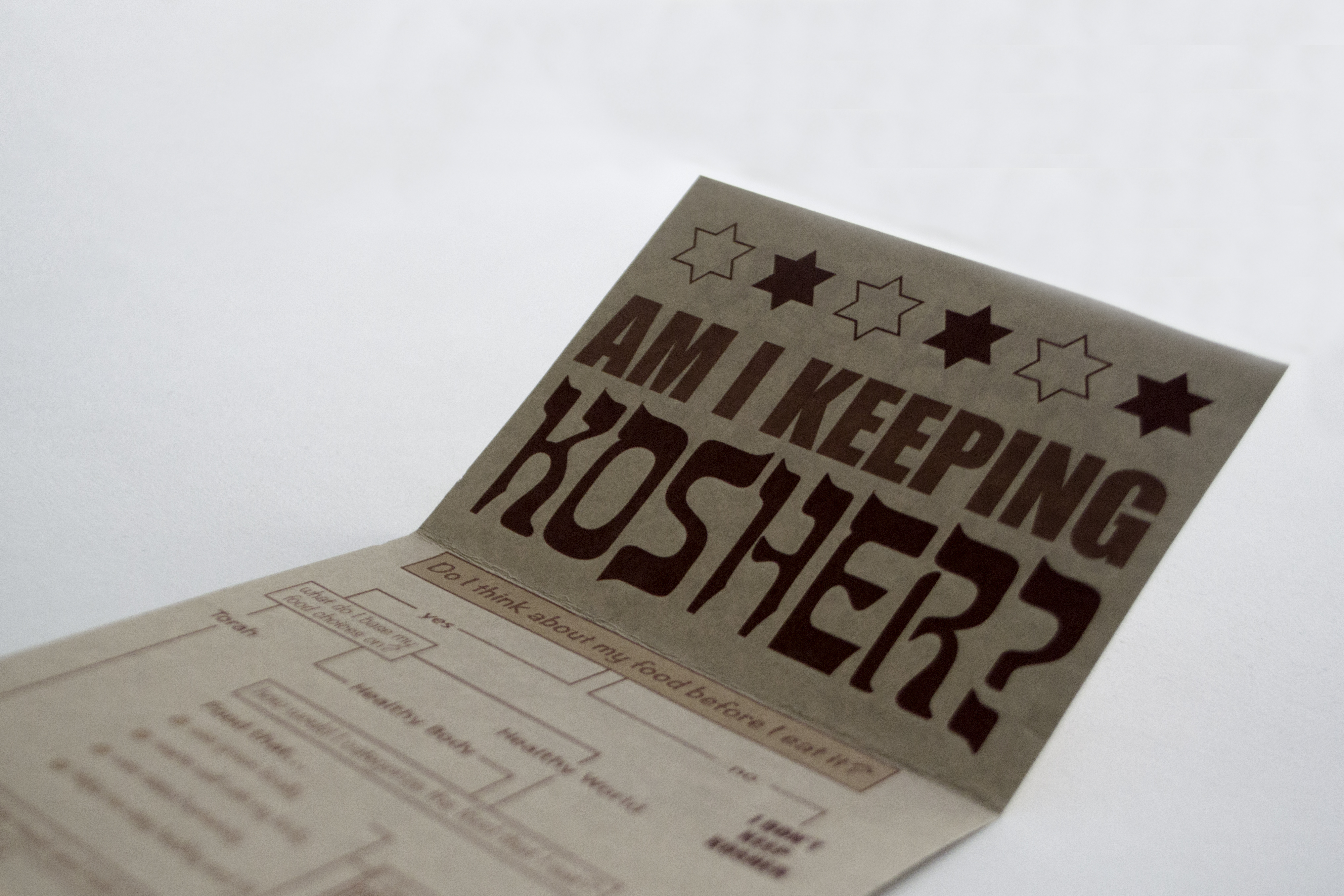
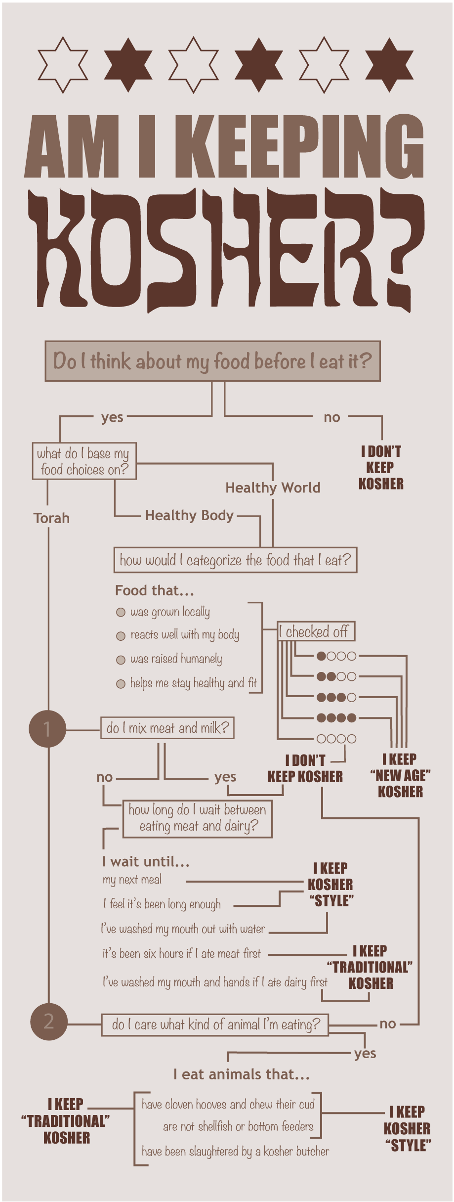
The design of this map is first and foremost about function. I want to be able to pull it out of my back pocket the next time someone asks if something is kosher and walk them through the steps that lead me to that conclusion ideologically. It’s hard to break down such a rich history into a simple infographic, but I did my best to allude to the nuances of Judaism through questions that start with “do I think about…” and “do I care…” The craft of the document, and my choice to print on textured tan paper reflect the styles of traditional Jewish literature.

 T
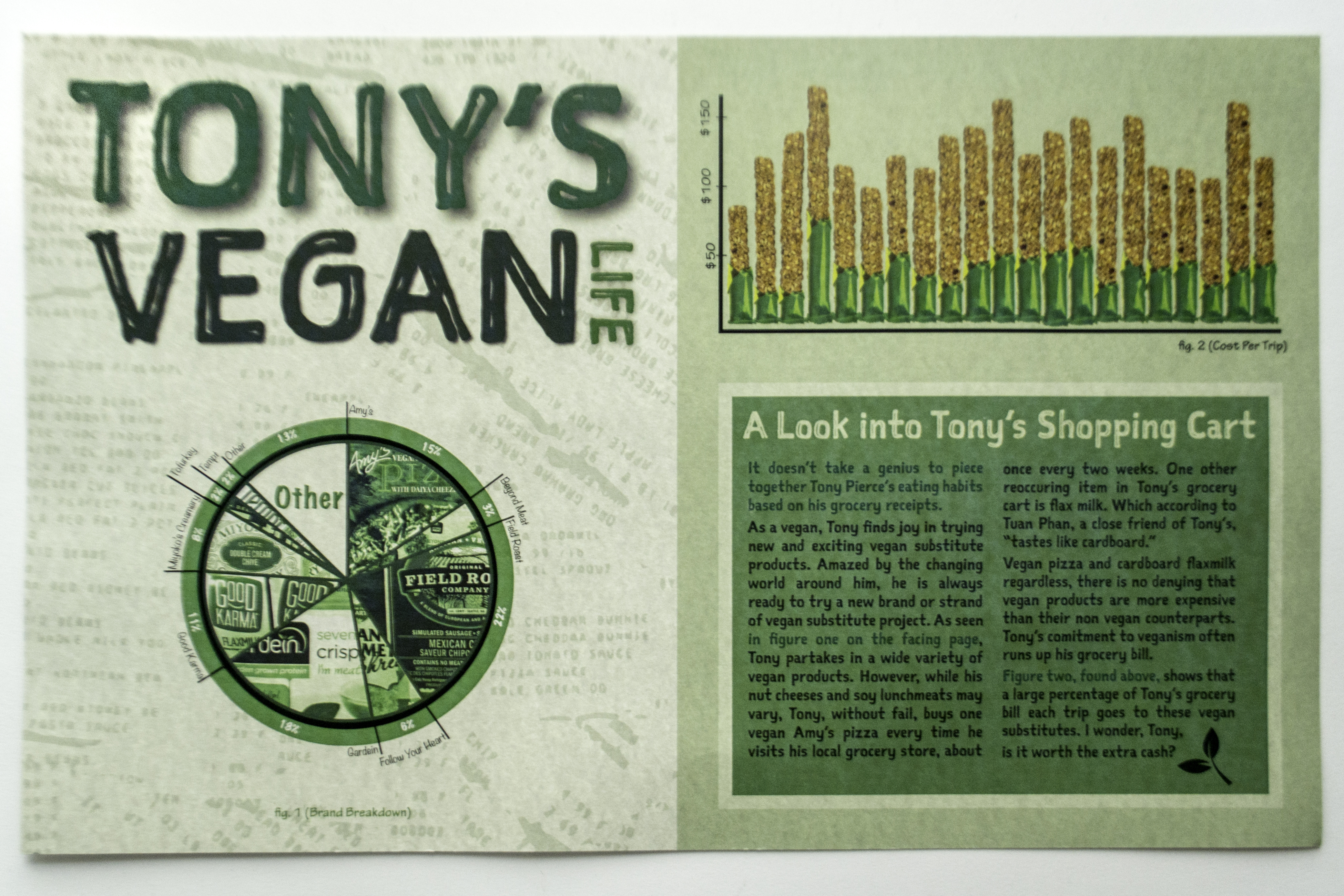
T ranslation of raw data into legible graphics is an extremely important skill for designers to have, in fact, I’d probably say it’s most important. It is our job to take information that one audience wouldn’t generally be able to process and make it accessible for them. In this case, I made financial information derived from a year’s worth of grocery receipts into a spread that the consumer can use to analyze his spending habits on vegan products.
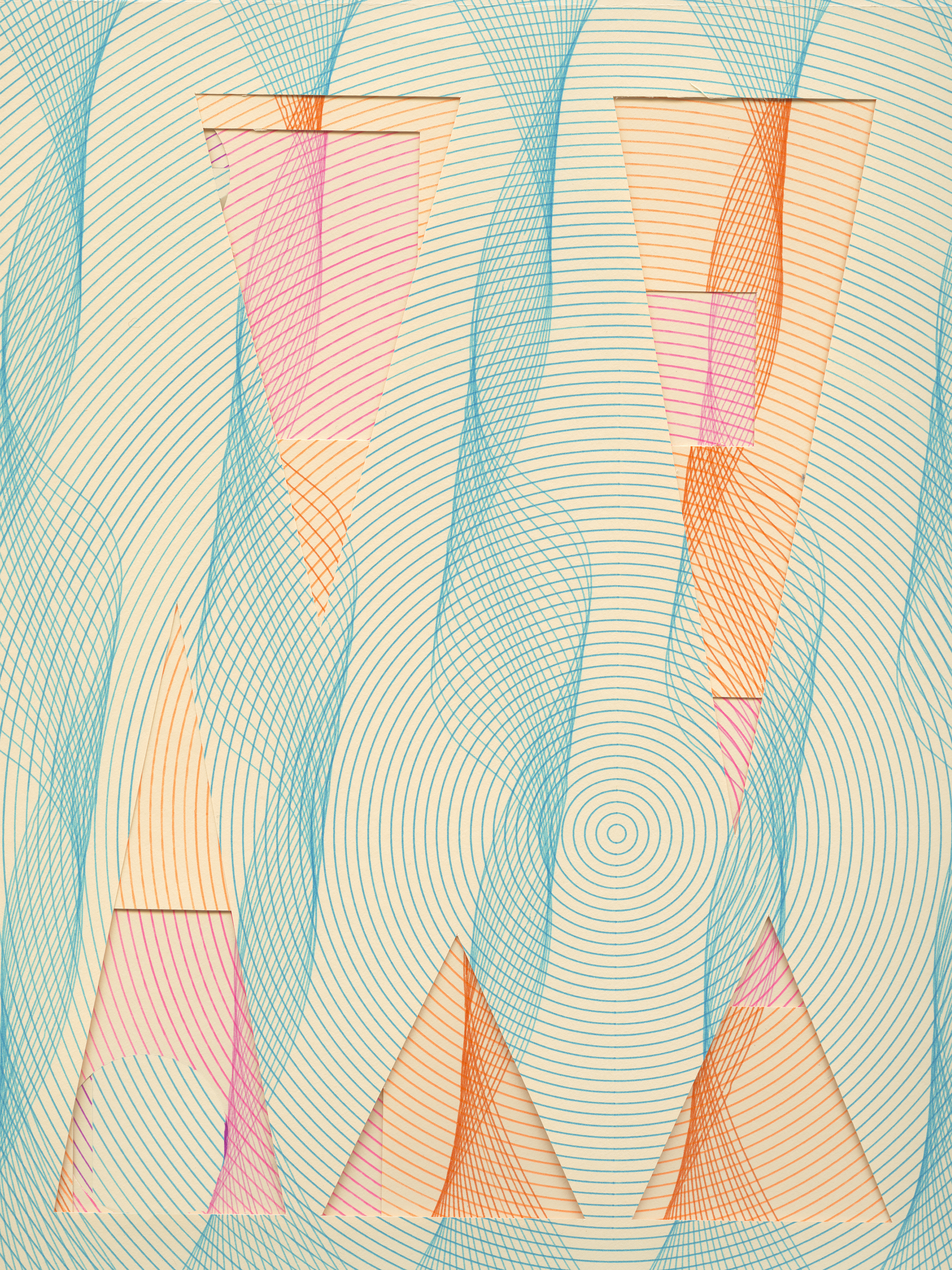
Conditional design is fascinating to me. Prefacing this project with research into conditional design provided me with a perspective that would not have been possible if I set out to make the same work without background information on the rule making process and the incredible success that it can produce as a method for creating work. Setting out simple rules–same design, four alternating colors, and an increasing number of cut outs with each plot–created an interesting collection of work that otherwise would not have occurred.

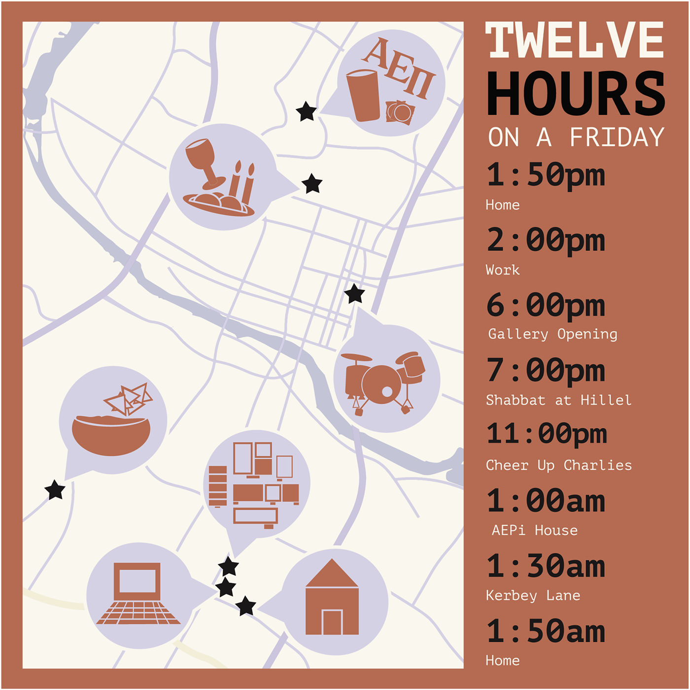
By examining my life through two axes, time and space, I was able to come up with an interesting depiction of my Friday night in Austin. In a sense, I plotted events and activities throughout the night both by location and time during the night on a map of the city. The color scheme of the design has similar feeling to sitting in a diner at 1 am, which is one of the feelings I was trying to convey.
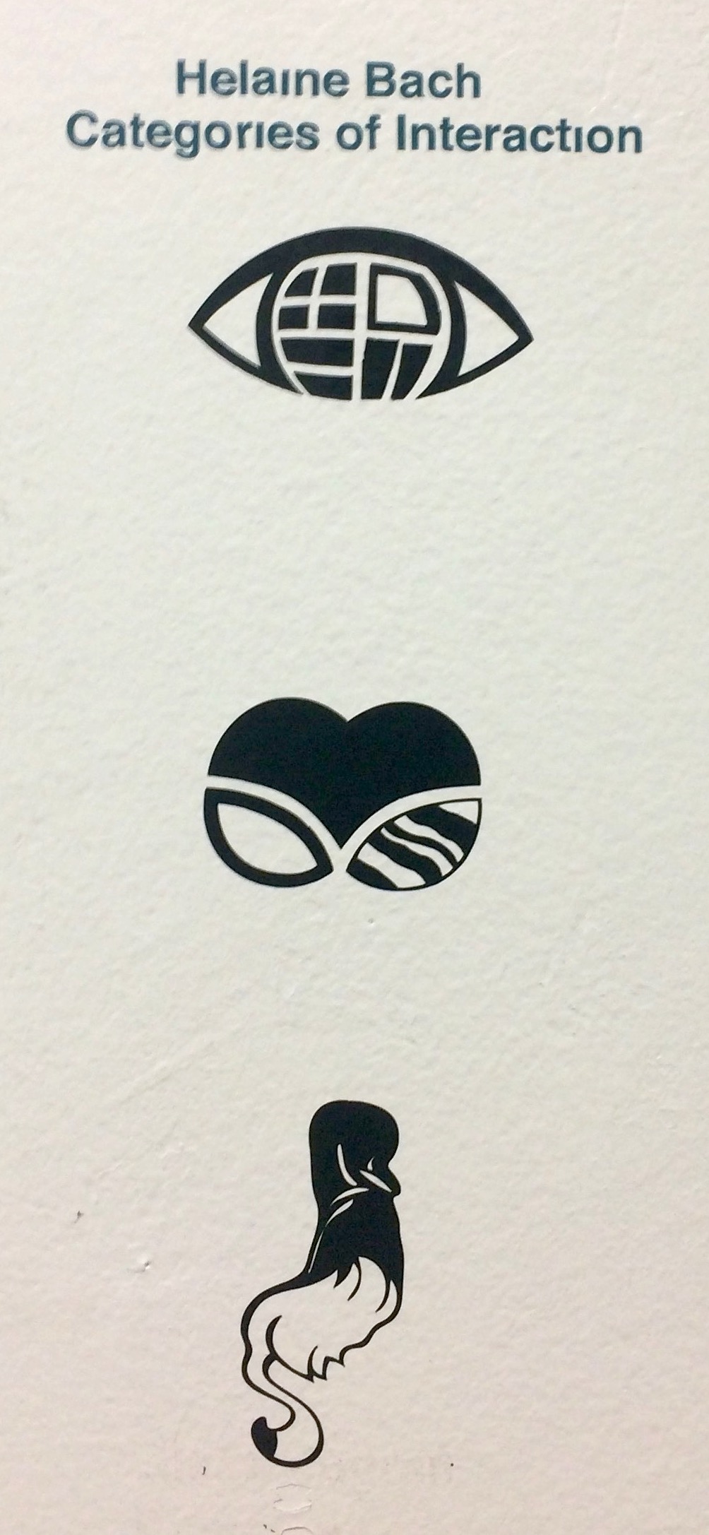
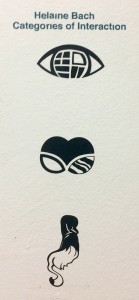 The methodology that resulted in these final three symbols is the most interesting part of project. The process of “frankensteining” my original designs was liberating in a way I wasn’t expecting. I was able to think outside the box to create designs that would never have existed had I not literally chopped up other designs and then worked to put them back together in a new way that looked naturally un-natural. The result of the process was three very distinct and strange symbols which don’t hold a lot of meaning on their own, but as part of a system, allude to the different types of interactions we have with other people.

When identifying my truism, I did a lot of thinking about the journey that brought me to where I am today. I embarked on a very personal path in order to find words to express what I felt about my life. Once I knew what those words would be, I set out to create a design which would express the feeling behind those words. I focused on the idea of fragility in order to showcase the delicate state of my mental health. I expressed this fragility through a pattern similar to those that exist on sets of china dishes.


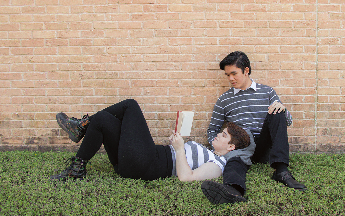
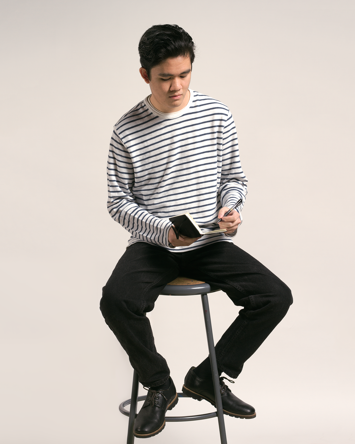
If what they say is true nothing is new anymore, then excitement comes from the fusion of two existing things. The fusion of preppy style and Beatnik style is interesting because the two have such a strong juxtaposition in their goals. People who dress preppy are attempting to fit into society, while people in the beatnik generation try their hardest to exist outside of mainstream society. The photographs themselves are a representation of these unique and differing styles.
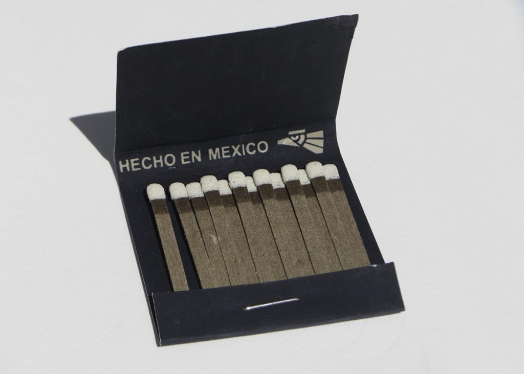
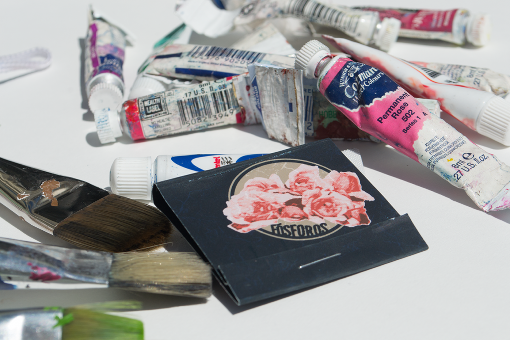
This matchbook is one which would find itself at home on the set of the 2004 biopic, Frida. Through extensive research, I was able to dissect the visual language of film and create a part of the universe created by the filmmakers. I was particularly intrigued by the self referential nature of the film, frequently using Frida Kahlo’s own work to tell her story. When designing this matchbook, I chose to incorporate Kahlo’s iconic flowers into the 1930s Mexico style matchbook in order to follow this pattern in the visual language defined by the filmmakers.