I am fascinated by the versatility of some of the larger typefaces. They are comprised of so many styles, that they allow for an interesting and clear hierarchy of information using fonts all from within the same family. This is what I chose to do when typesetting an academic journal article. I didn’t want the design choices I made to overpower the content, and so I experimented with this method of using a single typeface–Avenir–to format the copy of the article. I followed similar suit with choices of color, choosing shades of the same color. This slight variation in both color and type makes the layout visually interesting, but very cohesive at the same time.

As I designed my first typeface, I was determined to fill a need that I felt was not being met within my community. I previously cringed at typefaces that attempt to mimic Hebrew characters. Most of these typefaces lazily substitute Hebrew characters which vaguely resemble an English character. I decided instead to study the characteristics of Hebrew letterform and apply these characteristics to English letterforms. When presenting my typeface, I chose to model my poster after a Bar Mitzvah invitation, because I know that this is the niche opportunity where my typeface will most likely be used.
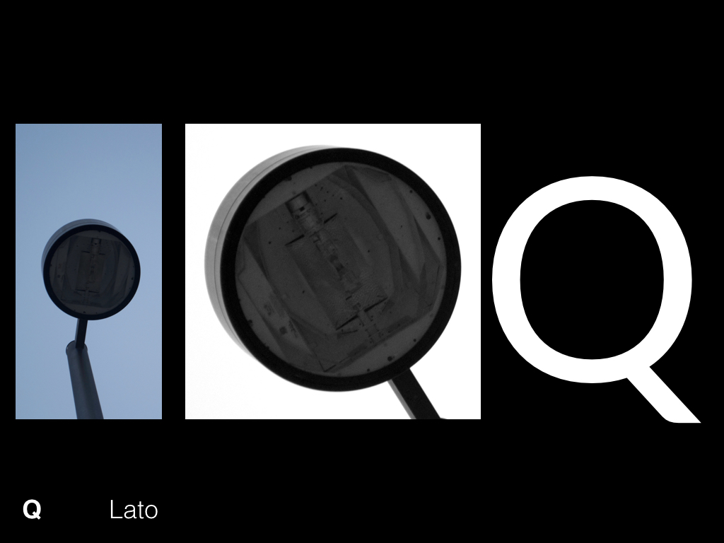
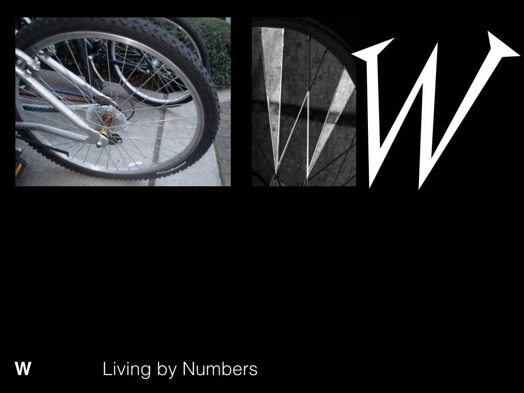
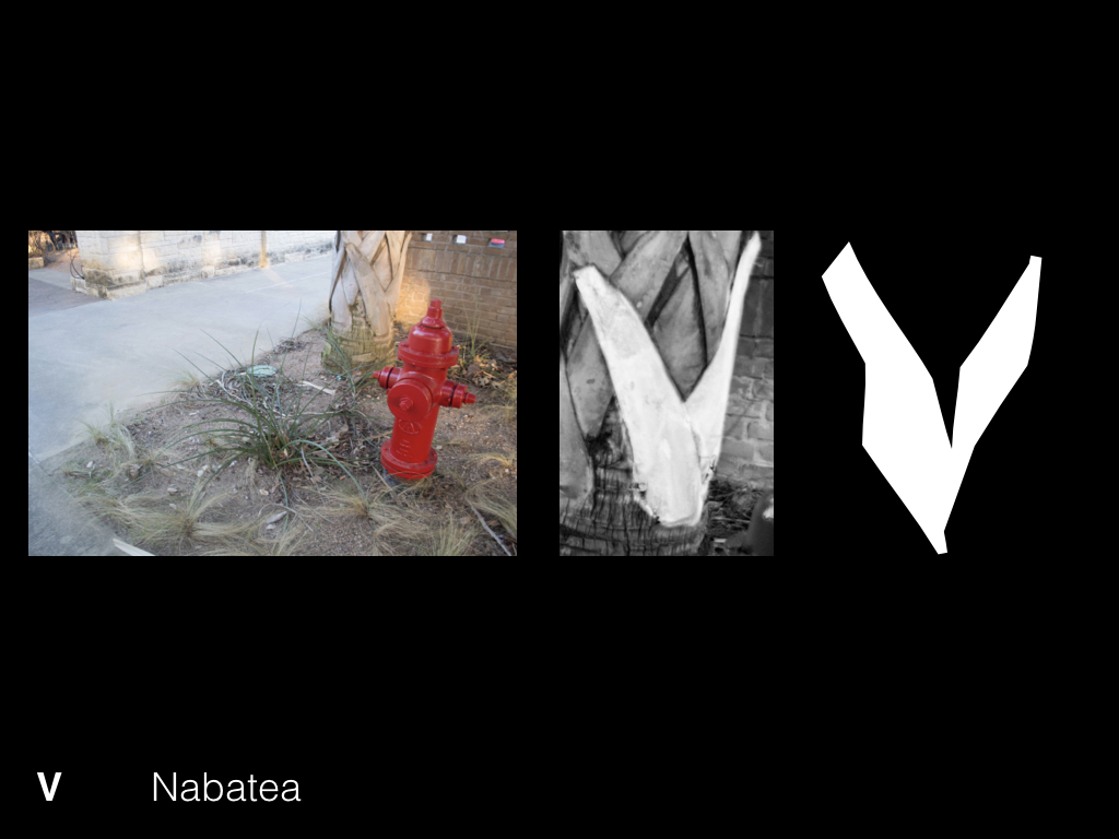
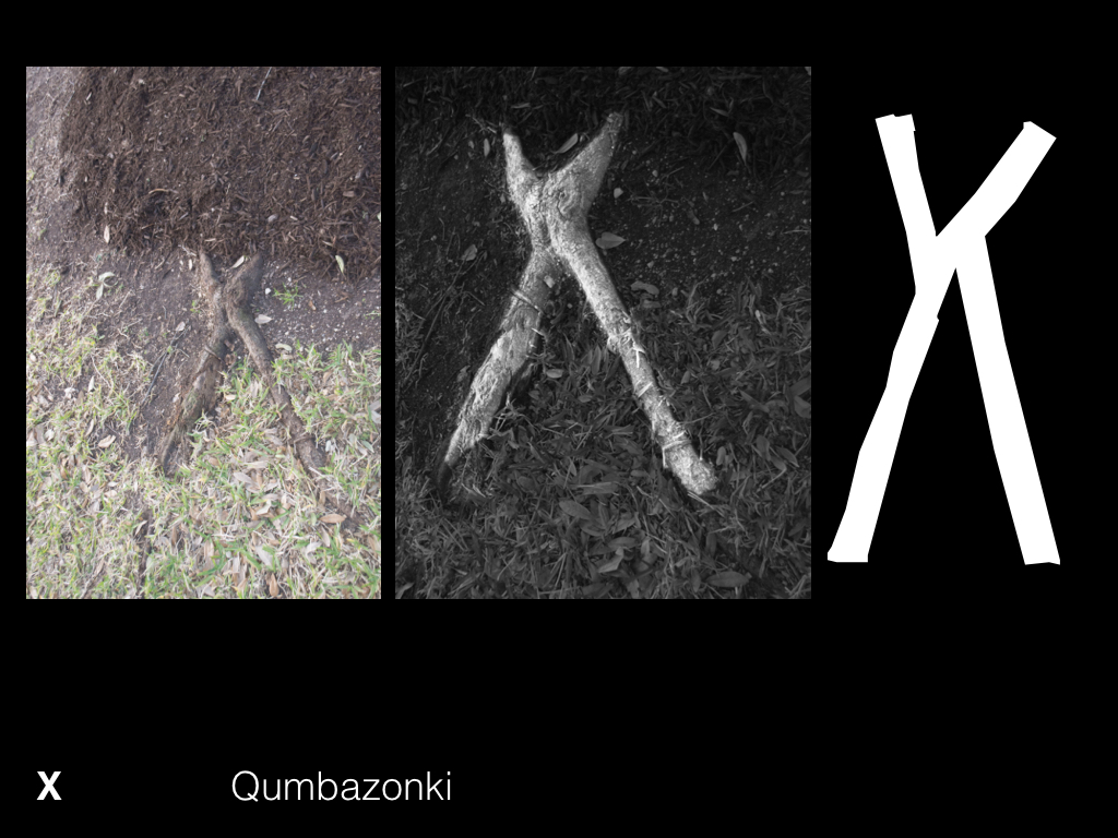
Through the process of matching existing typefaces to letterforms I found in my surroundings, I was pushed to understand the unique choices typeface designers make that distinguish their forms from other typefaces. I took extra care to identify the most distinguishing characteristic of each found letterform and go on to choose an existing typeface which possesses these same characteristics. I believe that this produced an effective match which showcases the essence of the found letterform in a way that wouldn’t have been possible if I simply chose a typeface where the single character matched exactly to the letterform from my surroundings.
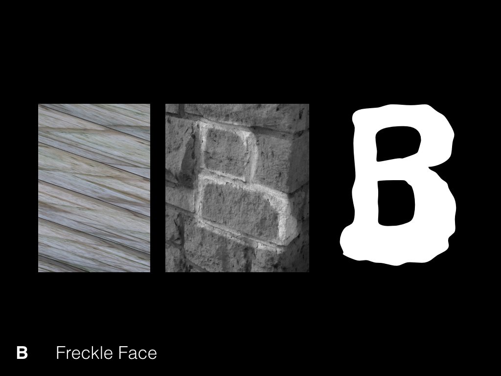
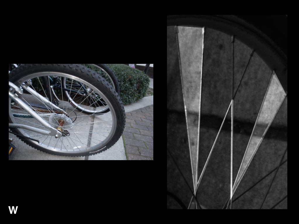
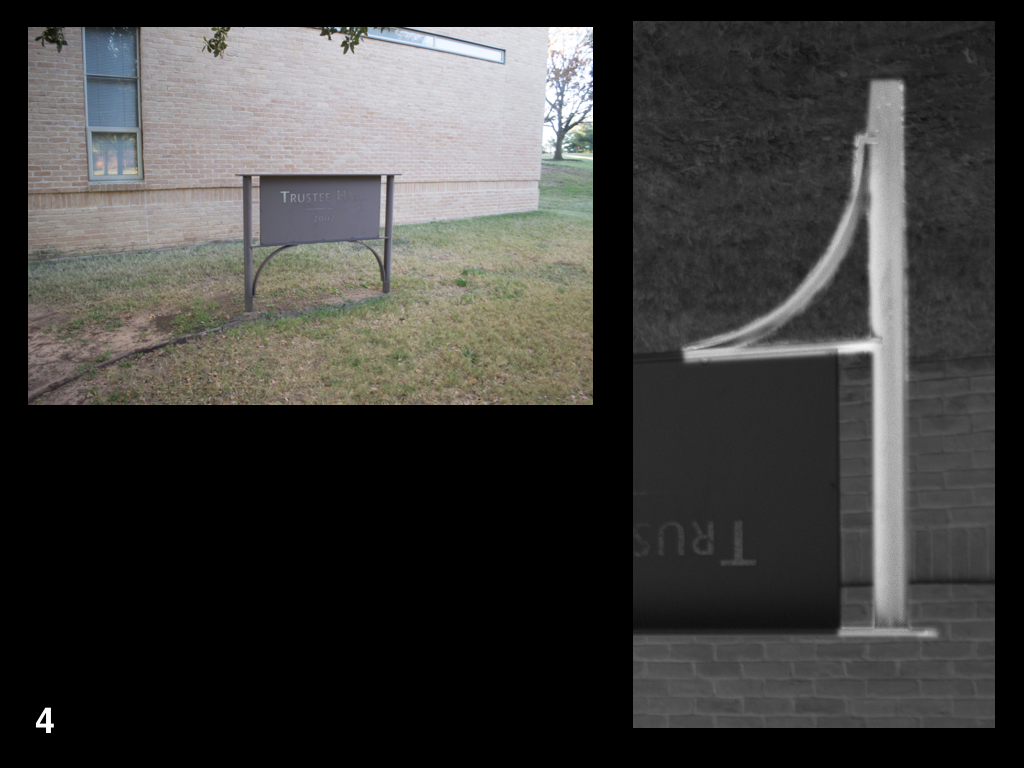
As a designer, it is essential to take inspiration from your surroundings. These letterforms found in my surroundings push the envelope on traditional letterform and invite the viewer to take a closer look at their own surroundings. As I wandered through campus, I made an effort to identify interesting and unconventional letterforms. I was particularly interested by letterforms formed by both natural and man made objects. The letterforms I was able to identify in my surroundings helped me to dissect letterform and focus on their formal properties, disregarding meaning associated with the characters.