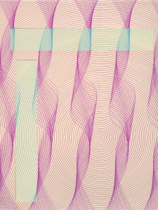
Conditional design is fascinating to me. Prefacing this project with research into conditional design provided me with a perspective that would not have been possible if I set out to make the same work without background information on the rule making process and the incredible success that it can produce as a method for creating work. Setting out simple rules–same design, four alternating colors, and an increasing number of cut outs with each plot–created an interesting collection of work that otherwise would not have occurred.

By examining my life through two axes, time and space, I was able to come up with an interesting depiction of my Friday night in Austin. In a sense, I plotted events and activities throughout the night both by location and time during the night on a map of the city. The color scheme of the design has similar feeling to sitting in a diner at 1 am, which is one of the feelings I was trying to convey.
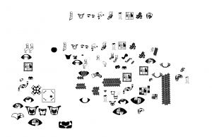
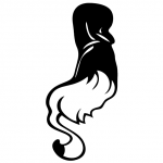
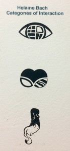 The methodology that resulted in these final three symbols is the most interesting part of project. The process of “frankensteining” my original designs was liberating in a way I wasn’t expecting. I was able to think outside the box to create designs that would never have existed had I not literally chopped up other designs and then worked to put them back together in a new way that looked naturally un-natural. The result of the process was three very distinct and strange symbols which don’t hold a lot of meaning on their own, but as part of a system, allude to the different types of interactions we have with other people.
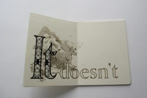

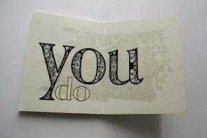
When identifying my truism, I did a lot of thinking about the journey that brought me to where I am today. I embarked on a very personal path in order to find words to express what I felt about my life. Once I knew what those words would be, I set out to create a design which would express the feeling behind those words. I focused on the idea of fragility in order to showcase the delicate state of my mental health. I expressed this fragility through a pattern similar to those that exist on sets of china dishes.
 This course has opened my eyes to a new way of using practice time. I’ve always had a hard time crossing the bridge between digital and analog art. I now understand that these are just methods and can both be used to reach the same goal and in fact, should both be used. I am now totally in love with the idea of sketching digitally. Before, I though of digital work as “the final product” – something that fits neatly on an art board as is ready for export to web or print. Now I realize that digital programs can be used in every step of the process. I’m really glad Tuan showed us his projects and how he works, because I’m finding that the edgeless, orderless flow of work really helps me create. I think that this has enhanced my practice time and made my work a lot more organic. I think that I have a very consistent practice, especially because it’s whenever I have a free moment; even finding myself doing graphic design while procrastinating on my graphic design homework.
I pride myself on the sophistication of my work. I follow rules very well and so once we were given the guidelines for a successful symbol, I worked really hard to make sure that I followed those guidelines. I’m aware that this rule oriented approach to design has it’s drawbacks and can at times inhibit creativity. However, I have found that it’s a great way to get results. My product looks like what it’s supposed to look like. End of story. However, I’m hoping that over time, I’ll be able to do both – follow the “rules” and be creative. A concept that we discussed in another class is doing work both “above the couch” and “below the couch.” I think that by making work that is below the couch, I will be able to start bending the rules a bit and making sophisticated work that is truly interesting. At this point, for the purposes of our “rules” for symbols, I’d say my work is highly sophisticated.


I have always had a tough time dealing with feedback I have a very personal connection to my work and often have trouble being objective when listening to criticism. I find it difficult to remove myself from the work, but like anything else, practice makes it easier. I have tried this semester to take a step back from my work when listening to feedback from both my classmates and from Tuan. I know how easy it is to end up working in a vacuum and I am very grateful for the opportunity to receive feedback. Outside of the classroom, I’ve had practice receiving feedback that was hard to hear from my first freelance job. I had one idea of what they wanted and they had another and it was tough. However, I’ve learned and grown from the experience and am doing my best to use feedback in the best way possible. If I had to place myself on a sliding scale, I’d definitely say I am towards the middle on this front, but working hard to get to the point where I can take full advantage of feedback.
 I’d like to think that the level of challenge I gave myself was relatively high. I entered the course with more illustrator experience than some. This is a product of a lot of free time during the summer. It would have been easy to complete the assignment using minimal effort. I would have produced interesting symbols and shown decent craftsmanship. Instead, I rose to the occasion and strove for perfection. A prime example of this was my insistence on not failing the letters test. In fact, I recut the vinyl after my first botched attempt. I’m still a little frustrated that the dots on my “i”s aren’t there, but after all, the size was ridiculous. I also tried new tools and methods in illustrator and really pushed myself to create sound shapes that will hold up to the 64000% test. I also tried really hard to make symbols that I wouldn’t have to “fix” later. I wanted my process in illustrator to be clean and legible all the way through. I avoided stroking objects and made sure to make compound shapes as I went. Overall, I think it was a god learning experience and I came out a better craftsman on the other end. I would definitely say I herd myself to an intense level of challenge.
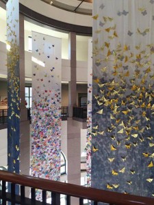 I have exposed myself to a lot of other expert experiences so far this semester. I always try my hardest to attend gallery openings and absorb as much design and art that Austin has to offer. I also had the opportunity to see my work from last semester on the Butterfly Project shown at the Bullock. The experience of going and talking about my work to people seeing it for the first time was very enlightening. I’ve also been doing freelance work this semester and it has been a new experience all together. Starting to make work for someone other than myself is definitely a new challenge and I’m really enjoying the challenges that come with it. While I would always like to do more, I think that my “extra stuff” would qualify as “lots.”
This semester I’ve faced a few challenges when it comes to social emotional development. This is the fist semester of my career at St. Edward’s taking a full 18 hour course load, as well as my first semester working. I admit that at times, I have been extremely stressed out and could have worked better to manage my time. However, I believe that I have improved over the course of the semester. Even writing this essay now, I am doing so as part of a structured plan for the weekend before midterms. I know myself and the time required for certain tasks and can plan accordingly. I also know the importance of self care and having fun. It sounds silly to “schedule my free time,” but with a life as jam packed with responsibility as mine, it’s important to take the time to breathe, and I am doing so. I think that I am making my way from out of control to in control and will only become more in control with time.
I have always been proud of my contribution to the classroom climate. I believe that I bring a lot to the table, metaphorically speaking and literally speaking this year as we sat around the table for critique. I’d like to think that I had helpful and honest things to say about everyone else’s work. I also pride myself in the fact that I was always available to help my classmates in any way they needed. As a lab assistant, it is part of y job to be available to students working in the lab. I have found that this availability reaches beyond the six hours a week that I am clocked in. My classmates respect my skills and find me approachable enough to come and ask for help. I think this is one of my proudest achievements this semester and I would definitely place myself at the highest level of achievement for this category.


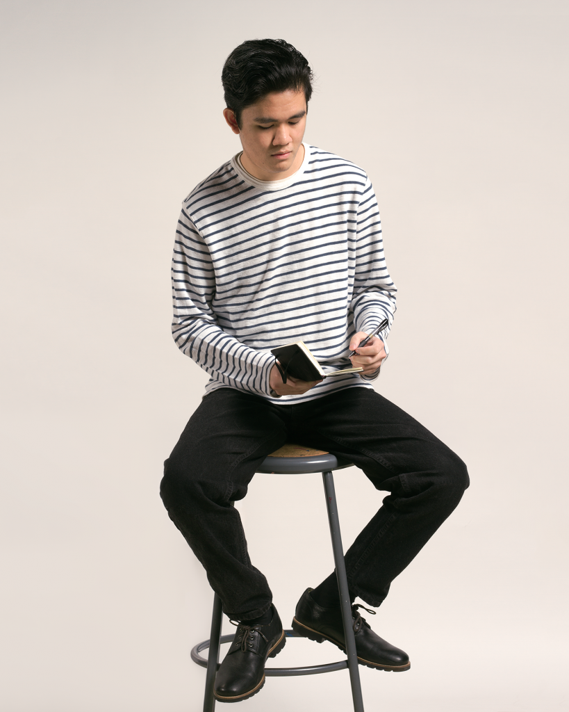
If what they say is true nothing is new anymore, then excitement comes from the fusion of two existing things. The fusion of preppy style and Beatnik style is interesting because the two have such a strong juxtaposition in their goals. People who dress preppy are attempting to fit into society, while people in the beatnik generation try their hardest to exist outside of mainstream society. The photographs themselves are a representation of these unique and differing styles.


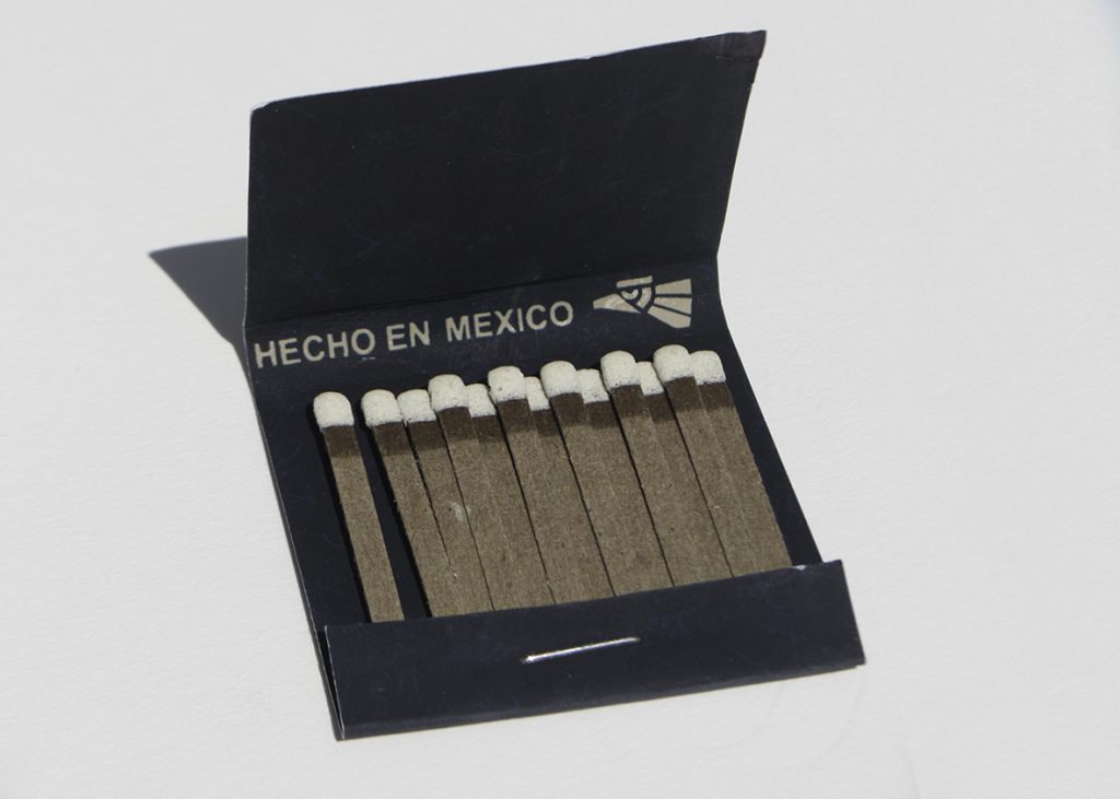
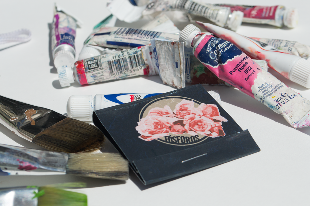
This matchbook is one which would find itself at home on the set of the 2004 biopic, Frida. Through extensive research, I was able to dissect the visual language of film and create a part of the universe created by the filmmakers. I was particularly intrigued by the self referential nature of the film, frequently using Frida Kahlo’s own work to tell her story. When designing this matchbook, I chose to incorporate Kahlo’s iconic flowers into the 1930s Mexico style matchbook in order to follow this pattern in the visual language defined by the filmmakers.
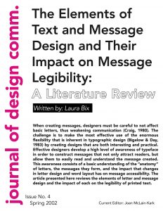
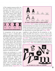
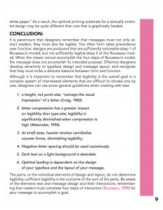
I am fascinated by the versatility of some of the larger typefaces. They are comprised of so many styles, that they allow for an interesting and clear hierarchy of information using fonts all from within the same family. This is what I chose to do when typesetting an academic journal article. I didn’t want the design choices I made to overpower the content, and so I experimented with this method of using a single typeface–Avenir–to format the copy of the article. I followed similar suit with choices of color, choosing shades of the same color. This slight variation in both color and type makes the layout visually interesting, but very cohesive at the same time.

As I designed my first typeface, I was determined to fill a need that I felt was not being met within my community. I previously cringed at typefaces that attempt to mimic Hebrew characters. Most of these typefaces lazily substitute Hebrew characters which vaguely resemble an English character. I decided instead to study the characteristics of Hebrew letterform and apply these characteristics to English letterforms. When presenting my typeface, I chose to model my poster after a Bar Mitzvah invitation, because I know that this is the niche opportunity where my typeface will most likely be used.
The Elements of Design
Line
Line is the element of length as a mark connecting any two points. Lines can organize, direct, separate, be expressive, suggest an emotion, or create rhythm. They can join elements or divide them.
Shape
The external outline of a form or anything that has height and width. An example would be the three basic shapes: the circle, the square, the triangle, considered to be the fundamental shapes of design.
Texture
The look and feel of a surface. In two dimensional form, texture is essentially visual and adds richness and dimension to the work. Texture can also refer to pattern, which is visual texture.
Value
The relative lightness or darkness of an object. Value adds dimension by creating the illusion of depth in design.
Color
Color creates a mood within the piece and tells a story about the brand. Every color says something different, and combinations can alter that impression further.
Plane
Three dimensional form that has length and width but with minimal thickness.
Volume
An enclosed area of three dimensional space.
Mass
Solid three dimensional form.
Space
Distance between shapes and forms, but it is best understood in designs as white space or negative space, terms used to refer to the empty but often active areas that are void of visual elements.
Light
Can enhance or obscure, affect emotions, entice us to enter, create mystery, can even be the sculptural medium
Time/Motion
Any word or image that moves functions both spatially and temporally. Can be implied as well as literal.
The Principles of Design
Unity/variety
When all design elements relate to one another and project a sense of completeness. A viewer will always seek unity in a message. Without it, the viewer will lose interest. Designers use ideas drawn from Gestalt theory to help their designs.
Balance
When all the design elements are equally distributed through the design. There are essentially two types of balance: symmetrical and asymmetrical. Symmetrical elements are arranged equally on both sides of a composition to suggest a stable or static motion. Asymmetrical elements create a deliberate imbalance to suggest variety or dynamical movement.
Scale/Proportion
Scale is the comparative size of an element of art or object in relation to other objects and expectations about what is normal. Proportion is the relationship of the size of parts to each other and to the whole artifact or image.
Rhythm
Pattern created by repeating elements. Rhythm denotes the movement in the way that elements direct our gaze to scan the message for understanding or information. The term sequence is used to refer to the viewing order of the elements and to determine the order of multipage publications such as a magazine or book.
Emphasis
Indication of the most important element on the page based on the message. It’s the element that stands out and gets noticed first. The most emphasized visual element in design is called a focal point because it attracts the view



 This course has opened my eyes to a new way of using practice time. I’ve always had a hard time crossing the bridge between digital and analog art. I now understand that these are just methods and can both be used to reach the same goal and in fact, should both be used. I am now totally in love with the idea of sketching digitally. Before, I though of digital work as “the final product” – something that fits neatly on an art board as is ready for export to web or print. Now I realize that digital programs can be used in every step of the process. I’m really glad Tuan showed us his projects and how he works, because I’m finding that the edgeless, orderless flow of work really helps me create. I think that this has enhanced my practice time and made my work a lot more organic. I think that I have a very consistent practice, especially because it’s whenever I have a free moment; even finding myself doing graphic design while procrastinating on my graphic design homework.


 I have exposed myself to a lot of other expert experiences so far this semester. I always try my hardest to attend gallery openings and absorb as much design and art that Austin has to offer. I also had the opportunity to see my work from last semester on the Butterfly Project shown at the Bullock. The experience of going and talking about my work to people seeing it for the first time was very enlightening. I’ve also been doing freelance work this semester and it has been a new experience all together. Starting to make work for someone other than myself is definitely a new challenge and I’m really enjoying the challenges that come with it. While I would always like to do more, I think that my “extra stuff” would qualify as “lots.”


