Tag: Image Methodology

Image Methodology: Interface Lesson

In order to present your work for an audience (whether that be a client, a job, or the public) you must keep in mind the user experience aspect of the presentation. Not only is the work featured within the portfolio app the designer’s work, but the motions of the app and the user experience are fundamental components on making an impression to the viewer.

This project was an introduction to Adobe After Effects and animation, as we simulated the motions of the app while featuring our work. I chose to create a file-like design with motions of tapping and swiping, and tried to make everything intuitive for the user.

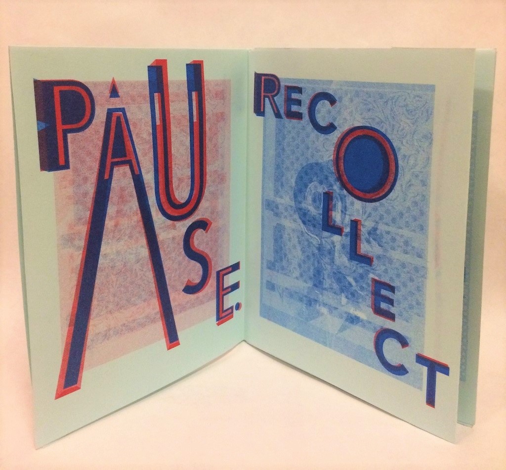
Image Methodology: Plotter Lesson

This project incorporated the concept of methods of design producing patterns within a pre-developed system. We had to produce 16 different images based within this system. Through the use of different factors (people’ s birthday months and dates assigned to different shapes) I developed a system that would create many unique designs. This project also involved elements of craft and material choice. I chose construction paper and metallic sharpies to produce a rich and unique palette for each variation of the system.

Image Methodology: Zine Lesson

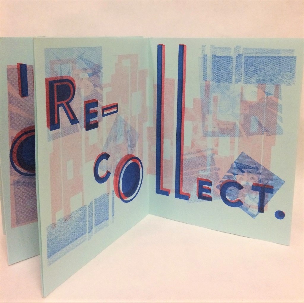
For this project we were to present a truism through the media of a zine (a usually small art-magazine). A truism is simply a statement that is true, and usually provides obvious recognition or advice on a particular subject.

These books became sort of little tokens of communicated thoughts. For my zine, I wanted to communicate a sort of truism that would help one to meditate on memories and re-collect themselves if they were stressed. I developed the phrase “Pause. Recollect in order to re-collect,” and I liked how the two words “recollect” and “re-collect” mirrored each other but supplied different meanings.

My project involved scanning objects (a radio and iPod nano to allude to music) , forming the images in Photoshop,  bringing them into inDesign, choosing a typeface and manipulating it across the page for more dimension. We also learned about the printing process of the Risograph printer and how to format our documents and prepare them for printing.

I could have been more careful with my crafting of the zine and this is something that I’d like to focus on in future material projects.


Image Methodology: Style Lesson

Style is within the mood and implications of things, and communicates a group of beliefs, histories  and attitudes. Through almost everything that exists, you can trace back an influence of another style that has produced the present thing.

For this project we had to partner-up and My partner and I chose to combine preppy with mid-60s Mod, a style filled with mini-skirts, geometric patterns, and long footwear. Mod style of dress derived from a whole subculture of “modernists,” people who listened to new, emerging jazz, dressed in custom, tailored, working class clothing in the 1950s. This culture notably expanded in the mid-1960s in Great Britain, with live music, pop-art, and bold characteristics in fashion (with doe-eyed, fresh supermodels such as Twiggy).

We began by doing a personal closet inventory and developed a list and sketches of what each outfit would look like. Everything we wore ended up being something from our closet! For the combination photo we chose a brick wall backdrop in order to combine the flatness of the Mod photo and the collegiate infrastructure of the preppy photo.

Image Methodology: Object Lesson (matchbook)

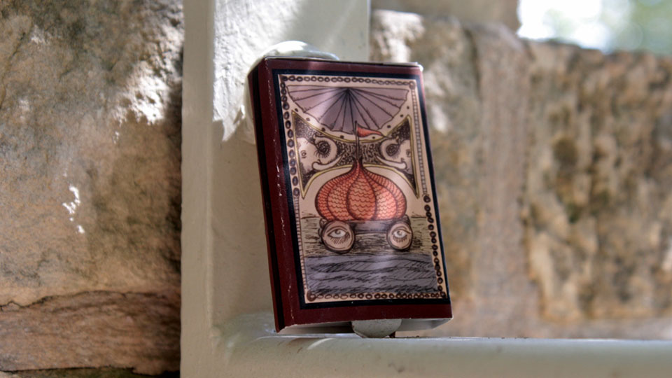
The objects of films, although many times overlooked, can become major components of the film’s narrative, and in some cases may even become representative of things larger than themselves. For this project we had to create a matchbook that could easily slip into the world of our film. I chose the film The Fall (2006), an imaginative adventure set in the 1900s that tells the story of a paralyzed soldier in a hospital and his friendship with a young girl.

A significant portion of the movie takes place in the young girl’s imagination, and I wanted to create a matchbook that suggested the majesty of this other realm but that existed in reality. In the movie the girl has a box of interesting, foreign items, and I wanted this to be an item that would spark her wonder and tie into the whole of the story. I illustrated the monkey and butterfly (two characters in the imagined world). This project involved developing the images in Photoshop, featuring selected typefaces, producing the material product, and documenting the product through photography.

© 2024 Emma D

Theme by Anders NorenUp ↑

Skip to toolbar