Tag: GDES 2

Graphic Design II: Visual Identity, Mark

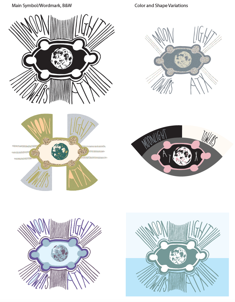
The symbol of our identity of our place (my place is the Moon towers) can represent the place iconically or metaphorically. I wanted to combine both of these ideas through the allusion to its structure (hexagon shape at the top) and incorporate the concept of the Moon towers as onlookers, a tower with six eyes that overlooks their certain place wherever they stand. I wanted to maintain a hand-drawn aspect (to provoke an ancientness and hieroglyphic aspect), but I had trouble initially this when scanning in my hand-drawn image and making it digital.

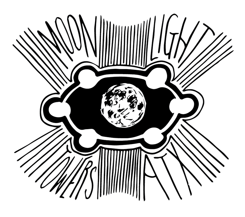
I chose to redo my symbol (see bottom) and incorporate more evocative material (such as the distortion static and the values on the eye) to develop a more sci-fi novel cover identity with the mark. I like the impact of my re-visited image much more because of its dimension and stand-alone nature through its shape.


Graphic Design II: Process Work/Research

During the research process of developing our identities, we were to diagram our place, take photos/images, write about our place, take sound clips, create music playlists and develop a color/material palette that evoked the ideas associated with the place.

Palettes reveal the proportions of color and do not have to be literal colors, but can provocative and metaphorical. While creating this mood board, I found that listening to my playlist inspired by the Moonlight towers also helped with the choices and process. I wanted to also begin developing the shapes that would become influential to my design of the Moon towers’ identity. I used static images and velvet material to create the in-town and other-worldly sense of the Moon towers.I would have liked to incorporate actual material to further the dimension of the palette.

© 2024 Emma D

Theme by Anders NorenUp ↑

Skip to toolbar