For our next project we were to design a catalog that featured a designer of our choice from a list. We were to focus on using the grid and expressing our own style while accentuating/alluding/complementing our chosen designer’s style.
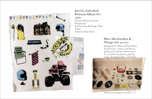
I initially chose the designer Paul Sahre because of his variety of compelling book covers, NYT illustrations, as well as his awesome work for the band They Might Be Giants (this year I have just started to really get into their music.) I chose to narrow in on his collaborations with TMBG, a relationship that has now spanned for about seven years. For research I went to a TMBG concert, watched a ton of music videos, read interviews and Paul Sahre’s “Two-Dimensional Man.”
The more I learned about Paul Sahre and his work, the more I was inspired to create and explore being bolder and experimenting with media! I wanted to capture that rough, fun, poignant creativity that I felt in all of his work. Sahre’s resourceful, humble, flexible, exploratory approach to design (welcoming all of the messiness and fun of creating) really excites me and I felt re-energized as a design student and was sort of reminded why I am pursuing design throughout this whole process.


Professor’s Feedback on the final, printed design:
“This came out really well. Paul is a great designer and as you know because you read his memoir, he really is a designer’s designer. He is all about the process, about going to unknown places. And you achieved that with this design.
Everything about the content is great. The finishing feels like a home job. The paper might feel better at a slightly lighter weight. The print feels like an ink jet, nothing wrong with that, but it would be interesting to see on a laser, to give it that extra crispness. On the cover, maybe scoot the wheel down slightly (note: the book printed slightly off and smaller than I expected). Print the wheel graphic on a CD label, and place it on the disk at the end, with a transparent sleeve in the back.
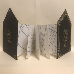
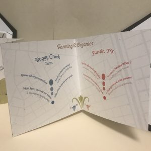
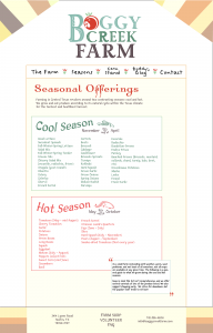
Watch those text boxes, some are too narrow, and would be better a little wider. 8-12 words per line for continuous reading, anything like 3-7 for short blurbs of text. Never use hyphenation for FL/RR text. Absolutely love how you used the torn images. Maybe run the red bar all the way across the page, and have it bleed. Watch your line breaks, and indented paragraphs. The feedback was all critical to make it better, but this one turned out great.”