Image Meth: Object Lesson

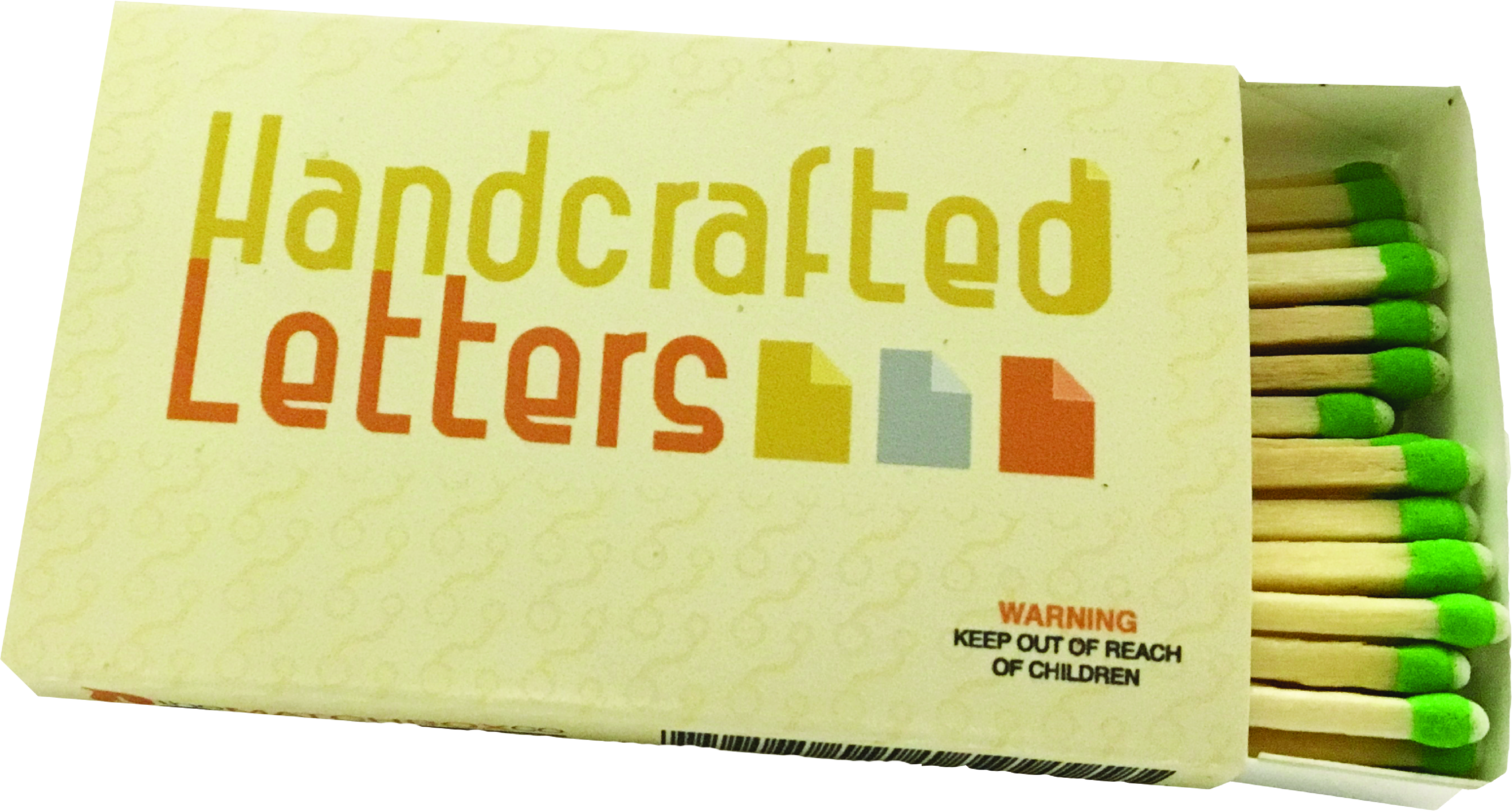
The design of this matchbox is to fit seamlessly into the movie Her, directed by Spike Jonze. The reason for choosing this movie to make a matchbox is because the iconology, image methodology and color scheme has a very distinct feel and look throughout the movie. This allows the designer to analyze visual cues in the film to effectively create a matchbox that one might find at the main character’s work.

GDES I: Cognitive Map

This placemat helps the Elwood Alehouse customer decide what type of beer they want. In beer selection there are many different factors that go into selecting a beer that the customer will enjoy. The three categories of factors are beer style, IBU (bitterness of beer), and ABV (alcohol by volume). To create a design that helps the customer navigate this difficult decision I start with beer style because beers within the style typically have similar tastes and alcohol percentages. This placemat also can be used as a spin the bottle type game to determine a beer style if the customer does not have a preference.

GDES I: Information Map

This information map tracks where Tony Pierce traveled and for how long he was in each location. This map was formulated based on Tony Pierce’s expenses from the past 12 months.

To obtain the necessary information for this map, I had to though his expenses and identify which where Tony bought goods. Based on the location of his purchases, I was able to determine where Tony was and how long he stayed at each location.

GDES I: Symbol Methodology

This project is very useful because a mark is used to communicate a basic or complicated idea to a viewer. To create a successful mark, the designer must consider form and functionality. To achieve this the designer should create a methodical approach to the mark making. In this case, the design is made by creating many marks in three categories: traced photos with literal meaning, stylized marks, and non-objective representations. The methodical framework requires a combination these three categories to create a unique symbol that has both form and functionality.

Type I: Grids and Spread

This layout addresses typeface selection, the grid, the spread, and text flow across paragraphs, columns, and rows along with consideration of elements of text and message design, and their impact on message legibility. Designers are faced with finding solutions to visual and organizational problems and one approach to solving these problems is the grid. It’s not the only approach one might take, but it’s one with several important benefits. These benefits are but are not limited to: Clarity, order, efficiency, hierarchy and cohesion.

Type I: Type Specimen Posters

This is an experiment with the presentation of a typeface that has several components. The first component is a personal survey of myself, a typographical study of type in relationship to my personal history. The second is a typeface selection as representation of your awareness of myself. And the third is an investigation of the role of hierarchy in typography. The third component stands out to me the most because creating a type specimen poster should directly show how the typeface may be used. This is helpful to designers so they can understand the typeface and find options to use with more ease.

Type I: Blurbs

This project aims to examine the relationship between typefaces and words & phrases. This is very important to understand how important it is to understand how typefaces evoke emotion. The typeface may draw emotion based solely on their form, but others are more ambiguous and may also create emotion from the text. This is important to understand because if the content of the text and the form of the typeface do not evoke the same emotion, then it can create confusion for the viewer.

Type I: Matchy-Match

With a formal series of photos that examines the relationship between found forms and letterforms, I am building a relationship between found letterforms and existing typefaces. This helps draw the connection between nature, architecture, and design. Understanding how all of these are intertwined helps designers create cohesive products.