

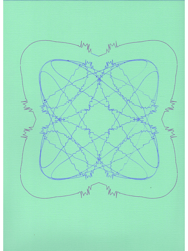

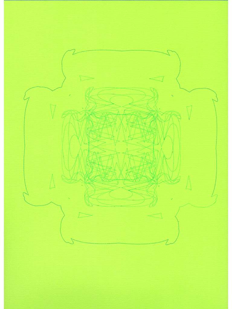


The plotter project was by far one of the most interesting projects I had in Image Methodology. For this project, I had to come up with a series of rules that were then going to be executed in order to create 12 different plotter drawings. What I got out of my instructions were drawings I honestly could never have expected. The rules were as follows:
- Start with two intersecting lines, it does not matter how they intersect.
- bend one line into a curve, then add to the shape with 2-3 curves. Make it as elaborate as you want.
- Take the other line and bend it slightly, making a smooth curve. Take this curve and duplicate it across the surface of the first shape, moving in a straight line. Make sure there’s an even number of copies and they are equidistant. You can even reflect the curves or alternate the orientation of them, if you desire.
- Take the duplicates and use pathfinder to unite them. It should make a closed shape. Try to fit this shape so the 8 is within it. Make sure the 8 is sent to the back, while the new shape is in the front.
- Make an envelope distort using the top shape, then expand its appearance. Take this shape and duplicate it, reflecting it horizontally. Take this result and reflect it vertically. Take this result and rotate a new copy of it by 90 degrees.
- Group this end result, duplicate it, enlarge it from the center, then use the unite it with a copy of the smaller version using the Unite button in Pathfinder. Center this on the smaller version as a frame.
Needless to say, the end result was incredibly interesting. Since they were all so delicate in composition, I used various gel pens to draw all the plotter images so that the line intricacies were not lost. All of the drawings remind me somewhat of Rorschach tests, which are usually composed of symmetrical ink blots. Some of the designs are geometric even, but most don’t include any straight lines and are instead a bundle of curves; some of the lines can even look akin to that of an audio wave. By far the most unexpected one was the image resembling a cross. It was completely unplanned, and the fact it exists was pretty baffling given the round nature of the other drawings. The cross drawing is the most delicate, almost resembling a doily. Overall, these drawings were incredible to watch unfold, yet I think their complexity probably stems from the complexity of my instructions. These images speak for themselves, and I am always impressed by how they turned out.