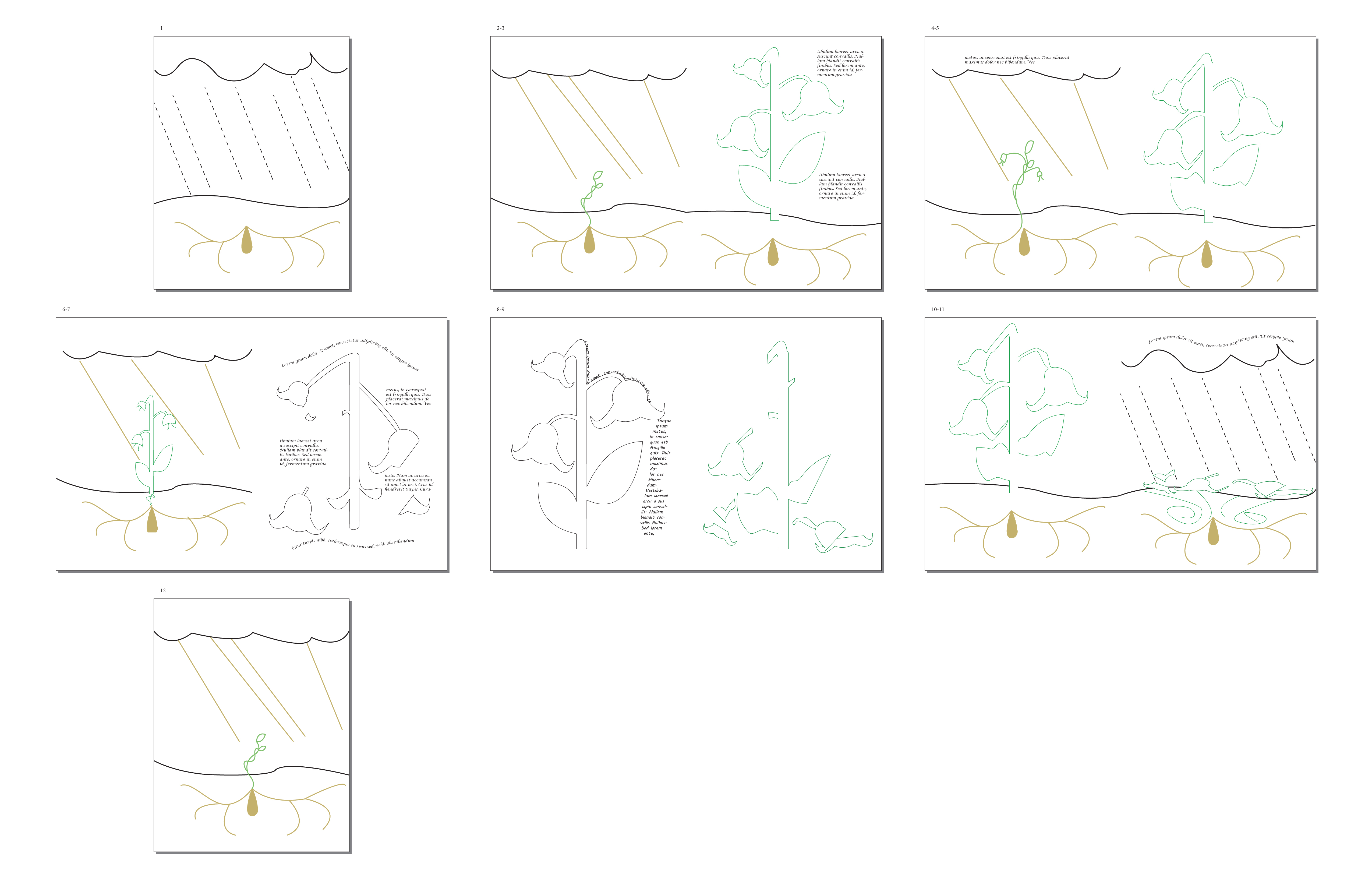
So, I’ve managed to create some quick demos of what I’m looking at for my book. It’s all proof of concept, and I have to say I like how things are going together.

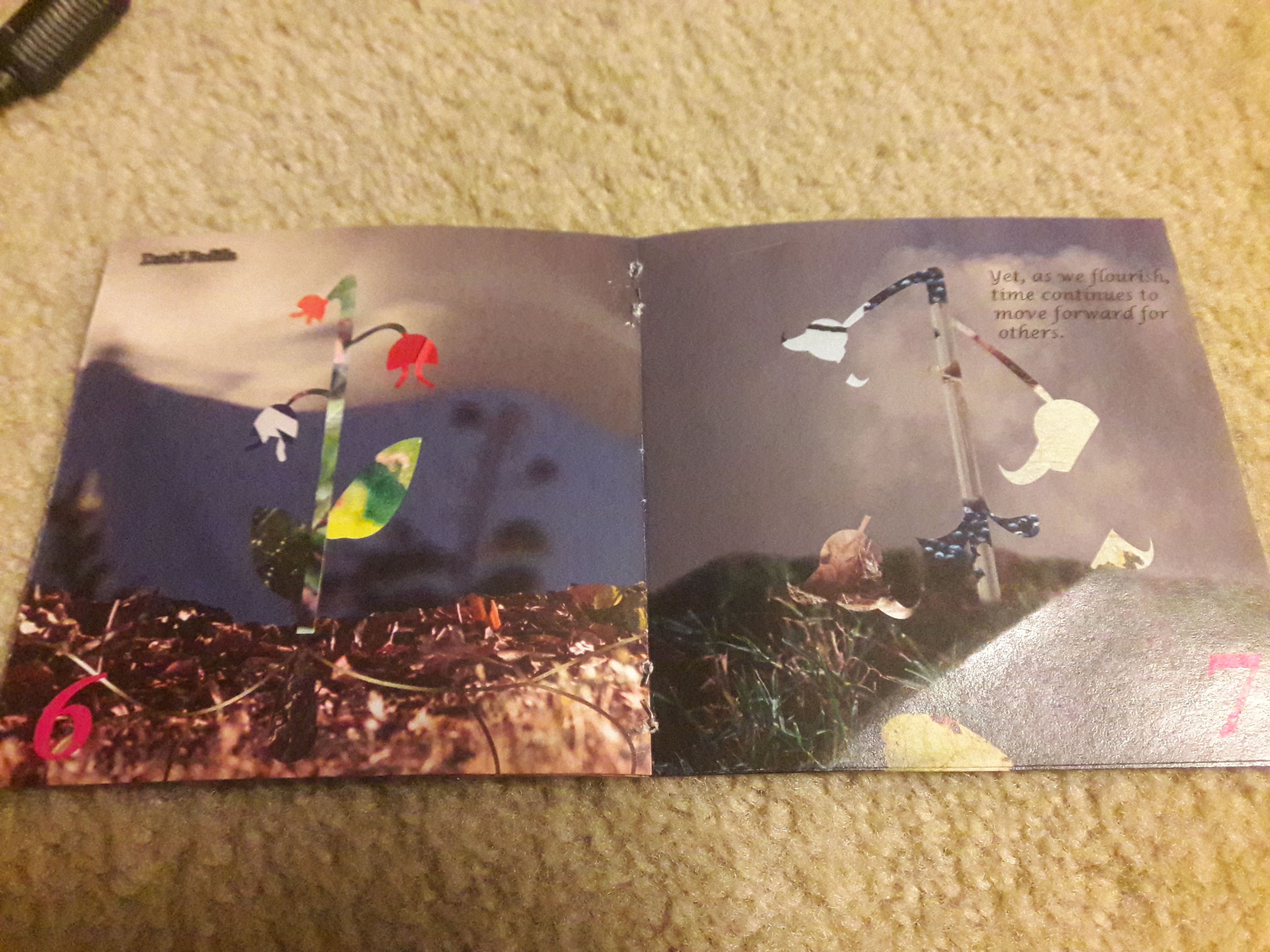
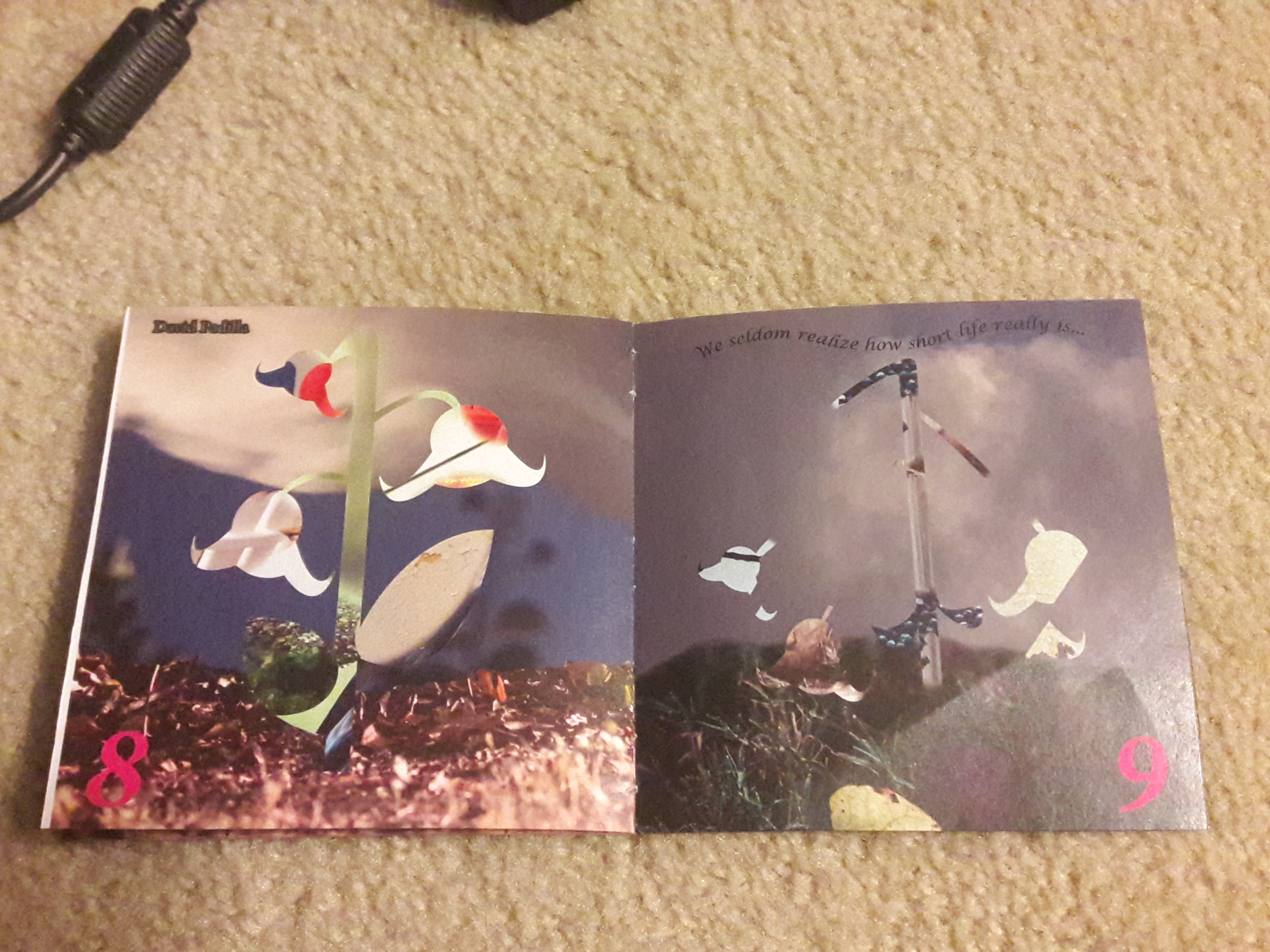
So these are two quick collages I put together that represent what I’m going for. On one hand, we have a blooming, vibrant flower, then we have a dying, diseased plant. In a sense, you can already see a chronological flow here, even if it’s just implied in the gutter between the photos on this blog post.
In short, I’m going to follow two plants (or maybe it’s the same plant) and they’re decay/growth. My idea is to pin to different narratives alongside each other, and bridge the two, probably starting with a seed and ending with a seed. It’s kind of a “circle of life” thing, but I didn’t want it to be linear in the life/death style, it jumbles the two together. These images gave me an idea of what I was capable of from a creative standpoint, and I think it proves that the project is doable, as I just need to pinpoint exactly what changes these plants go through, then make slight modifications to get them to look that way.
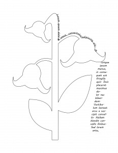
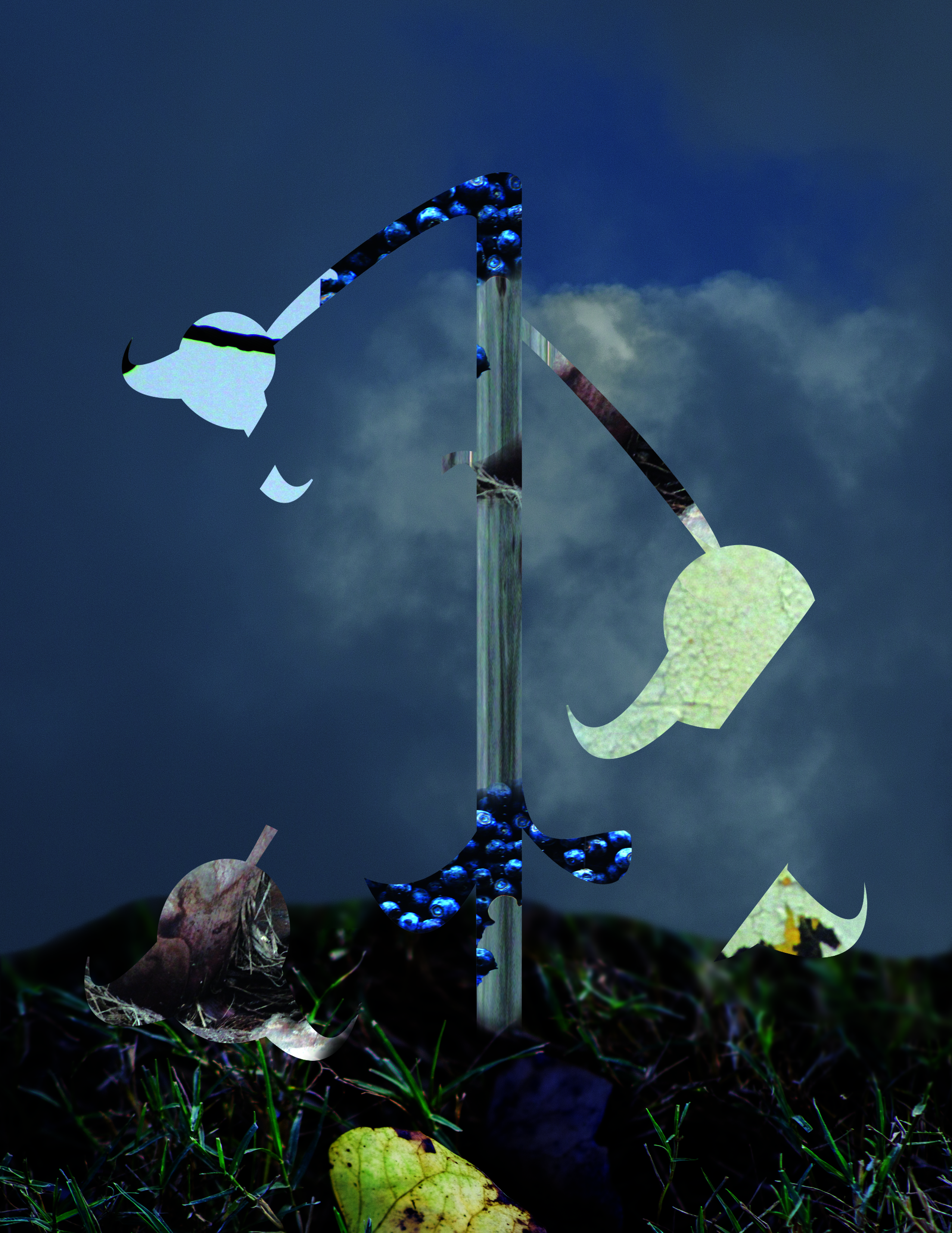
These last two images were my way of testing out typography. I didn’t have resources/know-how to create my own typeface, so I went ahead and looked at the default system fonts to see what kind of font/placement I’d like to use. I did a little experimenting with the text shape in the first image, trying to wrap text around the cut outline, while also creating a trailing group of letters that seems to flow off of the bud. I was going for a stream of water dripping off, but it was hard to do something like that with the heavy amount of text. I think depending on the size of whatever poem I choose to cover, I could maybe use individual words to give it that dripping effect. I’m really considering pairing these up with the two collages in a sort of double gate-fold, if that’s possible. I think it would go really well as the center of the book, but we’ll see how the narrative works out.
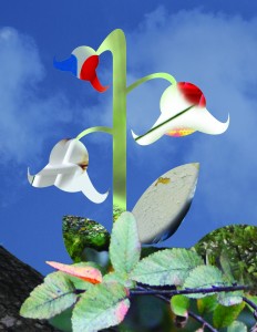
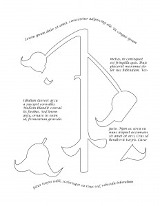
For the second image, I mainly wanted to play around with the placement of straight-up text boxes. I had some small “creative” elements on the top and bottom that gave a nice feel to the overall composition, I think, then I had the rest of the text flow in a zig-zag pattern through the text boxes (fortunately I remembered how to do that from my Yearbook days).
In both compositions, I wanted to stick with a script font, as I think it goes well with the delicate nature of both life and the plants themselves. I think that whatever text I source will benefit from this choice, as it’ll only highlight the nature of the text and the subject matter.
In short, this was a good sample and proof-of-concept for me, and I think the sequence of things will go pretty well together. There’s still much work to be done, but we’ll have to see how everything turns out in the end!