Monthly Archives: October 2016

Book Bonanza!

Book Bonanza!

This week was interesting.

After exploring the local park in my community, I decided that I’d end up making a book that follows the growth of a plant through the stitching together of various outdoor textures and the various textures of playground equipment.

img_20161102_071208550img_20161102_071248079img_20161102_071329386

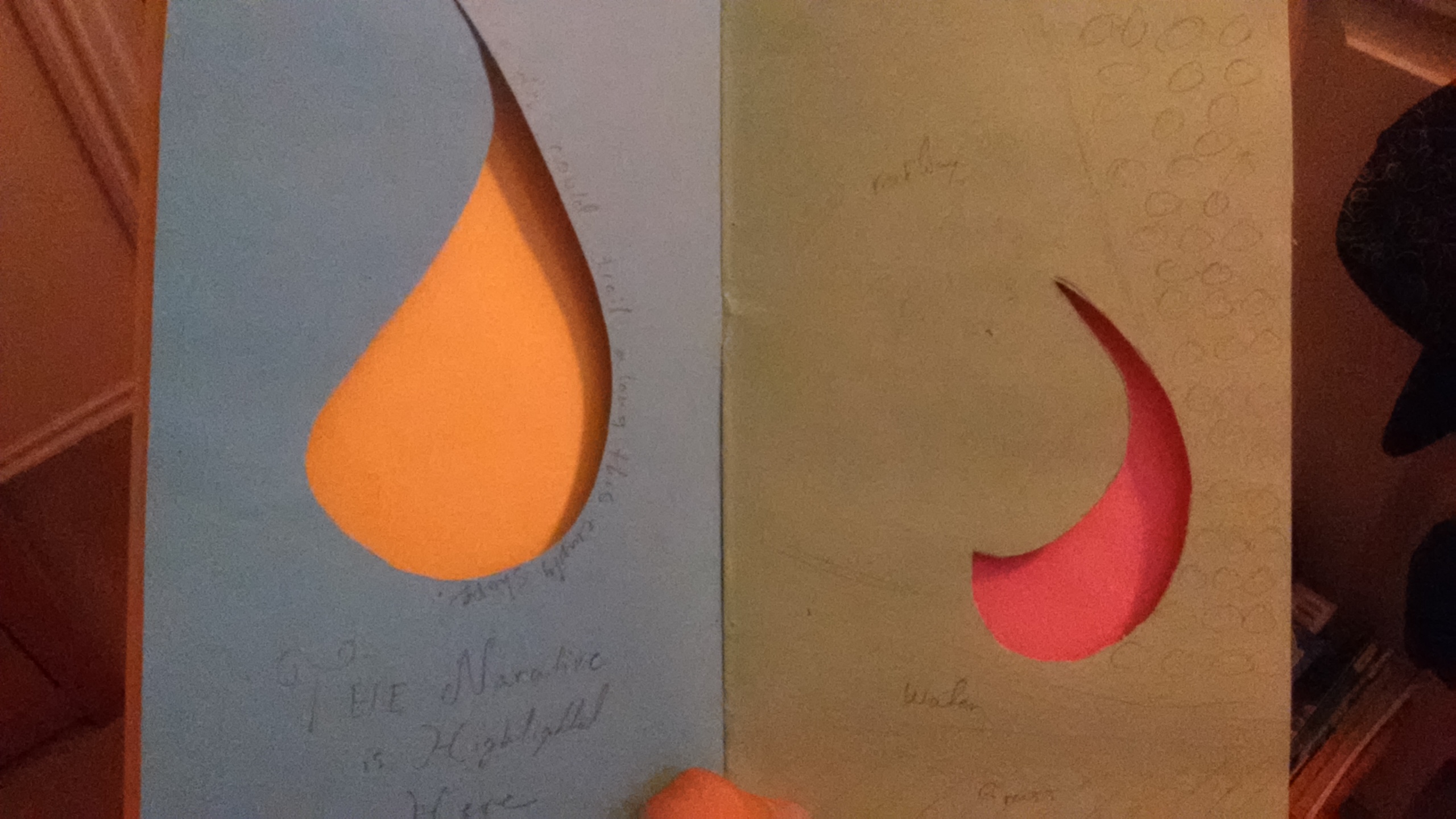
I had the idea when I began to cut through the book. It started with me cutting out a raindrop, which then evolved through further cuts into the idea of the moon, sunlight, a flower, a flower with leaves, then multiple flowers.

It’s obviously a work in progress, but it gave me a general idea of what I want to do. I think the important feature is going to be how i incorporate illustrations and collage into the area surrounding those cuts, and the mood those elements create. I want the end product to be meaningful, and while I couldn’t put in a gate fold, I was thinking that maybe a gate fold would allow for a more interesting image of a flower sprouting out from the spine of the book.

Regardless, it was a good opportunity to get my ideas down onto the page, and just exploring where and how to cut into each page was a very interesting and eye-opening experience. I did a lot of work with negative space, and it became difficult to work within those parameters and still communicate something abstract. However, it still managed to create a general example, and I’m sure it will only improve as I continue to expand my ideas along with my library of usable images.

Hopefully, the final product will represent what I envision. Even if it evolves, I think that the whole book making process has made my ideas a lot more open, at least in terms of organization and delivery.

Future Shaping

Future Shaping

Personally, I think it’s a good idea to have a general idea of where you’re headed in life. For instance, I’m considering getting my Bachelor’s in Graphic Design with a minor in Computer Science, then possibly pursuing a Master’s and PhD in Psychology.

I suppose this is customized to me in the sense that it’s all based off of my own goals in life; I want to create and leave some kind of mark on this little blue dot, yet I also want to have a strong focus on helping others. Those are my own life goals, nobody else’s, and everything I plan is only to further my progress towards those goals; to better myself and bring myself closer to the skill set I need to help others, as well as help myself.

*~*~*~*~*~*~*~*~*~*~*~*~*~*~*~*~*~*~*~*

I would like to travel to another region, just to get a sense for a culture that isn’t my own and pick up some influences. I’ve always been really fond of Japanese anime and food, so I think it’d be neat to visit Japan, especially with how friendly the locals tend to be with foreigners.

I’m not quite sure what draws so many people to Japanese culture or even anime, but they’re both things I’ve had a strong interest in since I was in elementary school. I think there’s a certain level of maturity in the majority of Japanese storytelling (at least with the anime I’ve seen), and that really resonated with me as a child who spent most of his life talking to adults rather than kids his own age. With that said, I think Japan would be the one place I would want to see before I graduate, or at least before my life got really serious.

<><><><><><><><><><><><><><><><><><>

I’m not part of any kind of student group or organization, I simply don’t have the time for it between my studies and commuting back and forth between school and my mom’s house every day. However, if it wasn’t already apparent, I’ve always been interested in the anime club, mainly because I started my high school’s anime club and ran it for two years. I wanted to see what a club like that could do at St. Edward’s with possibly more resources and definitely a more serious group than the kind we got in high school (which often was comprised with random kids with nothing better to do).

¯\_(ツ)_/¯

Anyway, that’s sort of what I’d like to do and see at St. Edward’s.

Memento

Memento

Christopher Nolan’s Memento, is a film that relies on a unique storytelling element; its entire sequencing is backwards. Memento begins with Leonard, a man with short term memory loss and a need to avenge the murder of his wife, developing a photo of a dead man in reverse. From that scene onward, the film is presented in reverse order, with the individual scenes being shown normally rather than in reverse. This left me wondering what was going on, and while it was a little disorienting, it was interesting to try and piece together the actual events and decipher what was happening to Leonard.

The film itself is a very tangled web, the flow of the story changing around halfway through, proceeding in a chronological order to end at the big jaw-dropping conclusion, which ultimately reveals the truth about Leonard’s condition and his life. The details that are presented during Memento are extremely crucial to understanding the film’s plot, and the non-chronological flow of the film demands that the viewer pay attention to the events that take place. From my own perspective, the film was rather immersive, and drew me in with the uncertainty of what was real or fabricated by another character, especially with the introduction of Natalie, who turns out to play a major role by manipulating Leonard through the first half of the film (a fact not realized until the end of the film).

The style of Memento is unique, but the twists are a key feature in Nolan’s own style, given that Nolan also created the film Inception, which prides itself on its uncertainties. I think that I’m most interested in the fact that he used chronological order in the end, as well as flashbacks, to clear up all the loose ends. It was especially interesting how in certain areas of the film, there seems to be an overarching conversation between Leonard and someone on a telephone, as it adds to the mystery while providing information about Leonard.

When I look at Memento, it seems like a film that revolutionized the film industry. Honestly, I’ve never seen anything like it, and I believe that in art, sequence and presentation are the two most important methods of controlling how the viewer experiences someone’s creation. If Memento was shown in chronological order, it might’ve had a predictable outcome, or may have been less intriguing. By controlling the work and how others perceived its flow and sequence, Nolan created a whole new sense of uncertainty, and used it to blindside the audience.

Alumni Presentation!

Alumni Presentation!

Overall, the alumni presentations were awesome, despite our second presenter’s technical difficulties. I liked what I saw from both of them, though. Out of the two, I most related to the first presenter, Camille Dollins.

Ms. Dollins has worked on a variety of projects, including UI design and marketing projects. I also really like how she’s applied her own creativity towards other subscription box startups, and helps others get their boxes looking top-notch. I really found it interesting how she works with both the company and her own clients, so I guess I mostly related to her career and the path she’s headed down. Ms. Dollins seems to be a “jack of all trades” in her field, which is quite impressive.

I suppose I was surprised by the way Ms. Dollins started out, with her own subscription box idea. I found it to be a unique project idea, and something I would never have thought anyone would attempt, really. It was a fantastic idea in the end, and I love how she tied it back to helping others. It got me started on thinking about maybe developing an app that could connect heart patients with similar patients in their area, as my mother has congestive heart failure, and is often frustrated by the lack of support groups for those in her position.

I suppose the most valuable pieces of advice I heard were to start looking for internships, and also to try and work for student life to build up a portfolio. I really appreciate Ms. Dollins for giving out such practical advice, and I really feel it’ll come in handy as things start to get more serious for me down the line.

Collage! – Wave 3

Collage! – Wave 3

As the third week of collaging ends, I’ve really gotten into the material. I’ve dared myself to try new things, and I’ve thrown caution to the wind a few times in an attempt to try new things. Overall, while it has been a struggle to break away from the formal and lean into the suggestive and abstract, I’ve worked diligently to try and capture those very concepts.

This time around, I managed to incorporate some items into my collages, as well as make some very interesting observations about my own style and creative mindset.

img_0004

For the first collage, I was determined to create something that could represent something through suggestions and minimal context, yet remain a jumbled assortment of random images. That came out in the form of the above collage, and took root in an experience I had at the Lucky Robot. I decided to make a sushi plate, but I wanted concepts to remain collage-like and relatively abstract. While it is the most formal out of all of my collages, it also remains abstract through the mere suggestion of form, being that it still requires thought to even understand what is depicted. The way the digital balanced with the analog was interesting, and was harmonious both in composition and content. I used the chopstick and string to give the image a three-dimensional depth, and I must say it was quite effective. I really like the way it turned out, even if it does stand on the outskirts of abstractivity.

img_0002

The second collage, to put it lightly, was quite messy. I like the way it turned out, as it’s definitely more abstract than the first one, but retains a unique composition, filled with not only circles but a variety of shapes and patterns. I think that this collage was the most difficult, as it mainly presented itself as I worked on it, while the other did the same, but at least started with a general concept/theme. This collage was definitely the most experimental, by far, and remains my least favorite of the two, only because I now see it as cluttered, even though it does have some redeeming qualities. I’ve incorporated several scans within the image, as well as a soda can and some random bits of metal/coin that I picked up off the street. Needless to say, it uses the items better, but looses something in it’s composition.

Overall, each collage has pros and cons, and I’m not completely content with either. Aesthetics aside, I think they are both interesting concepts and bring something new to the table, but they also each took a considerable amount of thought and effort to end up where they are. I think that that same effort is evident in the artwork, and that both pieces represent two distinct concepts within my own definition of collage; the first collage is clean and calculated, while the second is much more liberal.


My scavenged items:

img004 img005 img007 img011 img014 img017

Skills Inventory

Skills Inventory

My greatest strengths in Visual Studies include:

  • A healthy thirst for knowledge
  • Openness to feedback
  • Perfectionist mindset
  • Creative background in photography, graphic design, and yearbook design.

For greater success in this course, I need to:

  • Embrace criticism and learn from it.
  • Do my absolute best.
  • Leave no stone unturned in terms of ideas or applications of principles.

My greatest strengths in Drawing 1 include:

  • A somewhat steady hand.
  • Attention to detail
  • Sensitivity to pressure when shading
  • Good eyes
  • Active listening skills

For greater success in this course, I need to:

  • Visualize my goals
  • Try to draw what I see, and not infer too much
  • Rely on my tools to best represent what is in front of me, I can’t force it into existence.

My greatest strengths in 1st Year Seminar include:

  • A really big laptop to take notes on
  • An understanding of the answer to the question “Why are we taking this class?”
  • Respect for my peers and my professors
  • An open mind

For greater success in this course, I need to:

  • Pay attention
  • Seize every opportunity available to me during presentations
  • Always look for ways to grow as a person/student

My greatest strengths in Truth, Justice, and the Graphic Way include:

  • Decent art skills
  • Passion for comics and drawing
  • Good sense of composition
  • Ability to take skills mentioned in the readings and apply them creatively
  • Perfectionist attitude
  • Feeling unaccomplished when a quiz comes back as 5/5 instead of 6/5.

For greater success in this course, I need to:

  • Study like there is, in fact, no tomorrow.
  • Have long discussions about the material with my mother at three in the morning
  • Do my absolute best, because my work represents me
  • Never waste an opportunity to make something fun

My greatest strengths in Rhetoric and Composition include:

  • Background as a fairly proficient writer
  • Pretty nice understanding of grammar rules
  • Love of creative writing

For greater success in this course, I need to:

  • Be open to suggestions
  • Communicate with my professor about my work
  • Ask questions when needed
  • Never be afraid to try something new

My greatest strengths in Math for the Liberal Arts include:

  • A great understanding of basic math and algebra
  • Great listening skills
  • Openness to new methods of solving problems
  • Ability to understand what formulas do and how they function

For greater success in this course, I need to:

  • Study hard
  • Communicate with my professor if I need help
  • Keep my notes organized

My computer skills include:

  • Certification in Adobe InDesign, Photoshop, Premiere, and Illustrator
  • A little experience with Adobe Flash
  • Basic skills like Word, Excel, PowerPoint
  • Built my own PC with parts ordered online
  • An understanding of how computer parts function and work together
  • Obsession with graphics cards and CPU fans
  • Casual gamer = Pretty good understanding of program requirements hardware-wise
  • A love for learning new things
  • Drive management and partition skills
  • Troubleshooting skills

I still need to learn:

  • C++, CSS, HTML, Python, etc.
  • How to operate Linux
  • How to run a server for even something as simple as file sharing via IP connection

My greatest strengths as a researcher/writer include:

  • Openness to multiple perspectives
  • Attention to detail and the reader
  • Can narrow down topics well
  • Great at providing specific search terms
  • Proficient with online databases such as Google Scholar or JSTOR
  • Word Processing skills
  • Proficient at writing for debates and public speaking opportunities
  • Published short stories and poems in a school workshop
  • I write lyrics in my spare time

I need to work on these aspects of research and writing:

  • I’ve always had an A+ in writing classes, so I don’t think I have much to improve on. I’ve always done well on my AP exams in writing, so I think I’m more or less on track.

I learn best & accomplish most when:

  • I am involved in the material
  • I can have some kind of visual of what I’m learning
  • I love what I’m doing in class
  • Teachers/Professors are passionate about the material

ACTION PLAN:

Honestly, I have an A+ in all of my classes, so I’m really not struggling with anything or doing poorly in any of my subjects. That said, I don’t really think I have a need for an action plan, at the moment. I hold myself to a very high standard, so hopefully I’ll never need one.


Reflection: Visual Studies Style

Reflection: Visual Studies Style

collage1 collage-2

Pictured above are my latest pieces created in Visual Studies. We’ve been working on collages for a week now, and these are part of the digital round. The goal of the project was to explore design principles and the concept of harmony, in addition to exploring digital and analog mediums.

In the pieces I created, I mainly addressed the principles of shape and hue, while sprinkling in a little bit of texture into the image. I think it really captured the medium well, as I made an effort to try and use a few editing techniques to make the image more interesting. In fact, the green collage is a completely different color (purple, I think), just with an overall saturation change.

I think my strongest aspects are the concentration on circular shapes and hue, as well as the uniqueness of both pieces; they aren’t just copies of each other.

I feel that the green collage is pretty strong, but maybe a bit too cluttered. Conversely, the orange collage seems to be missing something. I also feel the orange collage is a bit unstructured, but not in a good way. It’s abstract, yes, but there’s something too formulaic and formal about it.

Conceptually, I think both images could benefit from the use of something more interesting, like how the clouds in the green collage stand out, the orange collage could use something like that, too.

Technically, I think the project could be improved by making the elements more clearly defined, such as the symmetry in the green collage, and the vanishing point in the orange collage.

Collage – Wave 2

Collage – Wave 2

The analog collages were pretty difficult, especially since I had no idea what I was doing. However, with some reassurance from our last critique, I figured I knew what I was doing, more or less, and I needed to explore things a bit further.

As far as the digital collages went, I feel there was definitely a better of the two. Both collages were centered around the principle of a sort of leading line or focal point within the image, and then expanded into the themes of color and shape, along with some interesting experimental features.

collage1

The first collage was mostly green/blue, and I tried to keep things as monochromatic as possible, even playing with the saturation of the images. I started with the circle cut out from one of my shots of the river around SoCo, then I just took samples of other textures and patterns and made the various elements conform to a general path, as all of the objects head towards the top-left and converge. I made a dotted line from one sample, and used it to divide multiple elements, which I figured was a creative way to go about creating some kind of vague symmetry. For the most part, I tried to keep everything as vague and abstract as possible; rather than leaving an object whole, I manipulated it, or cut it down further.

I think my favorite part about that collage was the hand and the typography element. At one point, I took a random hand off of the Mr. Rogers mural, and slapped it into the focal point. I think it gave the piece a new meaning, as everything seemed to stem from it. In addition, I took a letter A and cut it in half, then made a copy and inverted it, creating the layered/3D look that the letter has in the collage.

Overall, I think it kind of became a visual representation of life, moreso a breath of life than the act of living.

collage-2

The second collage was not my favorite, and was a little disjointed, in my opinion. The overall theme was orange hues, and I played with the idea of a camera lens, so that’s sort of how I structured the circles in their groups, and why some are more focused than others. Even looking at it now, I still feel like it’s missing something, I’m just not sure what.

As an experiment, I cut out four diagonal lines from the entirety of the collage, suggesting lines that lead to a specific vanishing point. They’re faintly suggested, so it was just something I wanted to put it and see how it turned out.

I think both collages were pretty well-rounded, and I used some cool principles, but the second one needs work. I’m pretty sure that both collages managed to capture a pretty good amount of Austin’s “weird factor”, and I think they each served SoCo justice in their own unique and weird way. Overall, they are more abstract and a definite improvement from the analog collages.


Triangle Madness

Triangle Madness

The word “collage” has never really meant anything to me before. I had no experience making collages, no interest in them, and ultimately no sense in what the point of a collage was. In the two days I have spent making these three collages, I have realized two things; (1) Cutting triangles for hours will make you insane and (2) the creativity of collages reveals itself when you let go of the reigns a bit.

For the first collage, I took a very calculated, measured out approach to the whole process. I confined everything to a form, and relied solely on contrast and shape to create my image. It is the most complete frame, but has the least amount of creativity. Yes, every shape is unique and has it’s own special part in the grand scheme, but it is all cold and calculated; there is no freedom, no space to breathe within the image. While the colors are contrasted and the lines are clear, the overall image seems too void of life. At first, I thought that the clustered and chaotic nature of the image represented the cluttered hustle-and-bustle of South Congress, and therefore did it justice, but there was room for improvement, and I did so with the next two images.

collage0001

The second collage was that of a heart comprised of blue and green triangles, a rather sharp, chaotic mess, with a flowing wave of hearts almost pouring out of the larger shape. Intentionally, the last heart shape on the corner is cut out from the actual base paper, which, for me, seemed to serve as a metaphor along the lines of the heart being left somewhere, presumably in Austin; it was a quirky feature, so I left it in. The overall composition is sharp, but I actually cut the shapes out before they were even placed, so the line that divides the green and blue was completely formed as the project was created, and the shape formed itself from there onward. The famous “I love you so much” graffiti makes an appearance, and in that sense was a love note to Austin and South Congress, in its own right.

collage0002

The final image was the most creative and the most aligned to the purpose of the assignment. I took circles of various size and color, placed them down on top of liquid glue, and simply saw what appeared. I followed a curve, and ended up with something that resembles a twister. Upon examination, there is some depth in the image, like the fact that the white circles within the top half’s negative space are small, while those near the bottom are large, making the image seem closer. I think the dynamic shape of the curve started as bubbles and progressed into something of sizeable power, and I was quickly overpowered by it. Ultimately, the curve itself and the background color of the paper made for an entirely different image than I had intended to create.

collage0003

The design principles I focused on were mostly harmony and color, and I think I managed to craft interesting pieces with those principles, yet I think there’s definitely room for improvement, and exploration is the key to that expertise. I think if I’m a little less controlling in how the image will be processed, I’ll get something interesting. Perhaps this project has preyed on my fear of blindly stumbling into big projects without a plan, but often it seems that things turn out better when you take those risks and cut the image a little slack.