For this book I decided to focus on the architecture of East Cesar Chavez. It is changing drastically and I wanted to make a book which also includes a map of all of the new style architecture, so we can look back on years from now and see how many houses and businesses have changed. My main thesis was that the newer homes and businesses being built have an angular and geometric structure to it, as oppose to the old homes that have a basic square shaped body and triangle roof.
Author: dgarciag
Animated GIFS

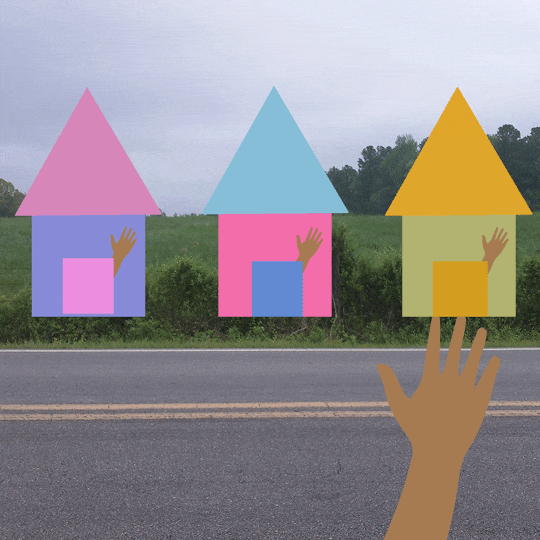
With these GIFS, i already new that I wanted to focus on the architecture of East Cesar Chavez. For the first GIF that is houses coming from the back to the front, the back are the newer houses and the front are the newer geometric styled homes that we now are seeing more of along the street, it’s supposed to represent the transformation that is happening. The second GIF represents the same idea but with the element of photography where we get a real life business that has embodied this form. Lastly for the the third GIF, it represents the people which is my take, I am not 100% sure if it is actually like this, but it is someone waving and having the people that lived in the old style homes wave back, but with the new structured homes, since they are new, they are not as friendly and are asking the person to just stop, because they don’t know the person and just want to live in their home.
SOURCE Program Booklet
Here we designed the program for St. Edward’s SOURCE conference. I had originally picked the colors purple and blue but then changed to yellow and blue since it was going to be Riso printed and we had a limited amount of color choices. The logo itself represents all of the schools of St. Edward’s that take part in this conference like school of humanities, natural sciences, business, all coming together to represent their knowledge.
end of semester wrap up


link to PDF:
I think one of the things you are wondering about me is my time management, and why I had a hard time reaching my full potential. I know that it’s one of the things you noticed at the beginning of the semester, and I definitely felt it, when doing the blue squares project it took me a while to get started on it and to finish it. Over the course of time though, I felt like I improved. I took days to just focus on my graphic design work, think about it, and get it done in illustrator.
One of the problems that I felt caused this was my mentality set and the way I was going about it. When I am given assignments if I think about them as assignments then it builds a wall in my creative mind that says “oh man i HAVE to do this because it is an assignment” then the motivation to do it decreases. So I realized that I had to not think about it as a school assignment, rather as a graphic design that needed to get done, then my mind felt more at ease and that’s when the creative magic started to happen. I have always been slow when it comes to doing projects, which is why sometimes I didn’t have the work fully finished when it was time for critique, but I got them done afterwards and took my time with it. I would stay up late nights and do the work. It always felt good when looking at it when it was finished, especially my SOURCE logo, I would think “i created that, i made the design come to life”. Looking back I put a lot of thought, time and hard work into the SOURCE project, I think that’s because we worked on it for a long time, week after week I would always look at the deliverables and logo with a fresh pair of eyes, and see something that I maybe didn’t see before during class.
I also stopped using my planner in the beginning of the semester, I just was not keeping up with it which caused problems in my time management life. I plan on using it again in the future and writing down everything that I need to do so I can see what it is that I need to do and by what time, especially when I start internships.
I think this was also a learning process, as a designer I feel like I am learning the way that my mind works, and what to and not to do. As well as technical things, like what tools are available to me in InDesign, After Effects and Illustrator. As a sophomore in college I have grown since not just the beginning of the semester but also freshman year. I feel proud of the work that I did in this class, and even though there can be improvements made to the projects, I feel confident in knowing that I created designs that represent a little bit of me and my own style, as i continue to grow as a designer.
On a side note, I just want to say thank you for being at St. Edward’s and doing what you do, I feel like you taught us technical skills in the adobe software but also how to think smart, you also challenged us, and me in a way that I am going to be able to take what I learned in Advanced Type with me to future graphic design classes. Have fun on your sabbatical.
-Diana Garcia
Weather Report – Advanced Typography
For this project we chose 4 cities and their weather for a weekend, and showed that weather using LATCH (Location, Alphabet, Time, Category, Hierarchy) through animation in After Effects. I chose my cities to be in the United States and Canada. First I picked the font that I was going to use, and created the weather icons. I started in Illustrator and then imported the files to After Effects. For the transitions I wanted to keep it consistent so it would seem smooth by adding what I call a “bow” effect which is when you pull something and then let it go, I feel like this is what my transitions look like, they go slightly get pulled one side and then rapidly go the opposite side.
Visual Mark: Identity – Graphic Design 2

From the process research that we did, we then needed to create a mark to represent our site. The Hike and Bike Trail is 10 miles long and has different areas with benches where people can just sit and reflect, I knew this is what I wanted my identity to be, a place where people can heal and grow. Based on this I decided to create a system to represent some of the different areas from the trail. An area where there was a fence between the trail and grass, where the lake met the trail, and where there were trees without any leaves. I made yellow a recurring color across the marks because that is what represents healing. I also picked colors that one would mostly see while there, brown and green. The marks have an organic and free form feel, almost as if they were hand drawn to represent the calm aspect of the trail.
Process Work/ Research – Graphic Design 2


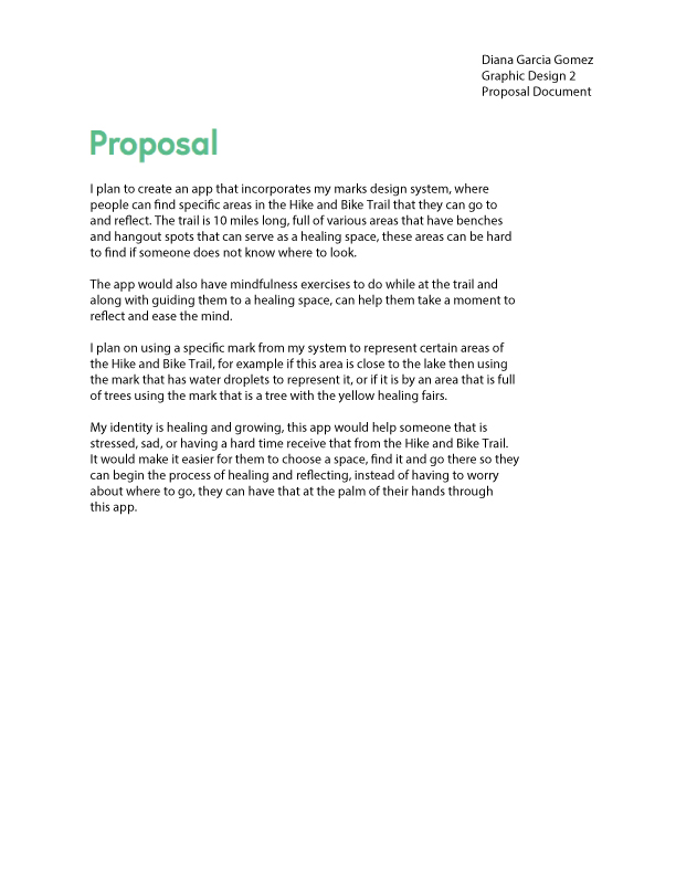

We had to do process work and research on a site that we picked, that would eventually lead us to creating marks for it, mine was the Ann and Roy Butler Hike and Bike Trail. I was familiar with the trail because I used to go there a lot when I was in high school. The trail for me would be a place where I could reflect and feel calm whenever I felt stressed. From my process work I knew that the direction I wanted to take was a sort of calm place where you can reflect.
Interface Lesson – Image Methodology
For this project we designed an app that shows the work that we had did in Image Methodology, using After Effects. The interface contains projects like the plotter, style lesson, and zines. This was my first time using After Effects, in the beginning it was difficult trying to figure out how to work with key frames but I soon got a handle on them. Since I am a fan of space, I chose my background to be the cosmos, and picked a san serif font for all the text. I then took pictures of the projects to insert into the interface. Overall I feel like it has a good flow, but it can definitely be improved and some transitions can be smoothed out.
Plotter Lesson

For this project we were tasked with creating a set of rules to be followed that would yield a design. Which would then be printed using the plotter in Arts 121. My rules were numbers that would have to be repeated either horizontally, vertically or diagonal, using 2 of those directions with 3 stars in one corner. I used flair pens to plot these along with white construction paper.
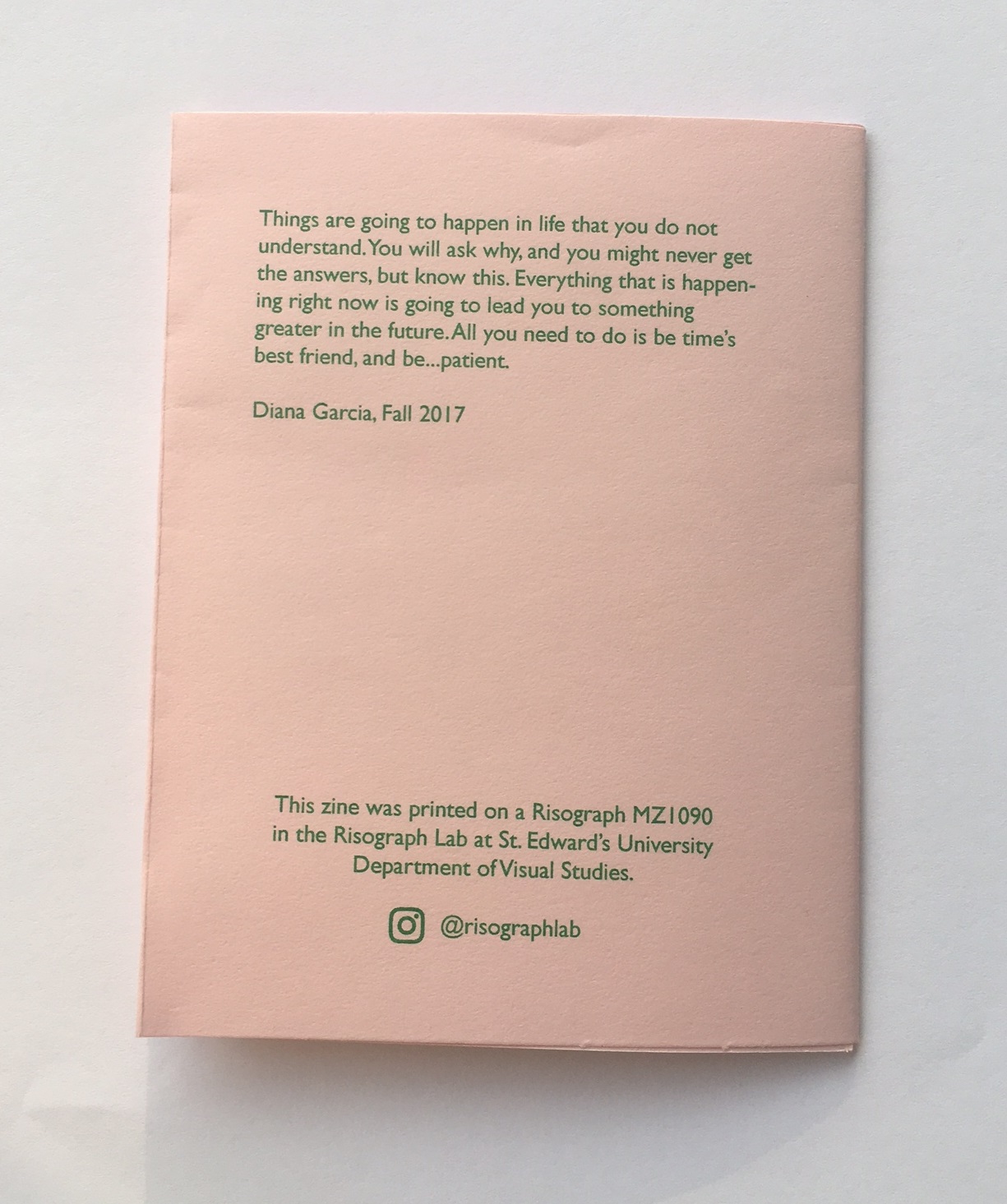
Zine Lesson (truism) – Image Methodology


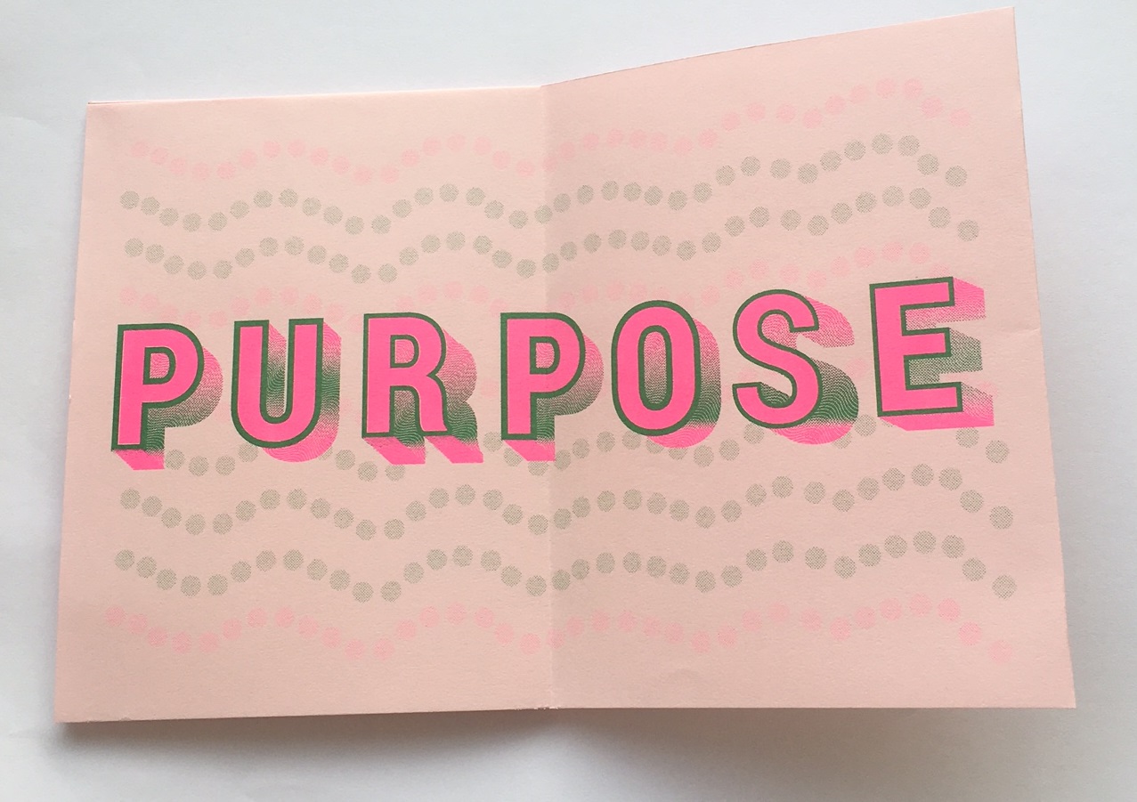
For this project we picked something that we believed in and wrote a one page paper on it. Which helped us pick a truism, I did “There is a bigger purpose” as a way to reflect that everything in life happens for a reason. We then designed a zine out of it, using only 2 swatch colors from the Risograph Lab. We added different layers to the zine, which were the actual type and the background. In my type layer I wanted there to be a sense of depth so I made a gradient with wavy lines in it. I also made the stroke of the letters thick to make them stand out. For the background I wanted to keep the theme of waves consistent so I made light opacity circles into a wave form. I would go back edit some of the stroke weights of the letters because when printed I noticed that some were thicker than others.