For the first one that reads “There is a big” it is a project I am currently working on in image methodology, where we are supposed to pick a truism and design chromatic type from it. I am not done with it yet but when I finish, it is going to read “There is a bigger purpose”.
At first I didn’t really know how to design the chromatic type, since I am not finished with it yet I may add some design on to the front of the type, but for the swirls in the second layer, I just started by experimenting what kind of lines I liked, I tried horizontal and vertical and ended up going with swirls because they seem more crazy, Jimmy described it as psychedelic.
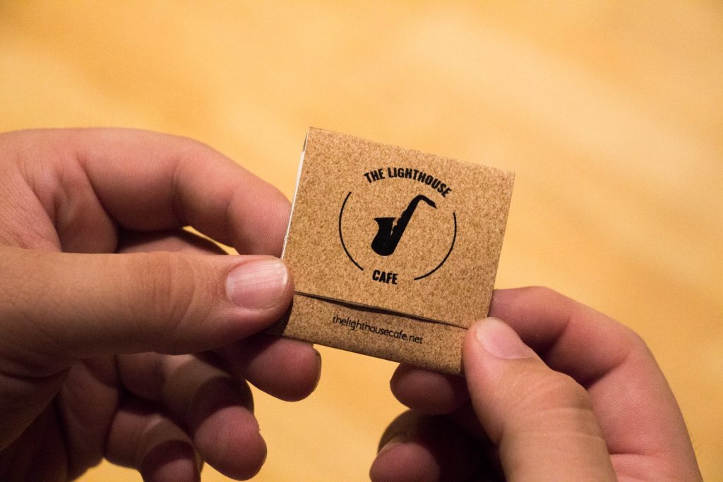
The 2 second photos, they are of matchbooks that we were asked to design based on a movie that we had to choose. My movie was La La Land and I based my matchbook off of the Jazz club that the main characters frequently go to.
I wanted to keep the design simple, and low in color. I think that the type that is inside the matchbook goes well and gives off a sort of jazzy vibe which was what I was going for. I also wanted to keep the color really low in saturation which is why I went with black and maroon.
- The strongest aspect of my work from “There is a big” that I have thus far is the color. I feel that fushia (don’t know how to spell it but the light pink that is in the riso lab) and green work really well together, especially in the gradient of the second layer. To me they give off a kind of crazy vibe.
- The weakest aspect right now is probably how they don’t look consistent. Some letters have a thicker layer (the gradient part) like the H and the T, while others are thinner. Plus I am not really sure which gradient I want to go with, the one that is crazy looking and bursting with gradients all over the place like the E or gradients like the other letters.
- It can be strengthened conceptually by thinking about the spacing of the letters, and again how they can look like they are all one family. I could also add another element to make them pop out more, like a drop shadow.
- It can be strengthened technically by fixing the second layer, and making it more parallel to the first one. For example the G, looks like it is out of place and like it is too far out.
- I am excited to see where this project goes because after we are done with the chromatic type then we have to design the background, and I want to see how that helps bring the word “psychedelic” into it.


Hi, this is a comment.
To get started with moderating, editing, and deleting comments, please visit the Comments screen in the dashboard.
Commenter avatars come from Gravatar.