Considering that this is my minor and I have only been designing for 1-2 years now I think that I have come a long way. One of the first projects I ever did was the matchbook project. I took so much time to make this matchbook and was very careful in making sure it didn’t get ruined because of how light and simple it was, any tear or smudge would be very noticeable. I looked at many details in the movie and took inspiration from the typeface, setting, and colors. I had never even printed on presentation paper and I made a big deal about what presentation paper was, where to get it, etc. I ended up having to get some presentation paper from a friend. I didn’t take the VISU class so using the printer was also new and kind of scary, I completely underestimated the time it would take to print I scheduled about 15-20 minutes to print. I was there for over an hour. Getting the sizing and color correct proved to be much harder once it was actually printed, also just getting the printer to print was hard, this would be a recurring thing for every project from here on out, and I now schedule in more time to print out my projects, I also have presentation paper on hand at all times.
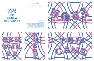
I felt that in my Image Methodology class is where I truly discovered that I loved graphic design and where I was shocked at my capabilities. Everything about the truism project overwhelmed me. I didn’t really understand how the risograph worked and only using 2 colors seemed limiting. For this project I really wanted to connect the zine to my family and used the geometric circular pattern to represent the circle of life and interconnectivity. I also thought of how I could bend the rules of only being able to use two colors. I overlapped the colors to make a third color, and I also created a white outline for my font and didn’t select a color to print it out, so when it was finally printed nothing was there, it was just a cut out of the shape. This is when people from class came to be and said that I had broken the rules and used more than two colors, and actually got Tuan involved to say how this was okay and I had only used the two colors allowed. At this moment I was actually able to do something that others hadn’t, and I was able to show others rather than always having somebody else show me how to do things.
I have barely been about 1.5 years into my graphic design minor and I am glad that I chose this as my minor and I can see that I have improved I had no prior knowledge of any of these programs and in my Type 1 class I was very overwhelmed because everyone else had prior knowledge and were whipping out amazing work in half the time as I could. I actually was a little worried that I had made the wrong choice in choosing this minor. I started googling how to so things and asked questions to improve my skills. I can now use my knowledge of design in my everyday life and look for ways for everyday things to be improved.

