For this project, we had to create five posters that represented our interests and dislikes. This involved figuring out the things I enjoy and the things that really grind my gears. The challenging aspect of this assignment was creating a collage that made sense and was designed well.
POSTER ONE: SELF | This poster is meant to represent the many faces of myself. This clearly demonstrates who I am as a person because each expression is different, whether it’s being serious or weird.  POSTER TWO: FAVORITE MEAL | I love food. This poster shows that I am willing to spend a little more time on designing when it comes to food. One of my favorite meals is pork chops with corn. This dish reminds me of a farm because it’s so simple but so filling, so I wanted to create a poster that had a washed-out, rustic, vintage feel. And I wanted to tie in some Biblical references, so I positioned the fork and pork chop to resemble the ‘Creation of Adam’ painting by Michelangelo.
 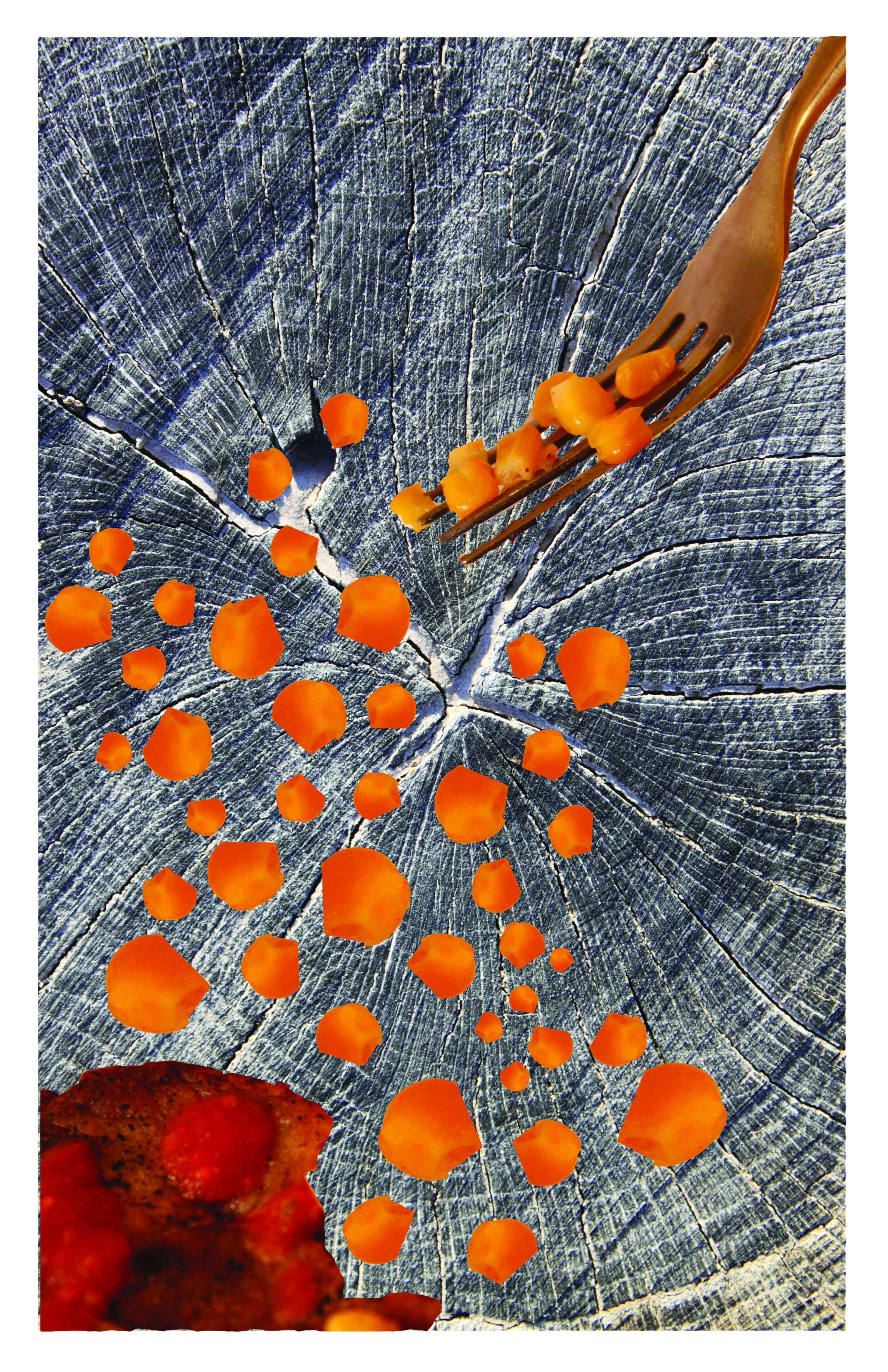 POSTER THREE: WHAT I VALUE THE MOST | I believe in having a good time, while enjoying some good music, while nature does it’s thing, eating some sweets and sleeping peacefully. I wanted this poster to be sort of magical. I accomplished that goal by choosing photos with vibrant colors, positioning photos within objects within other photos.
  POSTER FOUR: WHAT GRINDS MY GEARS | I call this poster ‘Not My Cup of Tea’ because it is filled with some of the things that just irk me. The cup of tea has an iteration of my name along with other objects I disdain. I also do not enjoy waking up in the morning, and I do not like amphibians and sand in my feet. This poster is successful because each photo is strategically placed, the color scheme is working well, and tells a story.
 POSTER FIVE: FAVORITE COLOR | The color red is such a romantic, powerful, and dramatic color. And I believe each photo within this collage represents at least one of those characteristics. However, I could have blended each photo with another better, in order to make the poster flow.