Critical Assessment- Mark

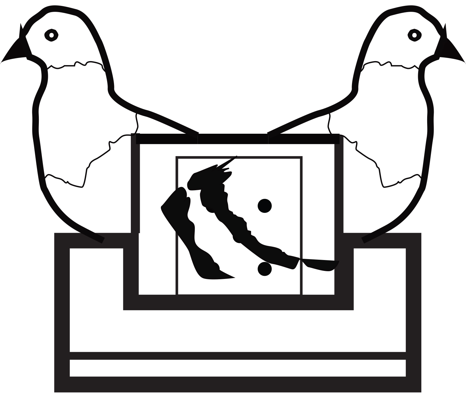
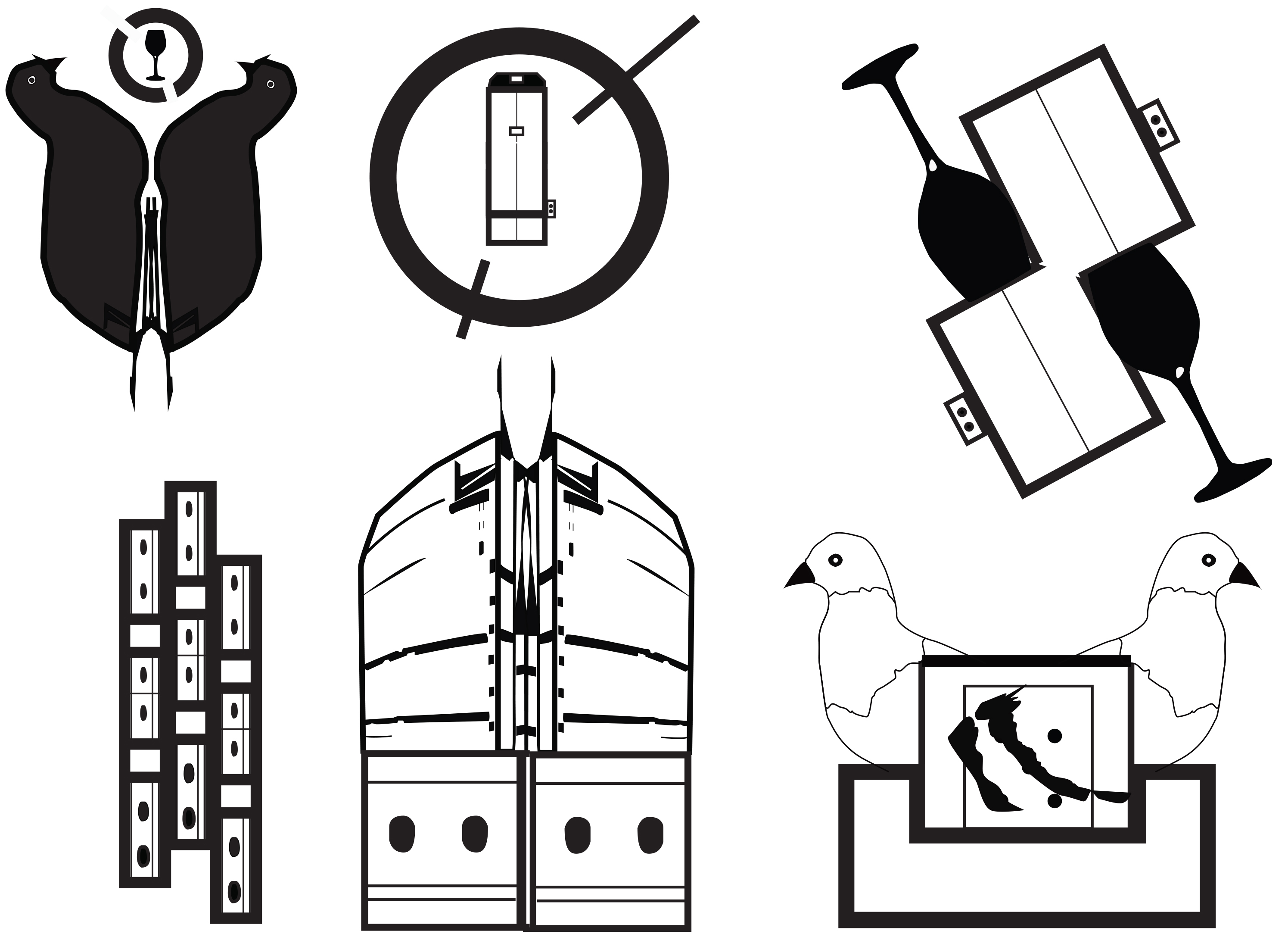
Mark: Critical Assessment


I created this visual mark based off the idea of a luxury high-rise condominium building in Austin and what the mark for the building would look like. I choose to do this because of my love for real estate and architecture. My objective was to appeal to the audience as comforting and homey while still being urban and vibrant. After several different previous variations, I decided this mark was the most effective in conveying this message.


At the time of completion, I really liked my mark. Looking back on it now, I do not have these same feelings about it. I think I could push the design future. If I were to approach this design again I would push myself by taking on an abstract form of my idea. A big help when executing the design was sketching out the mark before going into Illustrator. The end result is a combination of shapes that I originally sketched out and traced into the program.


As you can see, my growth is evident in the designs from the beginning variations all the way to the final design. Over the length of this design process, I was able to settle on a variation that I thought would work and that I could push it further. Once again, the concept was to remain simple.

Mark – Graphic Design II


Mark


This mark is actually two different ideas that I combined together. At first, my focus was primarily on trying to come up with an abstract idea for the bridge. Later on, I found myself focusing more on stylizing the type of the “360.” With both ideas, I decided that they would be effective together. I was very conflicted on what to do before I decided to combine them. I wanted to have just the type, however, I wasn’t sure how to push it anymore considering the limited time I was given to execute the project.

Process – Graphic Design II

ContactSheet-003-2dpfn5e


Process

This is a collection of files that I have accumulated over the research and design process of my logo. These files are the foundation to my final design. Having chosen bridges for my project, I wanted to focus mainly on the 360 bridge. I had to visit the location several times to fulfill all of my research. I noticed that at different times of the day, made a different impact on the onlooker. Sunset was obviously one of the best times to go so I took advantage of that.

Symbol Methodology – Graphic Design I

Symbol Methodology


The main idea was to keep the mark simple and the point is straightforward to the viewer. Looking at my symbol now, I wish I had experimented with color more. This being my first logo, it was not easy at first. I struggled with many of the variations you can see. I usually do not make a lot of variations to begin with because of difficultly trying to decide. In this case, it benefited me in the end because I’m glad that I was able to come to a decision on what to move forward with and I’m pleased with the design. If I were to take the design a step further I would go for an abstraction of the concept.

Critical Assessment- Symbol Methodology

Symbol Methodology: Critical Assessment


I created this visual mark based off the idea of a luxury high-rise condominium building in Austin and what the mark for the building would look like. I choose to do this because of my love for real estate and architecture. My objective was to appeal to the audience as comforting and homey while still being urban and vibrant. After several different previous variations, I decided this mark was the most effective in conveying this message.


At the time of completion, I really liked my mark. Looking back on it now, I do not have these same feelings about it. I think I could push the design future. If I were to approach this design again I would push myself by taking on an abstract form of my idea. A big help when executing the design was sketching out the mark before going into Illustrator. The end result is a combination of shapes that I originally sketched out and traced into the program.


As you can see, my growth is evident in the designs from the beginning variations all the way to the final design. Over the length of this design process, I was able to settle on a variation that I thought would work and that I could push it further. Once again, the concept was to remain simple.

Cognitive Map – Graphic Design I

Investment Map

This map represents the investment process with stocks. It shows only the main steps of the very many steps in which investing comes with. The extensiveness of this map was what I found to be the most challenging. Along with the design also came research because I personally have never invested into a company, but always found it interesting. I had to find the steps into investing and translate them into these graphs and charts. This was a time consuming process trying to plan the flow of things as well as the overall layout.

Information Map – Graphic Design I

Grocery Store Map

Based off of many summed up transactions a created this map to represent the amount of money being spent in the specific grocery stores. Tony’s favorite grocery store ended up being Wheatsville. While first approaching this project I struggle a lot with the color palette, however I am satisfied at the outcome. I have never had to actually design a graph before so this was a learning process for me. I am used to the default graphs that are already preloaded, however I designed this one completely on my own.

Artifact Map – Graphic Design I

Favor Map

This map is an illustration of where I traveled during a shift at work (Favor). This map was difficult at first, it being the first map I have designed. I think that if I were do redesign this map now, I could definitely make it more sophisticated and interesting. I always try to stick with the simplistic approach to designing things because less is more. The blue reflects the color of the company Favor.

Display Typeface – Typography I

Display Typeface

For my typeface, I wanted to create something unique and futuristic. I struggled a lot with trying to stylize the letters to where they all appear to fit in the same typeface along with working in FontStruct. I would have taken a different approach and drawn out the individual letters in Illustrator rather than have used FontStruct. Overall I do like the typeface and the feel it has to it.