
zUncategorized
There are 8 posts filed in zUncategorized.
Interaction: Website
Junior Studio: Catalog
Junior Studio: Invitation

GDES 3 – Book

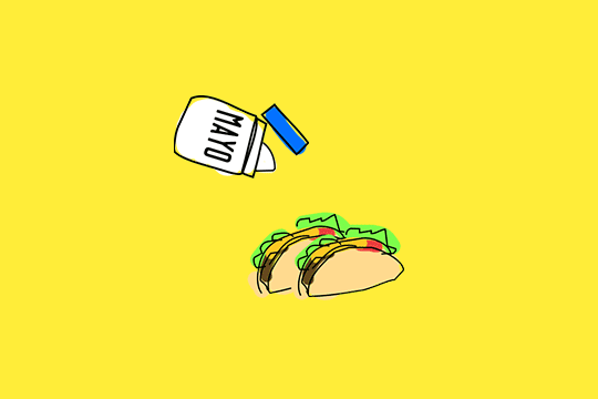
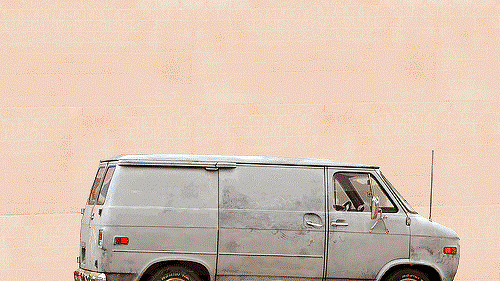
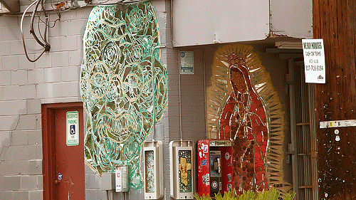
GDES 3 – GIFS


Graphic Design I: Cognitive Map
For the decision map, I decided to create one for one of my favorite book/film series. Since it was based off of the Harry Potter series, there’s already a sense of style and look associated with it. I didn’t want to stray or shake things up from what the movies’ promotional material provided. The red and gold color scheme works well with Harry’s Hogwarts house, Gryffindor. I didn’t want the poster to be flat, so I developed a textured background using the cloud effect in Photoshop. The footsteps is taken from the films where Harry has a map of Hogwarts that shows everyone’s whereabouts and where they’re going. Producing the content was the tough part so that the decisions flow well and make sense. I put an object that is vital to each movie with the logo to create almost an icon for each of the movies. 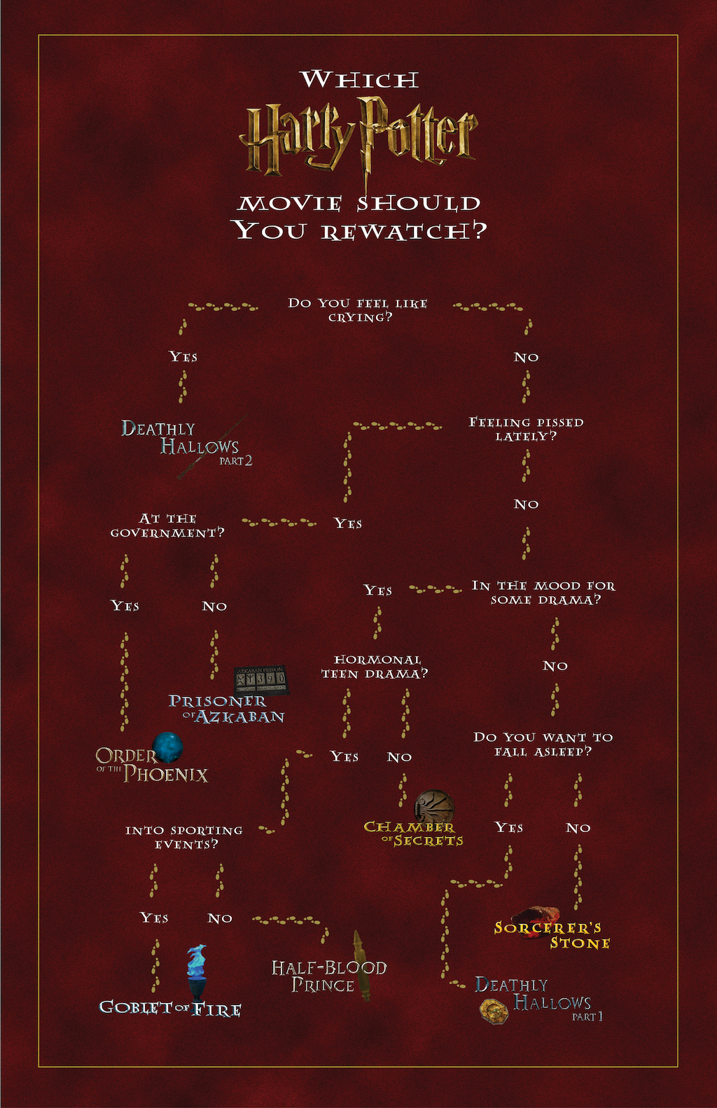
Typography I: Type Specimen Poster
The typeface that I created for this project was inspired by the text of old computers with green monochrome monitors. The use of Fontstruct heavily influenced my direction because of the way it used blocks and a grid to build each letter. I wanted my typeface to be geometric and mostly square. I styled each letter so that almost every left side is bolder because of the fact that I’m left-handed but also to create some contrast and visual interest.
