The portfolio app interface was something I felt that came easy to me. I wanted my interface to be sleek and modern. I presented my work as a feed, which I felt was the simplest and most direct way of showing it. With social media, everyone understands feeds and reads content in that way all the time. With the interface being simple, I focused a little more on the transitions and movement. I wanted the transition to be as smooth as possible and wanted to give a sense of “material” to it as the work screen slides into view. The typeface I chose gives a more technological feel without being distracting.
Image Methodology
There are 5 posts filed in Image Methodology.
Img Meth: Plotter
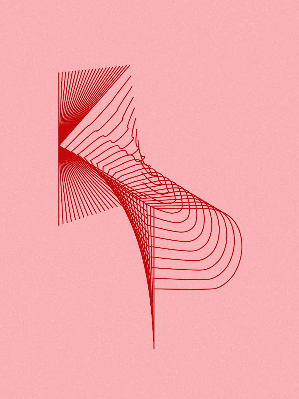
This project is dedicated to the female pop artists that I listen to. The assignment required us to create a set of rules that would in turn create a unique design. The rule I came up with was to plot the initials of my favorite female pop artists and blend them together. I drew each letter individually using the pen tool and then blended using the blend tool. To plot these designs, I decided to use pink paper and red ink to assert the femininity of pop and these artists. I found that by blending each letter together, it created an interesting 3D-like form that I liked.


Img Meth: Zine
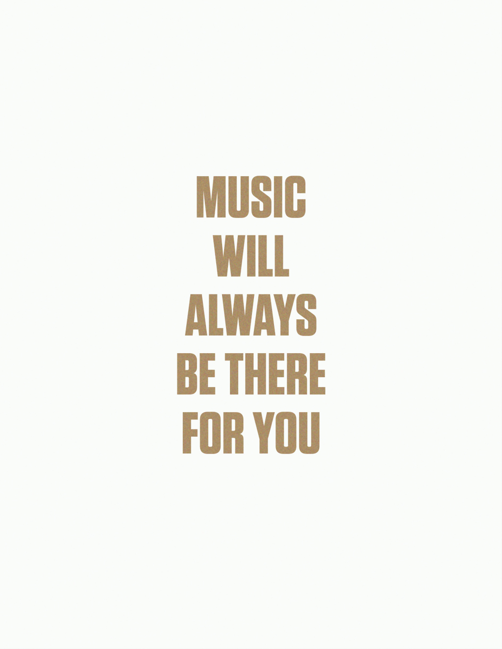
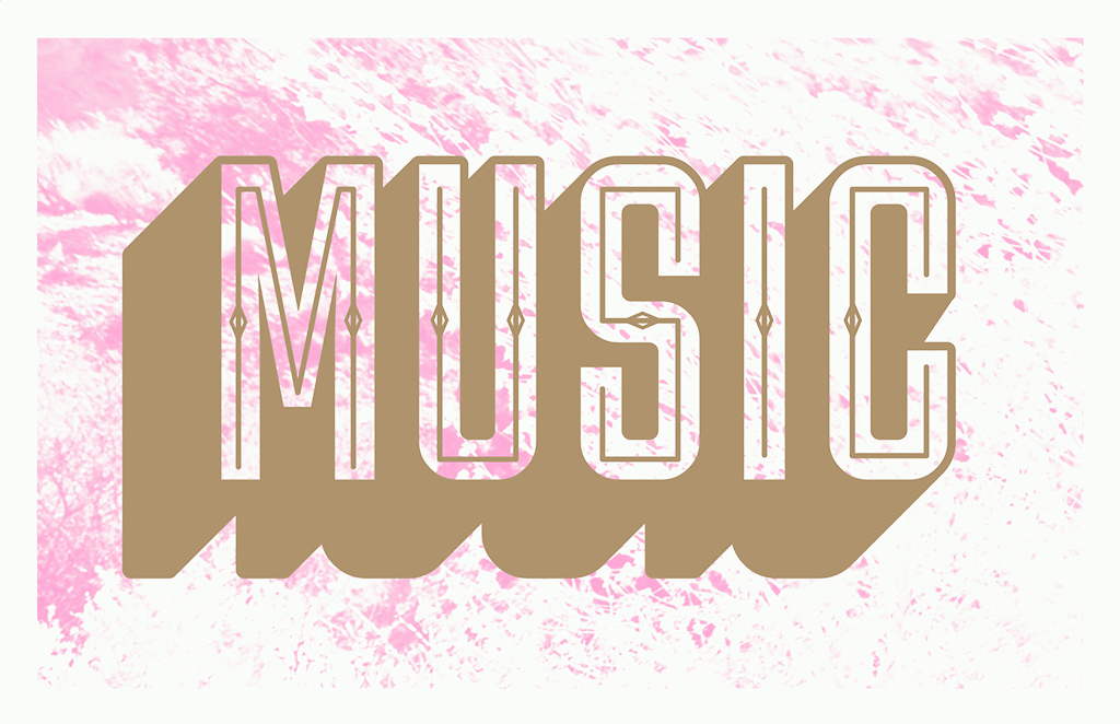
For the zine project, I focused on creating a truism about music. It’s something that I’m into and it’s always around. The colors of the design plays on the fact that I mainly listen to pop music. The pink and gold stands and pops out. While the project had us making chromatic type, I didn’t want to make mine seem too much of a standard chromatic wood type because the type style tends to turn into a vintage and almost western feel. The sans-serif font helped prevent that. The backgrounds provide a texture that helps visualize how there are various textures in music.

PDF: atruongnzine
Img Meth: Style
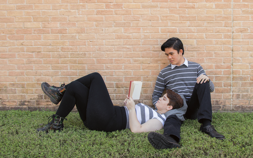
The two styles that were replicated and hybridized were Beatnik and prep. Both of them are contrasting styles in which the Beatniks strayed from what was the norm and the preppy kids tried to fit in with an elite sense. The hybrids combined very different looks into something interesting and quite stylish.


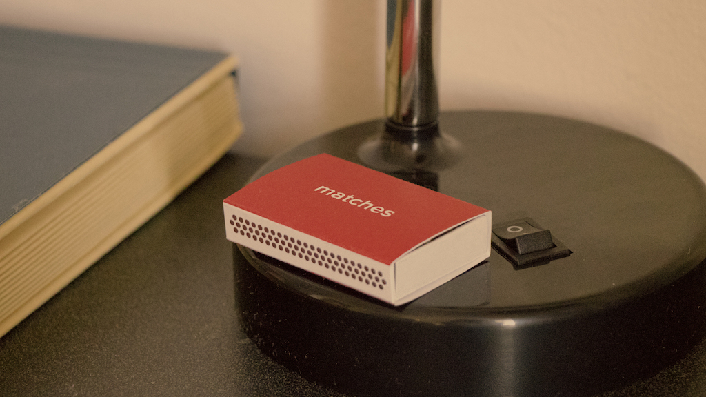
Img Meth: Object
Movie props are essential pieces in telling a story of symbolizing a greater meaning. By creating a matchbox inspired by Spike Jonze’s film ‘Her,’ there was a need to fully understand the world that the movie takes place in so that the box would seamlessly fit into the movie itself and its visual style. Red is a significant color in the film and so I thought that would work well with the matchbox.