The portfolio app interface was something I felt that came easy to me. I wanted my interface to be sleek and modern. I presented my work as a feed, which I felt was the simplest and most direct way of showing it. With social media, everyone understands feeds and reads content in that way all the time. With the interface being simple, I focused a little more on the transitions and movement. I wanted the transition to be as smooth as possible and wanted to give a sense of “material” to it as the work screen slides into view. The typeface I chose gives a more technological feel without being distracting.
atruongn
Graphic Design I: Cognitive Map
For the decision map, I decided to create one for one of my favorite book/film series. Since it was based off of the Harry Potter series, there’s already a sense of style and look associated with it. I didn’t want to stray or shake things up from what the movies’ promotional material provided. The red and gold color scheme works well with Harry’s Hogwarts house, Gryffindor. I didn’t want the poster to be flat, so I developed a textured background using the cloud effect in Photoshop. The footsteps is taken from the films where Harry has a map of Hogwarts that shows everyone’s whereabouts and where they’re going. Producing the content was the tough part so that the decisions flow well and make sense. I put an object that is vital to each movie with the logo to create almost an icon for each of the movies. 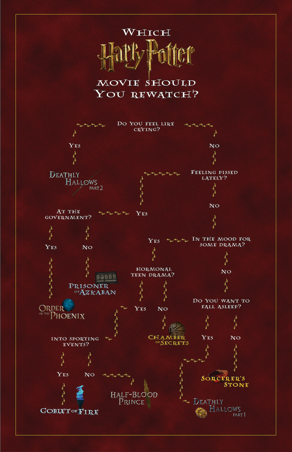
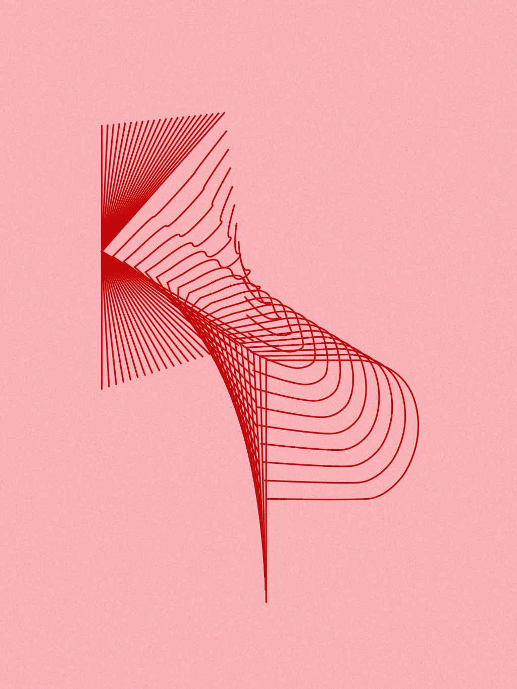
Img Meth: Plotter
This project is dedicated to the female pop artists that I listen to. The assignment required us to create a set of rules that would in turn create a unique design. The rule I came up with was to plot the initials of my favorite female pop artists and blend them together. I drew each letter individually using the pen tool and then blended using the blend tool. To plot these designs, I decided to use pink paper and red ink to assert the femininity of pop and these artists. I found that by blending each letter together, it created an interesting 3D-like form that I liked.


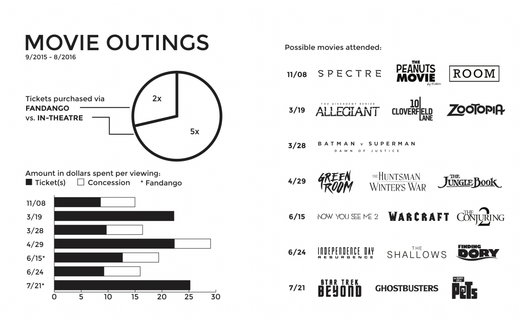
Graphic Design I: Information Map
For this information map, a lot of data organization was required. Out of Tony Pierce’s bills, I decided to focus on the movie tickets that he purchased throughout the year. I had to figure the standard ticket prices in-theatre vs online and recognize the possibility of him buying food or drinks. Since this map is to be placed in a book, I laid everything out in a manner that would be easily read. I chose to keep the color all black, as I imagined it would simply be a very standard black and white information book. I managed to simplify the movie logos so that it would all be flat and one color, keeping up with a minimal feel to the map.
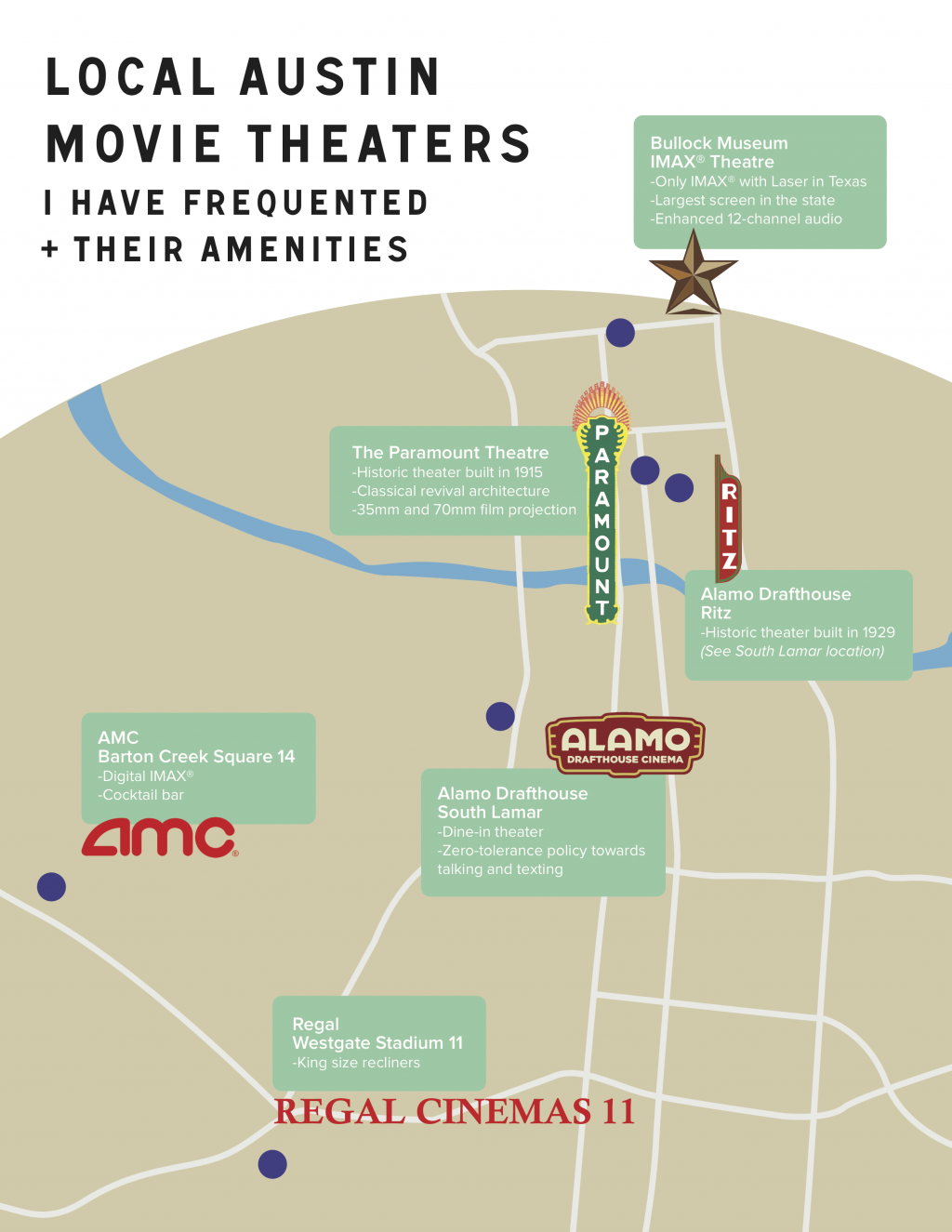
Graphic Design I: Geography Map
Further showing my interest in film, I made this map of local Austin theaters that I have been to. I thought it would be good to make a map of them because each theater is so different and provides something unique. The color scheme I chose is very neutral and not too bright and contrasted because I didn’t want to make the map too straining and busy. I wanted it to be clean and easy to understand. The header typeface gives a very humanistic quality to the map that I liked because it is a personal geography map.
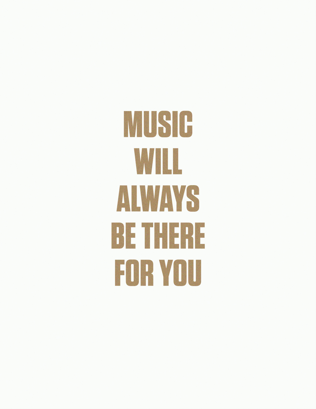
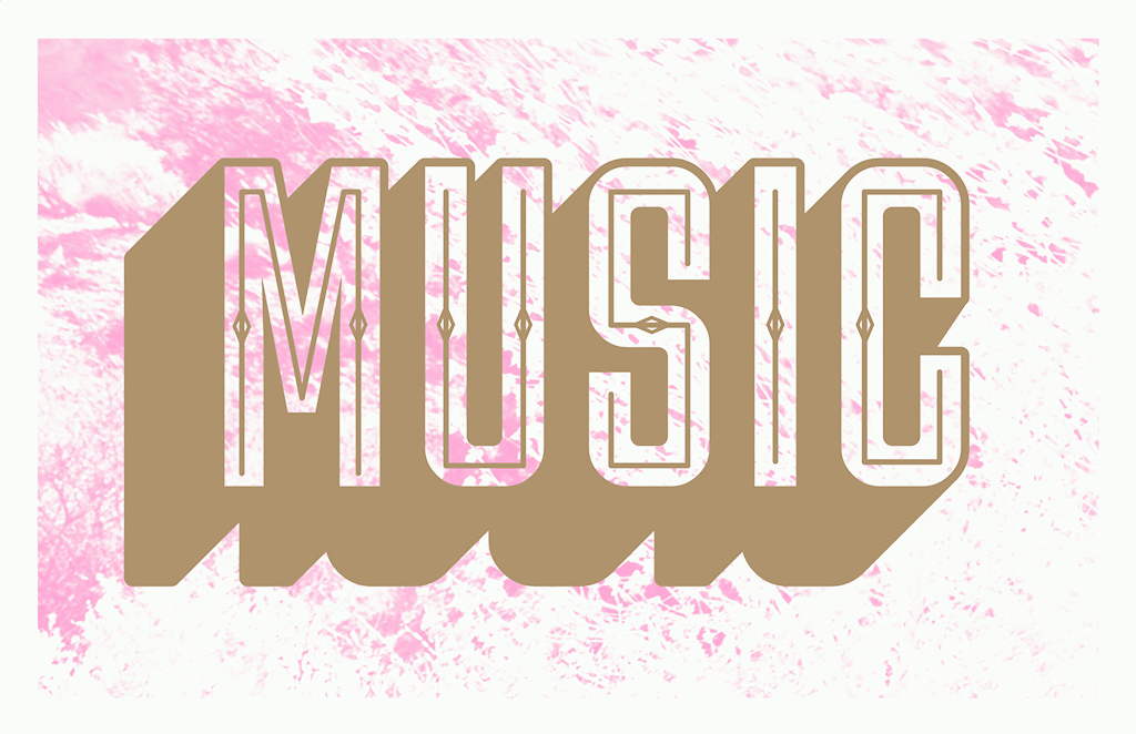
Img Meth: Zine
For the zine project, I focused on creating a truism about music. It’s something that I’m into and it’s always around. The colors of the design plays on the fact that I mainly listen to pop music. The pink and gold stands and pops out. While the project had us making chromatic type, I didn’t want to make mine seem too much of a standard chromatic wood type because the type style tends to turn into a vintage and almost western feel. The sans-serif font helped prevent that. The backgrounds provide a texture that helps visualize how there are various textures in music.

PDF: atruongnzine
Graphic Design I: Symbol Methodology
 For this project, I created a hybrid of symbols that would arbitrarily fit together. I focused on independent film and tried to take an iconic item from each one. In drawing the individual symbols, I tried to keep each item as bare and simple as possible to make it easy on the eyes. For the final hybrids, the movies I ended up using were Perks of Being a Wallflower, The Spectacular Now, Whiplash, Nightcrawler, and Ex Machina. Despite being arbitrarily placed together, the hybridized films have things in common.
Img Meth: Style
The two styles that were replicated and hybridized were Beatnik and prep. Both of them are contrasting styles in which the Beatniks strayed from what was the norm and the preppy kids tried to fit in with an elite sense. The hybrids combined very different looks into something interesting and quite stylish.


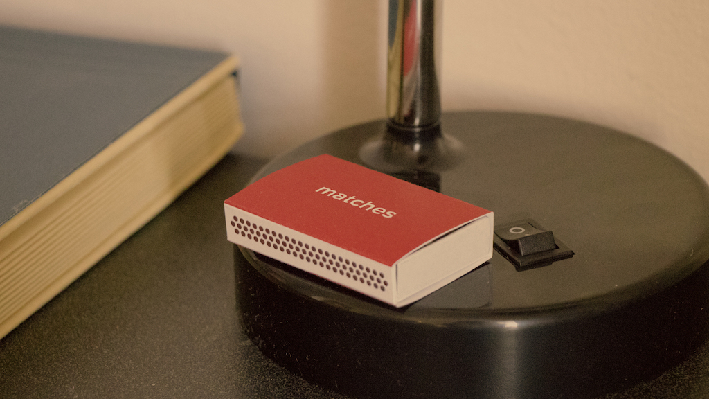
Img Meth: Object
Movie props are essential pieces in telling a story of symbolizing a greater meaning. By creating a matchbox inspired by Spike Jonze’s film ‘Her,’ there was a need to fully understand the world that the movie takes place in so that the box would seamlessly fit into the movie itself and its visual style. Red is a significant color in the film and so I thought that would work well with the matchbox.

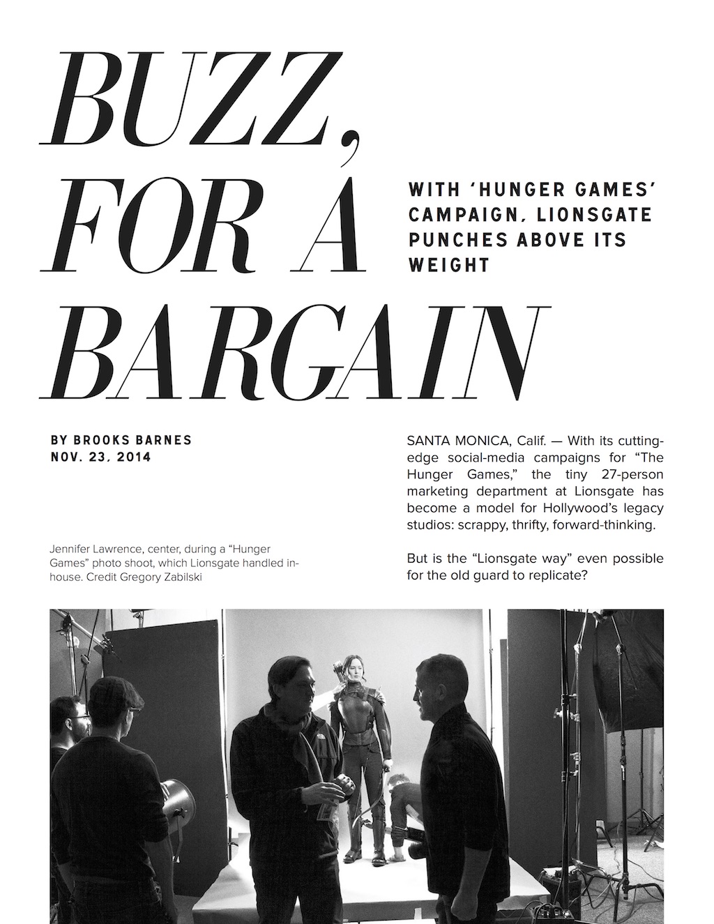
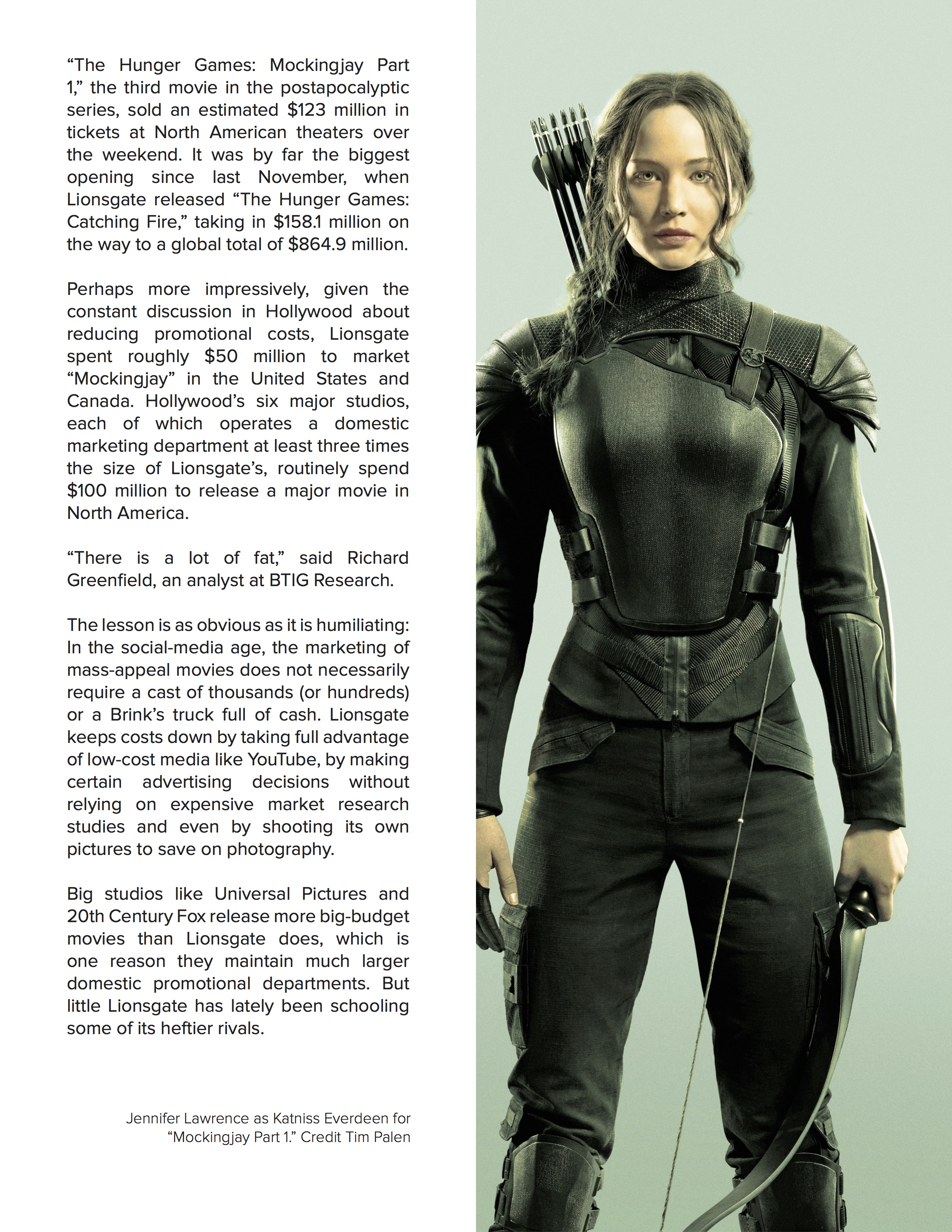
Typography I: Grids and Spreads
This spread was designed for an article about the marketing for “The Hunger Games.” I imagined this article for a high-end magazine. I wanted to keep the text clean and minimal as possible. The layout is very straightforward, and I placed the images where I thought they would be the least obtrusive. The cover page of the article was largely inspired by vintage layouts influenced by Swiss Style. I wanted to give a sense of a sleek and sophisticated magazine print.