Img Meth: Plotter

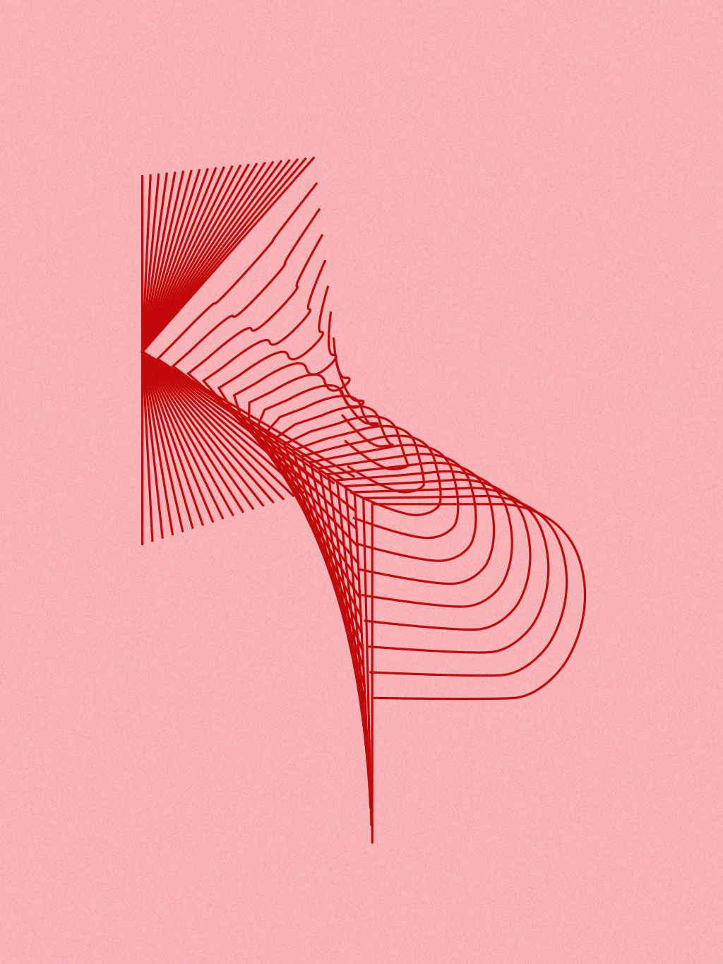
This project is dedicated to the female pop artists that I listen to. The assignment required us to create a set of rules that would in turn create a unique design. The rule I came up with was to plot the initials of my favorite female pop artists and blend them together. I drew each letter individually using the pen tool and then blended using the blend tool. To plot these designs, I decided to use pink paper and red ink to assert the femininity of pop and these artists. I found that by blending each letter together, it created an interesting 3D-like form that I liked.


Graphic Design I: Information Map

For this information map, a lot of data organization was required. Out of Tony Pierce’s bills, I decided to focus on the movie tickets that he purchased throughout the year. I had to figure the standard ticket prices in-theatre vs online and recognize the possibility of him buying food or drinks. Since this map is to be placed in a book, I laid everything out in a manner that would be easily read. I chose to keep the color all black, as I imagined it would simply be a very standard black and white information book. I managed to simplify the movie logos so that it would all be flat and one color, keeping up with a minimal feel to the map.

Graphic Design I: Geography Map

Further showing my interest in film, I made this map of local Austin theaters that I have been to. I thought it would be good to make a map of them because each theater is so different and provides something unique. The color scheme I chose is very neutral and not too bright and contrasted because I didn’t want to make the map too straining and busy. I wanted it to be clean and easy to understand. The header typeface gives a very humanistic quality to the map that I liked because it is a personal geography map.