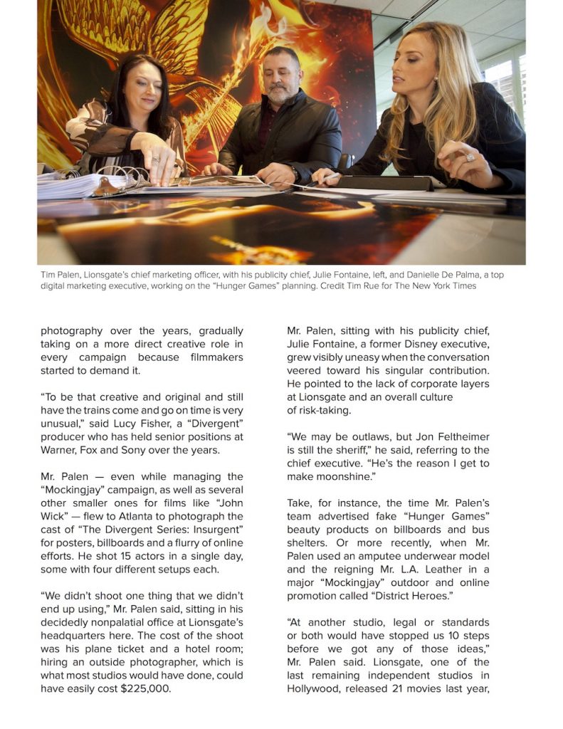
This spread was designed for an article about the marketing for “The Hunger Games.” I imagined this article for a high-end magazine. I wanted to keep the text clean and minimal as possible. The layout is very straightforward, and I placed the images where I thought they would be the least obtrusive. The cover page of the article was largely inspired by vintage layouts influenced by Swiss Style. I wanted to give a sense of a sleek and sophisticated magazine print.
February 2016
Typography I: Type Specimen Poster
The typeface that I created for this project was inspired by the text of old computers with green monochrome monitors. The use of Fontstruct heavily influenced my direction because of the way it used blocks and a grid to build each letter. I wanted my typeface to be geometric and mostly square. I styled each letter so that almost every left side is bolder because of the fact that I’m left-handed but also to create some contrast and visual interest.


