Blog Post #12

Part 1: Reflection on this semester and course. Feel free to write any and all comments here. We want and appreciate your feedback (both positive and critical).

I genuinely really enjoyed this class. I learn better from lectures rather than group work, and this class was mainly lectures. I thought that the study tips/organizing/prioritizing stuff in the beginning of the year was so helpful, practical, and relevant to real life. They were things that you could quickly and easily implement that would have a big impact on you being on top of your assignments and other obligations (and less stressed. Any less stress helps). I like the more relaxed yet effective teaching style. The only thing I have to complain about is the cussing. I’m all for joking and being real, but it is just not professional. Plus, it is inconsiderate for people who do not cuss because it may make them feel uncomfortable. I like that there are several professors so you get several perspectives. This class, the students and professors had a sense of humor about themselves and about life in general and I could appreciate that, especially at the end of a school day. A wide array of fascinating information was presented. I love how we not only learned about our own fields, but also those of our arts peers. Making it open for questions after each lecture was just easy access to a wealth of experience and knowledge. I found it highly encouraging with the guest speakers coming in and breaking down how to have the careers we want. It helped to put a face to the career, because before this class, it could be a little overwhelming for students as a whole to be taught how to be successful in your chosen field without humanity and personal advice and stories to back it up. It almost felt like you were going into that industry alone, like feeling your way around in the dark. But now the daunting, abstract road to success is now looking real and attainable.

Sequence- Prototype (Laser)

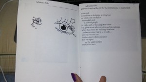
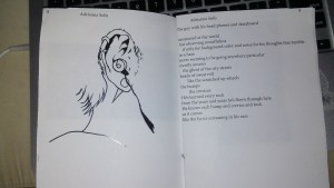
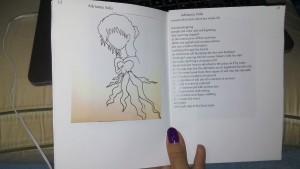
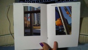
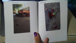
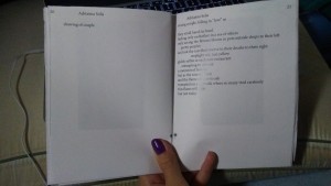
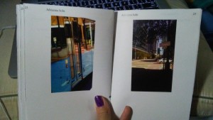
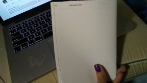
Cover PagePages 2-3Pages 4-5Pages 6-7Pages 8-9Pages 10-11Pages 12-13Page 14-15Pages 16-17Pages 18-19Page 20- 21Pages 22-23Pages 24- 25Pages 26- 27Back CoverSo some progress, in terms of the content. I did not have much problems with printing, the instructions were pretty straightforward, especially compared to the previous printing instructions. I completed a couple of more poems; now, I only have one more to complete. I did half of the drawings (to be made into collages) and inserted those into the prototype. I still need to figure out how to scan them and insert them into Photoshop and remove the background of the drawing (I believe the instructions are somewhere in my notes). Also, I recently decided that I want the front and back cover to be a solid black, with a white text box for the title in black letters. I will also have to figure out that. I still have much more to do, but I feel I am making progress in the concept, the content, and the technical ability. I feel it’s coming together.

Blog Post 11

Part 1:

Bill Kennedy is mainly a photographer. He sees his craft as research. He said this research has two branches, pure research and what he calls “applied research.” Pure research is more straight foreword photographs that solely capture information about certain people or places, which he had to do when he had more journalism type jobs. Applied research, which is something he is way more interested in nowadays, has to do with playing around with photographs to capture your individual perspective and artistic viewpoint. He does this by taking photographs of simple, everyday objects and abstracts them heavily beyond recognition through Photoshop.

As an artist with a passion for vibrant color, I was fascinated by his work. It’s remarkable to think that his pieces are photographs of objects or at least were originally, because they look like abstract landscapes. With the shapes and colors, they almost look like paintings. His tampering with the “temperature” of the photos in Photoshop actually does make the viewer feel cold or warm. As a poet and lyricist, I was also fascinated by the titles. Some artists just slap on a title that simply describes what is depicted and some even choose to leave their works untitled. But Kennedy’s titles are lyrical and thought-provoking. They further the viewer’s imagination and allow it to run wild in the piece. It welcomes the viewer to open up his or her imagination and make their own images and ideas as to what the shapes are, almost like naming the figures of clouds on a summer afternoon.  Some of his titles that come to mind are “Winter Midnight” and “The sun and rain and cabin window.”

Hollis Hammonds creates detailed pen drawings and art installations that can be quite massive. She has a variety of projects that range from an attempt to draw all the objects from her home like the artist, Elise Engler, in her piece “Everything I Own,” (she said she “only” made it up to 200) to a variety of pieces that study storms and weather, to detailed collages, which include what she calls asteroids, or floating balls of a multitude of objects, to narrative combinations of image and text of adventures of her 5-year-old “adorable” self. hating consumerism

I feel something distinctively healing in her work. When I look at her works, I feel almost relieved. She has briefly shared with our class her experiences with depression, breakups, and during her presentation, deaths and her house burning down. I feel like the common focus on chaos in her works is all of those conflicting thoughts and emotions from those events coming out. When I look at her work, I feel relived because I feel as if she had purged those tornados of thoughts and surges of emotion by getting them out of her system and into the material world for her to look at. I feel personal relief what I look at her work, because I use art in the same way. There is something almost empowering of capturing all the chaos that is vague and abstract in your soul and bringing it all out of you and in front of you for you to look at objectively. I feel relieved when I look at it, like the relief you feel after you cry after a period of increasing tension, throwing up after a period of bodily discomfort, the quiet after a storm. My favorite work of hers is “House on Fire.” The flickering lights in the background makes for mesmerizing dark beauty. I was also fascinated with her piece titled “Memory” which depicts the concept of how when someone dies, you gather all the superficial objects that belongs to them.

Alex Robinson does minimalistic art, that seeks to find the something in the “nothingness.” It is a play on perception. She created works like these, which felt like her, but then her “world collapsed” when she had kids. She then created less and created more colorful pieces. She is now able to return to the work that feels more like her, which is the more simplistic side of art. I thought it was interesting how she took pictures of her empty apartment, to study “the light and sensitivity of the space.”

I did not care too much for her work. I can respect her as a fellow artist, but I just do not resonate with simplistic art. I more resonate with the chaos and detail of Hollis’s work and the colors and abstraction of Kennedy’s work.

Tammy Ruben is mainly a 3-dimentional artist. She plays with senses, color, texture. She makes her objects a smaller size because of wanting to bring people in, rather than like giant murals where people must draw back. She wants people to get closer, but not to the point of being able to touch it. She wants to show through the sensation of wanting to touch her works but can’t how we as humans have all these desires and we pursue them but we never fully satisfy our longing.

It could be that it was my last class before supper or the colors and shininess of the objects, but I was not surprised when she said that some of her viewers have commented that they want to eat or lick her works. Her objects looked like sugary treats, like cupcakes and candy. My favorite was the piece of the Ku Klux Klan hats with eyeholes. The hats were so visually interesting in that they were blue and bedazzled. I loved her concept that the hats look innocent and “almost adorable” as she put it when they are separate, but become ominous when they come together.

Joe Vitone is a photographer and self-proclaimed “cowboy artist.” In his presentation he shared his photographs specifically form his time in Valentine, Texas. He called his collection of photographs “Valentine and Beyond,” which I find fitting because it not only captures pictures of people and places in Valentine but also the history and stories of those people and places. He shared several of those stories with us, including the individual stories of the wife and daughter of a rancher. His fascination with animals showed up in several of his pictures, including the ones that depict what he calls the “cowpocalype,” or the process of branding and castrating of cattle.

I noted during his presentation that a lot of his photographs are in black and white. I think several of his photographs are black and white so the viewer can see the action taking place more. It is less something to please to eye, but more a part of a story that the viewer wonders about.

Part 2:

I am an ambitious person so I have several goals. Aside from becoming an art teacher, I want to be a singer in my Christian rock band, Tears of the Sun, I want to be a fashion designer, a free-lance artist. I am taking small, tangible steps towards those dreams. For the band, we do not have all the instruments yet, but every day I practice my singing. I Facebook message my favorite singers, asking them advice for vocal performance, and some of them have actually replied back. Apparently, several of them have credited the same DVD. I ordered this DVD yesterday actually. I created a YouTube channel last week and I will upload videos of just me singing so I could gain some kind of a built-in audience for when we make audios with the instruments. I made an Etsy shop for my fashion line, Lunaresque, and I have many designs already, now I need to actually create the pieces. I saved up for a sewing machine which I still need to learn how to use. As for free-lance artist, I am trying to get into the habit of making art on a more regular basis. I plan on going to all the art shows I am able to and I think in the VISU-1100 class, we are going to make our own websites of our work. I already have a Facebook page for my artwork. I think I will improve just by doing those things on a regular basis, but as for the next five years I guess try to at least have one album out, have some shows under our belt. Have my online Etsy shop for my fashion up and running.

Sequence Thumbnails

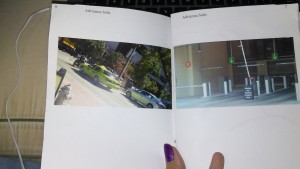
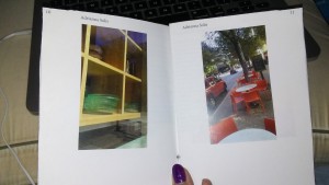
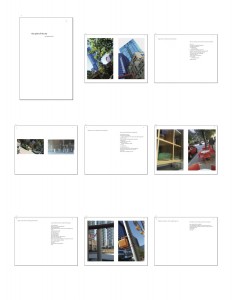
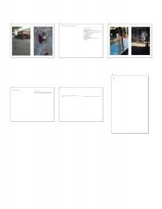
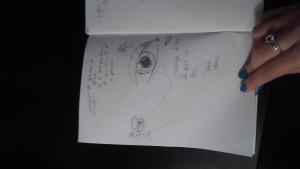
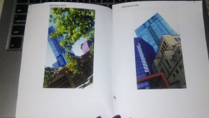
Thumbnails 1Thumbnails 2The sequence of my book involves a pattern. It is organized by the format: photo, photo, collage, poem. The two photos are followed by a collage comprised of those photos to illustrate the process of abstraction, how collages are made of complete media that is taken apart and then reconstructed into something new. The collages are integrated with drawings of different characters. These characters are the topics of the poems. These characters are all people that you typically find in a city, such as a foreigner who sees the city as both chaos and opportunity for his family, a homeless person, etc. All these poems tell of how each character is interacting with the city. The book opens with the first character, a young woman who is from a small town and is exploring the city for the first time and is mesmerized. Her poem is the first and the only one told in first-person. Throughout the book, all the other characters are being introduced in third-person. This is because the book is slightly told from the young woman’s point of view, as she is observing all that is going on around her. She comes back in the last two pages, which comprise one big drawing depicting a scene in the city that includes all the previously introduced characters. This is to convey the idea that everyone has a story and that all of our stories work together.


Extra Credit Post- Elise Engler

Of the works of Manhattan artist, Elise Engler, I was most fascinated with “Everything I Own.” It was such a novel idea to draw every object one owns, but such a bold move to actually pursue the idea. It took a remarkable amount of patience, as it took her year and a half to complete such a tedious task. I loved her sense of adventure and that she documented her travels by creating almost visual lists of the objects she traveled with, a set going and a set coming back. The set coming back being larger because of the new objects she either bought or picked up on her adventure, plus new art, of course. One such adventure was a trip to Antartica. Engler went as a “Non-Science Observer.” I did not know such a position existed. She said Non-Science Observers could be journalists, photographers, and artists such as herself. I was fascinated by the training you have to go through and how the sunlight is the same though the day and “night.” Whatever inspires her, she just goes for it without questioning. She has the spirit of asking just to see what happens. She feels compelled to draw the items in a fire station, she goes and asks if she can and sure enough. I think that is the appropriate spirit of an artist, throwing yourself into new things and new territory just to see if it works. In addition to drawing “lists” of objects, she also does an exercise every morning, in which she draws the first thing she hears on the radio. This is interesting because you are taking something audio and creating your own images from the information. It is also a great practice to keep your drawing regular rather than sporadic. Overall, I very classy woman and an artist who is not afraid to do her own thing.

Blog Post 10

Part 1:

The first speaker from Spacetime Studios was Gary Gattis, the CEO. As a CEO, he naturally talked about the business side of gaming, which is something I have not really thought about before. I thought his approach to feedback was kind of profound. It is a popular thing for people to say to respond to negative feedback with an attitude of, “who cares what you think, this is what I want to do and this is the way I want to do it!” This is usually proclaimed as confidence. Some respond to feedback the polar opposite, with taking it personally and losing motivation to do their work. Gattis suggested a third, more effective approach. He explained how the first response does not really make sense in the gaming industry, where the goal is to get the maximum amount of people to enjoy the game. He suggested taking feedback objectively, not to brush it off entirely like in the first approach, but to also not take it too personally when taking the message in. He acknowledged that taking in negative feedback is tough, but he said to look through the possible anger to find the real problem. Only then could negative feedback actually be constructive. There is a certain reason why that person is angry and if taken objectively, one can find that reason and be able to apply practical improvements to the game. Additionally, I liked his energy and humor.

Gattis was followed by Bryand Wood, the Senior Game Designer. Something that stuck with me was the concept that there are two types of game design, the first being System Design, the second being Content Design. System Design is the many technical details of the game. He gave an example of how many seconds a character holds a fireball before shooting it. Would three seconds be too long in a faster paced game? These intricacies were mostly organized in EXCELL, a program I learned in high school. Content design would be what color is the fireball? Does the character gain more power in the fireball the longer he holds it before firing? I thought he was a natural at explaining. I was also amused at his saying that randomness is a game designer’s best friend.

The last presenter was Eva Tran, the Art/ UI Lead. She explained the more artsy side of gaming, whereas the first two more talked about the technical side. She mostly deals with Concept Art in gaming. I perked up a bit, because I am an art major, but she did not really have as much content as the first two presenters. The practical takeaways from her presentation were to draw every single day and that when employers look at your portfolios, they want to see the realistic stuff you can do included, no matter how cartoony the game is going to be. They just want to see that you can draw realistically, and to be able to draw realistically well.

Part 2:

How does one go about booking a gallery show? How do you gain more recognition as an artist? What does online presence mean to modern artists? Like do you have your own website, do you use social media? If you need your own website, how do you go about making it look professional when you do not have a knowledge of web design? Do you get the help of a web designer? Are there user-friendly programs to do it yourself? How do you get commissioned to do murals on the sides of buildings?

Sequence Reflection

sequence contact sheet

sequence-poem-ideas

psbuildingandtreedowntownaustinpsbusreflectiondowntownaustinpsthreebuildingsdowntownaustin

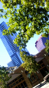
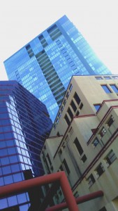
When I wrote the poems, I messed around with different typefaces, but I decided to just keep it in Calibri, as plain as that sounds. This is because, I do not want anything too showy for this book; I want this book to have a reflective, pensive feel to it. And for some reason, that translates to a simple font to me. I think the poems are turning out well. They are turning out mostly how I envisioned them. I also want everything, even the title which I came up with today “spirit of the city”  lowercase for much of the same reasons. When photoshopping these images, I added a lot of contrast to bring out the sharp angles of the buildings. I also turned  up the vibrancy.


Sequence- Blank Book Sketch

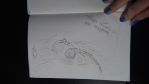
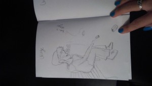
In my book, I have the format of picture/picture/collage/poem. The pictures are of my new site, down town Austin. The collage will be comprised of pieces from the two previous pictures. This is the show the process of abstraction, how completed pictures are taken apart and brought back together in a collage. The collages will be combined with sharpies drawings of different figures. The poem will be about the figure depicted and their relationship with the city and their place in it. For example, the first drawing is of the eyes of a girl and there are several stars scattered around her. The collages are her irises. The poem is about a girl who is seeing the city for the first time and is mesmerized. The last two pages will be an extended poem about all of the characters’ stories and how they connect. On the sides of the poem will be all the pictures of the drawings/collages.

Cover (I'm going to come up with some sort of creative title that goes with my concept)Page 1Page 2Page 3Page 4Page 5Page 6Page 7Page 8Page 9Page 10Page 11Page 12Page 13Page 14Page 15 and 16Page 17Page 18Page 19Page 20Page 21Page 22Page 23Page 24Page 25Page 26Page 27Page 28Page 29Page 30