Visual Identity: Mark

For my mark, I am conveying the idea of serenity within the greenbelt. The greenbelt is a place to go and relax and find some peace of mind. The muted colors along with the wavy lines are meant to create the sense of tranquility. The mark can also be broken down and used in pieces instead of one solid object. The text can be used on its own to label specifically the greenbelt. While the circle and the wavy lines can be added as an ornament to products that are meant to be used at the greenbelt.
 

Process Work/Research

Here is my color swatch of the greenbelt. The goal was to create a color and materials swatch that showed off how I saw the greenbelt. I specifically arranged the circles this way to convey movement, because to me movement is very important when talking about the greenbelt. Nothing is static. The reason for the cool and warm tones in this color swatch are because at this time in the year it was a transition time between winter and spring. During the winter the greenbelt is full of grey, blue, and green tones. While in the spring the sun shines and creates a warm glow over the greenbelt. The materials in this picture are the 3 major components of the green belt water, foliage, and rocks. These materials are showed intertwined with the colors because they give off those tones based on where the material images are placed.
Interface Lesson

Through this project I created an app prototype that I would use as a portfolio app for my iPhone. This was my first time using after effects and the whole processes was a learning experience for me. This started off with setting up how I wanted my app to look using the ios interface. Then moved into after affects to stat the animation. The goal of this project was to create a new way to interact with the app and understand how things move inside the interface. I wanted my app to be simple and image based, because I wanted the app to show off my work more than anything.


Plotter Lesson

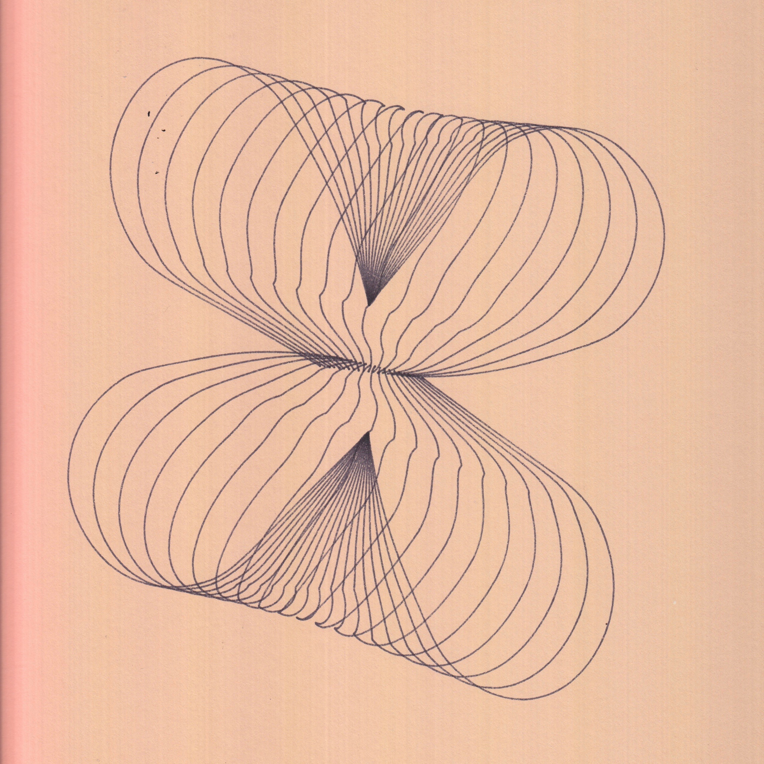
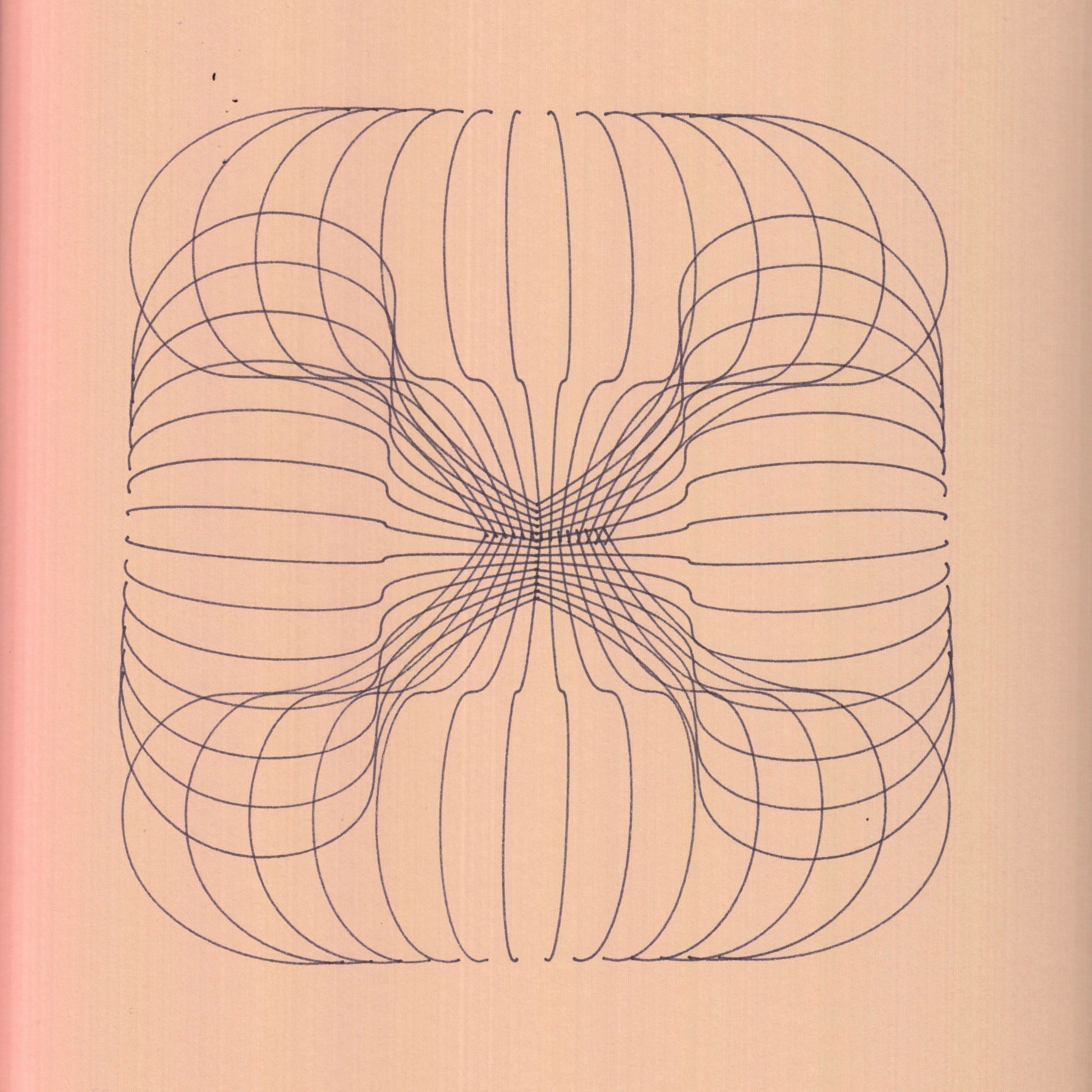
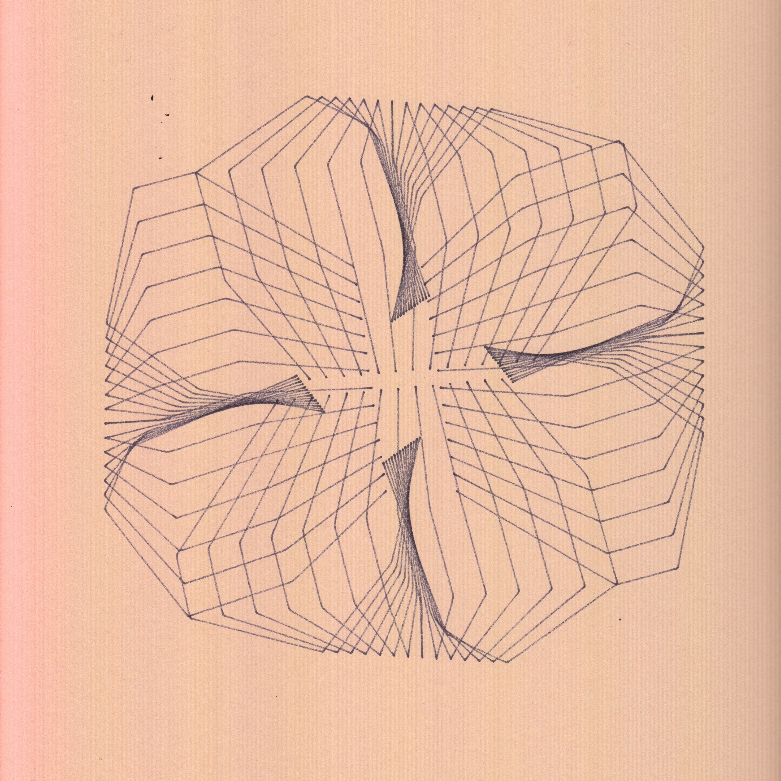
To create these plotter drawings, I created a set of rules and steps to follow that created different images using the same system. I began by drawing a line in illustrator, reflecting that line, and then blending the two lines. After that I duplicated the image that was created by the two lines to create another image. The final result of each image was to draw the viewers’ attention to the middle of the page. After using the same set of rules for each image every drawing came out unique and its own.

Zine Lesson

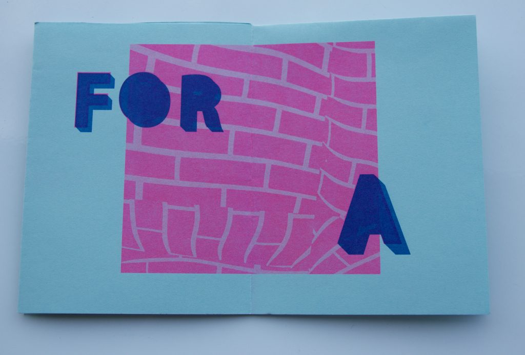
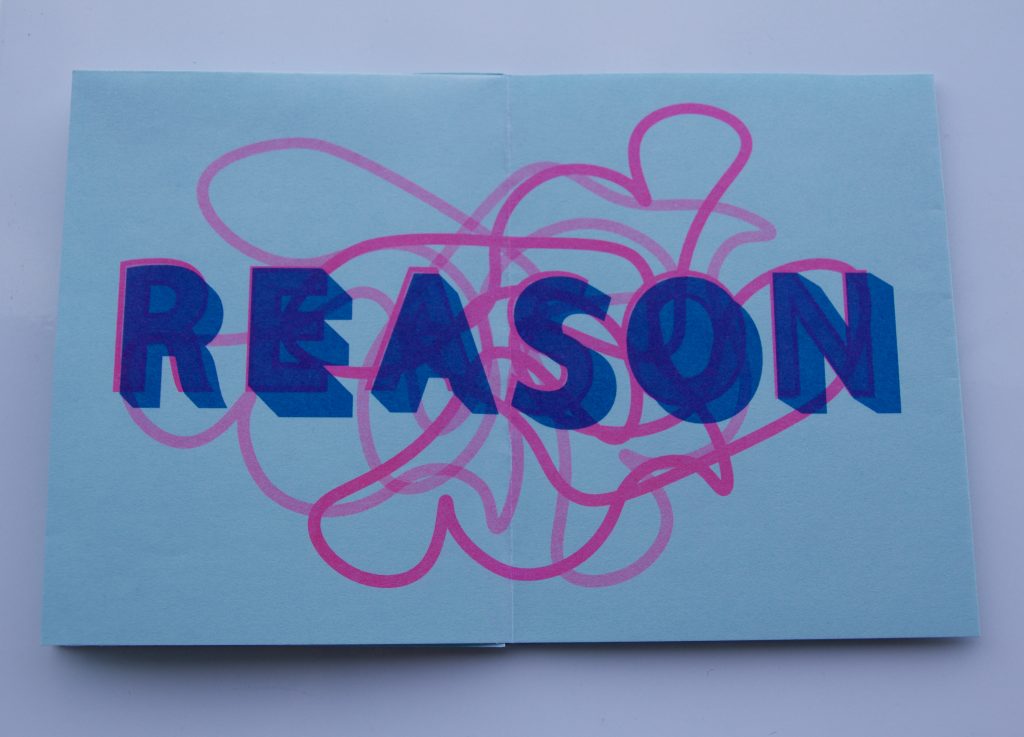
To start of the zine lesson, I wrote a short writing about a moment in my life that impacted me. Through this writing I was able to create a saying that I can really stand by. The writing started off very detailed and had every though and image that I was able to remember from that time in my life. Then the writings got more defined by cutting out unnecessary information and details that were not important to the saying. The final draft of this writing can be found on the back of the zine. We then made the type face and added in abstract images that pulled in everything together.

Style Lesson

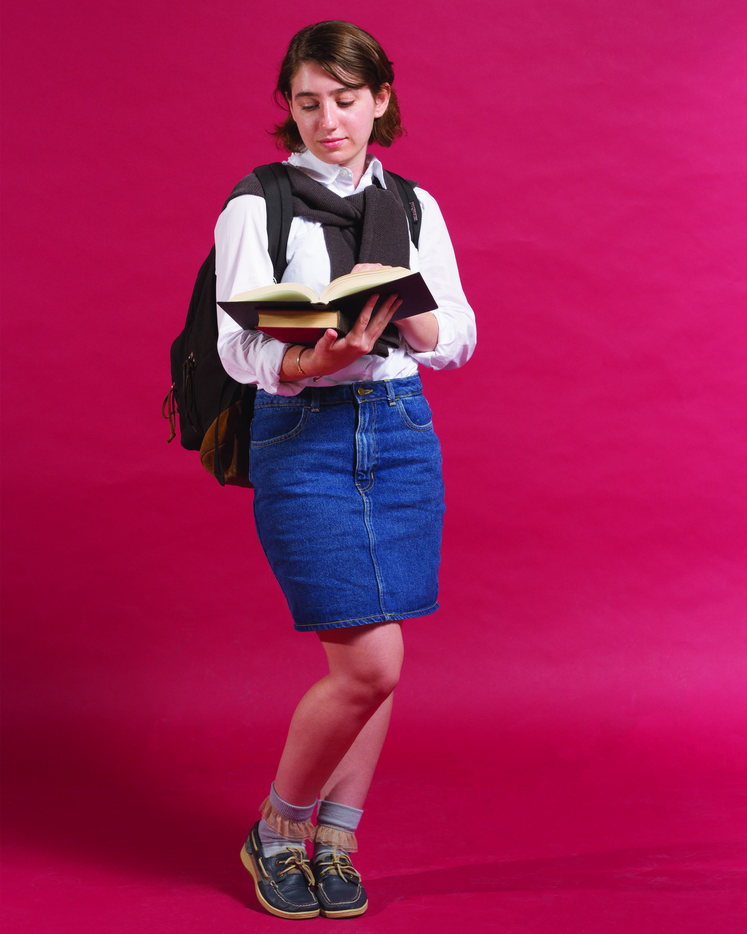
Through the style lesson I saw how style is something that we take in even before we officially meet someone because it’s something that we perceive first, like a first impression. Even if style is not a direct pretrial of personality, style has specific elements to it that conveys certain looks like those of prep and skater. When thinking about how to dress prep there is a certain image that pops into my head. That image is conveyed in the first photo. For the skater look, a very recognizable skater look is 90’s skater with baggy clothes a layering. When it came to combining both these looks we took those specific elements of each look and combined them into one. In order to connect these three images red was used to relate these images back to each other in a series.

Object Lesson

This match book was based on the film The Grand Budapest Hotel. To get inspiration for this project I watched the film and looked out for images that stood out to me that really showed the style of the whole film. Through watching the film, I saw how objects make the image. The little details in a film or even a photograph can carry a lot of weight and meaning. Each object is strategically placed and made to fit the scene it’s in. Through this lesson I was able to make a matchbook that I saw as a product of the hotel, as something that could be at the front desk when you check in.

Mapping Project: Cognitive Map

For this map, I created a system that tells you what type of horror movie to watch through a serious of questions. When I came up with the 6 top horror movie categories it became clear what questions I should ask to end up in one category. In order to layout the decision choices I sketched out all the possible outcomes that could happen through the questions that were being asked. I added in images to give the reader a sense of the horror movie metaphors. Instead of just yes and no questions I came up with questions that could have multiple answers, but I boiled it down to just two answer choices forcing the reader to follow the map all the way through to end up in one category. The answer you end up with is based on the type of movie you are most likely to sit all the way through and not walk out because you are too scared to keep watching.

Mapping Project: Information Map

I began this project by extracting information out of an excel document that pertained to money being spent at gas stations. As I started focusing more on the gas station information I noticed the large amounts of visits to 7-Eleven. This then gave me the idea for the first graph, the bar graph. It tells the information about how much money is being spent at 7-Elevens and it includes overlapping information about where money being is spent when not at a 7-Eleven. In addition to this graph I added in a location graph to show what amount of money being spent and where these different gas stations are at.

Mapping Project: Artifact Map

For my artifact map I decided to map out the outside outlets of the buildings that I frequently visit throughout my week. Through this map I showed outlet locations and the foot traffic of these buildings. The foot traffic is labeled as low, medium, and high to show if you have a chance of getting a free outlet. Something I could add into the map would have been seating, because that’s something that comes in handy to know about when you are trying to charge something like your laptop.