Graphic Design 2: Visual Identity: Mark

For the mark project, I had to create a mark that identifies my public space which is Zilker Park. I created a strategy that was appropriate to the brief summary I had written about the park and I gave the park an identity. My identity was to show the connectedness and pure relationship between a human and a dog. From that, I narrowed it down to how two things make a whole. From the identity, I was able to create and abstract mark. The process was really vital to this project because I had to come up with how I was going to create my mark. I started by creating a word map that had to go with connectedness. Second, I drew literal marks of my identity. Lastly, I created a DNA string and blended it together to show how things mesh together and from that I started to create many different abstract symbols which led me to my final mark.


Graphic Design 2: Process work/ Research: Writing

For the process and research part of the mark, I want to focus on my descriptive writing of Zilker Park. The writing portion of this part played a big part in my process because it allowed me to define my identity so I knew what to create. It allowed me to express the feelings I wanted to capture and was how I came up with idea for the identity.

This is a picture of the writing and the link to the paper is underneath.

Descriptive writing on Zilker park-tl26ms

Image Methodology: Interface Lesson

Everyday, a designer has a portfolio that they add too but what if they could save all their work in an app so it is portable? I created a demo of what my portfolio would look like if I did this. It was my first time using after effects which was challenging. I was happy about my static layout of my app but the animation part was hard for me to master since it was a new program.

comp up animation final (Converted)1 from aly gorday on Vimeo.


Image Methodology: Plotter Lesson

Life is a rollercoaster filled with many different mixed emotions. I created a set of 16 plotters that I printed out and chose a medium and color palate. My process was really important for this project because I had to create a set of rules to create my designs. I would use the blend tool to blend two objects to merge together and create a design that showed the different of emotions that life puts you through. Once I made my design, I would copy it and rotate it so they mirrored each other. Overall, my plotters show the chaos of life with lines and how they work together.

Image Methodology: Zine Lesson

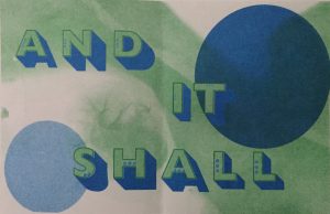
A truism is a proposition that states nothing beyond what is implied by any of its items. My zine is about the truism I created based on my 6 different stomach illnesses that I suffer from. My truism is “Seek Help And It Shall Be Found.” I have believed in this when I face obstacles and when my disease first started, I saw five doctors that told me I was crazy and making it up but I still persisted to find the solution. Finally, I had one doctor who helped me and I believe it is because I kept seeking out help and with my persistence, I found what I needed.

Image Methodology: Style Lesson

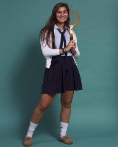
For the style lesson, we had a partner and had to create a portrait of a preppy outfit. I was the one who posed for this picture. I wore my high school uniform because I went to a private school which had a lot of preppy in it according to the preppy handbook that Jimmy gave us as a reference. The second portrait was a style of my partner and my choice. We chose to do 80’s business woman. For the third portrait, we blended the two together.


Image Methodology: Object lesson (Matchbook)

A prop is an object used on stage or on screen by actors. It can be anything and it can even be involved in the plot. We are surrounded by props everyday and they tell a story. The importance of having props is to enhance a performance and make it feel more authentic. For this project, I had The Great Gatsby as my movie. I created a matchbook that could be given out as a party favor at all of Gatsby’s parties because everyone smoked at that time. It would fit into the time period and actually be something the characters would use. I put the Gatsby logo on the top since it was his party and the colors are black and gold which are represented throughout the whole movie and give the feeling of that time frame. I was very pleased with the process and the end product of my matchbook.

Graphic Design 1: Mapping Project: Cognitive Map

This was my favorite map to create. My topic was what type of procrastinator are you? I really enjoyed picking a topic that was relatable and creating different choices for it. The hardest part was deciding where to place my icons and how to set up the map. I didn’t want it to be messy and hard to read. The easiest was making the icons and it definitely was the most enjoyable. I loved being able to create what I wanted to see and I am really happy with how it came out.


Graphic Design 1: Mapping Project: Information Map

For the information map, it was definitely challenging to organize the information and create a visual aid that represented all the information in a clear and concise way. It was difficult to gather information and trying to understand excel. I decided to focus on the entertainment and media aspect of the information to create graphs. The feedback during the critiques for this project really helped me incorporate texture into my graphs.

Graphic Design 1: Mapping Project: Artifact Map

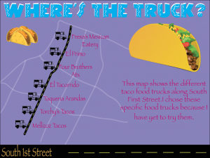
To create the artifact map using personal geography, I had a hard time getting started but then I decided on the topic of taco food trucks that I wanted to try. I picked a street and found the ones I wanted to try and then I represented them on my map. Overall, I was satisfied with the process and how I decided on my topic but I was dissatisfied with the end result. I got too caught up in trying to making something pretty that the context got lost along the way.