I couldn’t pick just one artist for this assignment, sadly.
1.-Most of the artists I admire are all dead, unfortunately. Many of them were rebels and pioneers who created work in styles never seen before or that were considered subversive. Nowadays, the question of what art even is has in a way opened up the doors of what is “acceptable” as art. This isn’t to say that everybody is an artist or nobody is an artist, or anything like that. It’s just that the definition of an artist is so broad now, that it’s almost difficult to find the pioneers nowadays.
Even so, I think there’s plenty of beauty and worth in the art that we see every day, the art that embellishes all we look at. I personally really love editorial art. A picture is worth a 1000 words, as the saying goes, but what about when the words are already written? The best editorial artists are the ones that can represent the message of the article their work accompanies and manage to be visually striking. Two of my favorite editorial artists are Sachin Teng and Victo Ngai.
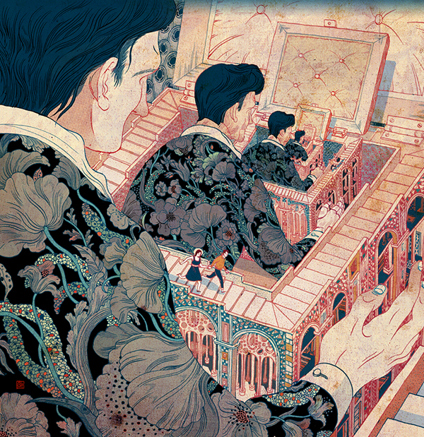
SACHIN TENG
“30 DAY CHALLENGE // DAY ONE // YOURSELF OR PERSONA” –digital– June 14, 2012

Sachin Teng hails from New York and graduated from the Pratt Institute with a BFA in Communication Design and a focus in illustration. His awards and clients can be found on his site (sachinteng.com) but include:
-Gold Medal Society of Illustrators (53, 56, and 57)
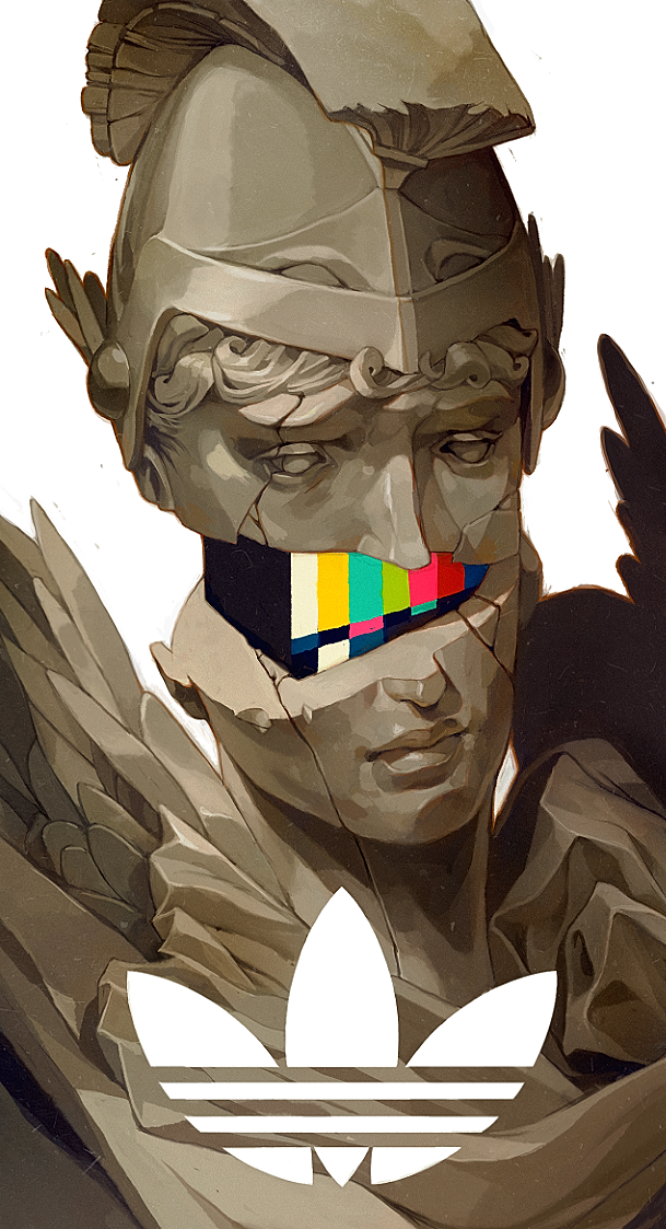
-Adidas
-Wired
-The New Yorker
-The New York Times
“Original”, commission For AdidasXFootaction –digital– Published online in January 28, 2013
Raised in an artistic family, due to his father being an artist himself, Teng showed aptitude for art from a young age. He’s influenced by artists like Jackson Pollock, Mark Rothco, Frank Stockton, and James Jean (another hero of mine), but also by things like graffiti, Buddhist temples, old Hannah Barbera cartoons, pixelations, and Japanese animation.
Even so, his work is largely based around design. In a September 2013 interview with Juxtapose magazine, he said the following about his design influence:
In design there’s no room for ego. Form follows function. If you forget about the function the design will turn on you. And people will notice. The best design is the kind you don’t feel. You never notice when a bus seat is designed well but you will notice it’s designed badly if you get off the bus with a backache.
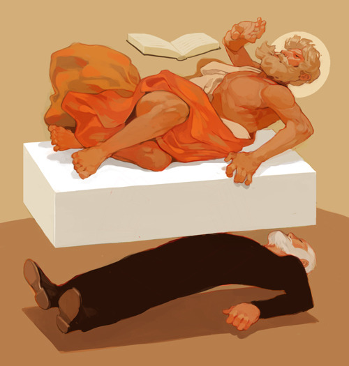
“Passion of St Matthew” For The New Yorker –digital– Published online October 31, 2014
I find his work to be highly original and visually appealing. His shadows are blocked out in defined separations as opposed to gradients or diffused edges. Outlines are used as well, all of which help build an idea of the subjects having volume. He also tends to use warm colors and have pops of pink and orange behind darker lines.
He mainly works with digital mediums, but is also well-versed in gouache.

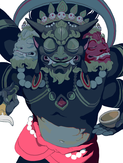
“KIII-N!” For QPop Shop’s Akira Toriyama/Dragonball 30th Show –gouache– Published online on November 11, 2014
He also does short animations of his work on occasion, most of these being part of a 30 day illustration challenge he took part in on his Tumblr.
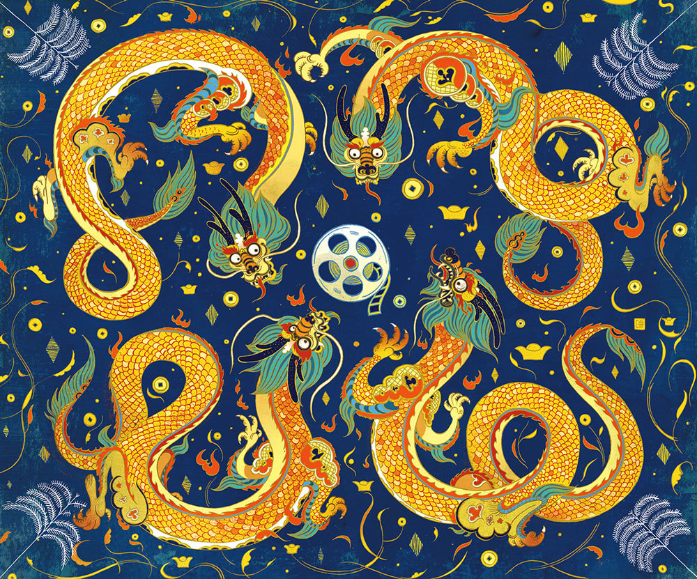
30 Day Challenge // Day 24 // Something That Represents Your Favorite Culture –digital– Published online on March 24, 2014
I think his art style is incredibly original and I have taken lots of inspiration from him.
His website: http://www.sachinteng.com/
His blog: http://sachinteng.tumblr.com/
Interviews referenced: http://www.dallasobserver.com/arts/question-the-artist-illustrator-sachin-teng-7093585
http://www.juxtapoz.com/illustration/supersonic-selects-sachin-teng
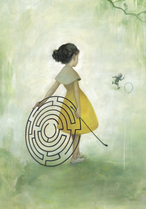
VICTO NGAI

Grooming Day, Plansponsor Magazine
Victo Ngai (“Victo” being short for “Victoria”) hails from Hong Kong, graduated from the Rhode Island School of Design, and is currently based in New York. Her clients and awards can be found on her website, but include:
-Forbes 30 under 30
-The New York Times 20 Notable Op-Ed Art 2010, 2012, 2013
-Society of Illustrators 53,54,55,56,57
-The New Yorker
-The New York Times
-Square Enix
-Scientific American
-Sundance Film Festival
Interior spread for “Variety” –ink and digital– Published online in Feburary 2015
Her work has a heavy usage of blues, reds, and yellows. Much of her work is also influenced by her Chinese heritage (which I think has an effect on what she’s hired to draw as well).
Growing up in Hong Kong, I was largely influenced by Asian arts and crafts such as Nianhua, Chinese ink scrolls, Lianhuanhua and Ukiyo-e. Attending RISD in the States exposed me to works by Western art masters such as Gustav Klimt, Egon Schiele, Antoni Gaudi, William Turner, Norman Rockwell, N.C. Wyeth and Al Hirschfeld. Now I am constantly being inspired by things I see and experience everyday.
Her work is always lined and tends to have a solid color scheme. It’s incredibly intricate and certainly reminiscent of the intricate works created during the Tang Dynasty. They’re also very atmospheric and almost dizzying in the amount of thought that obviously goes into her work.
Window or Small Box, Tor –ink and digital–
I really feel like her art speaks for itself. It’s expressive, yet mysterious. You can appreciate the entire picture, but also each detail she puts in them.
More of her work can be found through:
Her website: http://victo-ngai.com/
Her Blog: http://victongai.tumblr.com/
Quoted text comes from:
https://wedesignstudios.com/artist-interview-victo-ngai/
2- Illustration is something fascinating and beautiful. It has, like any other art, the potential to represent hundreds of things. However, the beauty of illustration is how it can stand alone outside of any other contexts, or be part of a whole story.
JAMES JEAN
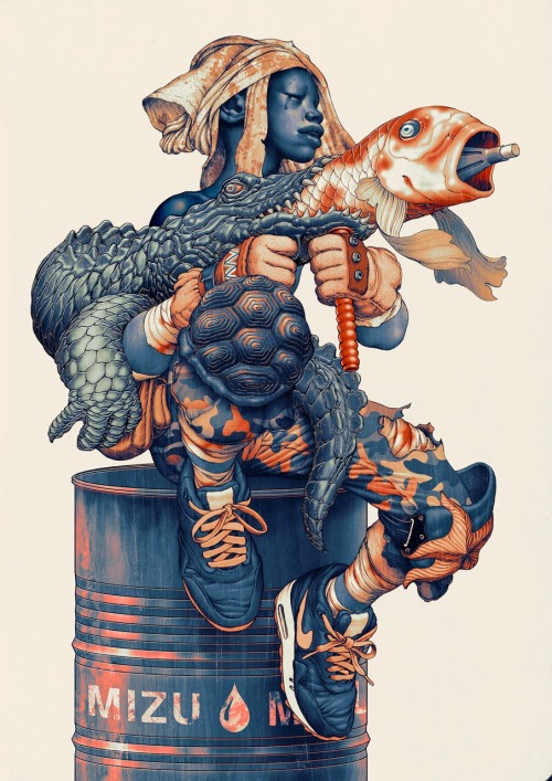
“Mizu” –Ink and Digital– 9 x 12″, 2014.
James Jean is one of today’s most popular and influential artists when it comes to the illustration industry. He was born in Taipei, Taiwan, and graduated with a BFA from the School of Visual Arts in New York. He has done work for:
-Chronicle Books
-Vertigo Comics
-Prada
He has won multiple awards for best cover artist (for his notable work in the Fables graphic novels), as well as a gold medal in the society of illustrators. A more detailed list can be found in his website.
His personal work is full of meaning, social criticism, and tends to be very conceptual. His use of color and values is unique and original, as well as his tendency to mix mediums. One piece of his can be graphite, acrylic, and digital all at once.
“Maze” –mixed media on paper– 29″ x 41″– 2008
Some of his most famous and celebrated work comes from his covers done for the graphic novels “Fables” published by Vertigo comics. Jean left the book after its 81st issue. He has since done murals, animations, and illustrations for Prada, work for ESPN, and more recently published a book that spans his work from 2010 to 2014

“The Good Prince” — Graphite and digital — 2002
More of his work can be found in his website:
http://www.jamesjean.com/
3- Lastly, I wanted to show one of my favorite artists who are involved in art direction. I want to work as an art director for animated films one day (and even non animated ones), so of course I look to the best in the business for inspiration. My favorite one out of all of them is Daisuke Tsutsumi.
DAISUKE TSUTSUMI

Lighting key done for Blue Sky Studios’ “Horton Hears a Who!”
Daisuke “Dice” Tsutsumi has worked as a color, lighting, and art director for Blue Sky studios and Pixar. He’s left Pixar to form studio “Tonko House” with fellow concept artist Robert Kondo. Tsutsumi hails from Japan and is also a graduate from the School of Visual Arts in New York. He is a philanthropist, having illustrated books to help raise money for relief (most notably for the Tohoku Earthquake in 2011) and fight against deforestation.

Lighting and color key for Pixar’s “Monsters University”–digital–
His work is reminiscent of impressionism in the sense that he captures lighting and color more than specific forms and details. He has an incredible eye for the way light works and the most appealing colors to use. I remember that when the ending credits rolled around at the end of “Monsters University”, I was so struck by the beauty of the movie that I stayed through the credits to see who had done the visual development work in the movie (and also because I was sure there’d be a bonus at the end–I was right!). It’s considered good design when nobody notices it, but in animated movies, I feel like you don’t want that. You want people to remark on the beauty of the movie, and I was struck by the beauty in “MU”.

Color script for “The Dam Keeper” –digital–
His latest work was done in an independent basis. He and fellow visual development artist, Robert Kondo, formed their own studio to produce films that spoke more to them. Their first short film, “The Dam Keeper” was an innovation in animated films. Completely animated and PAINTED by hand, the short unfairly lost to Pixar’s “Feast” (though we all know that the academy is biased towards big names and has even been proven to not watch the animated films they judge. But that’s another story). It has made rounds in film festivals around the world to great critical acclaim.
Of course, I love more than just these few artists, but I talked about these because I always feel myself thinking back to their work when I need inspiration.