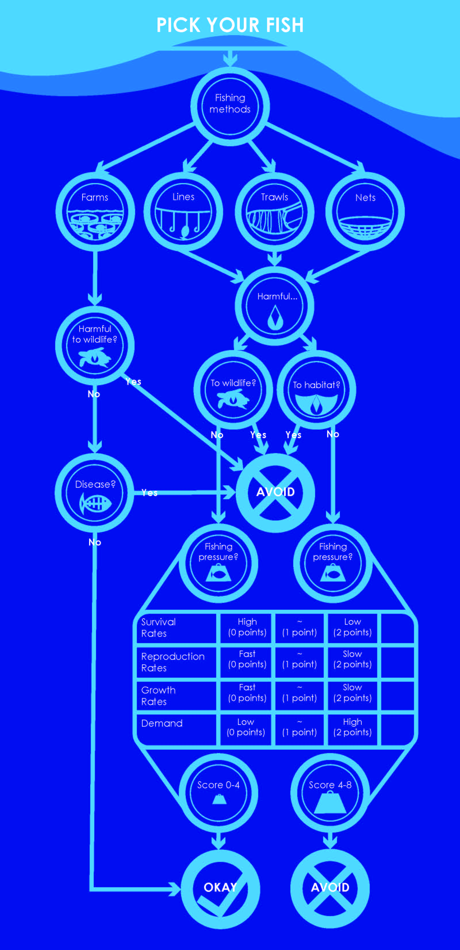
The type specimen poster below was one of the first projects where I had to incorporate colors and text in a way that displayed a set of characters; for the purpose of this assessment though, it would be more appropriate to compare these glyphs to the symbols in my other two projects. This poster represented what my freshman knowledge told me to do with the color, placement, and general display of my symbols, and which symbols to choose in the first place. I think that this project was successful both in displaying my typeface, and as a basis for comparison in my use of symbols in other design classes. I think that since this first project in type and its design, I have really been able to focus more on how I present my material, and incorporate it into the goal of the project at hand. For example, in my information flowchart, I had to create symbols for each of my decision points, but I had to focus much more on simplifying them and making them easily visible in a large map with a lot of data. They had to be easily comprehensible, and I think that I succeeded within this project, on a different level from the type specimen poster. The weather report also made me think more about the presentation of material, this time through motion, and figure out what information could be represented by symbols, and what couldn’t.
I believe that I am really good at being able to create symbols that encompass the concept I am conveying, and that help to deliver information simply and easily. In addition, I think that my choice of colors has grown more sophisticated since I started at the beginning, because I have more ways of testing out my color choices, and I have a better idea of how digital translates into physical. I also think that I have a pretty solid grasp on how to create hierarchy using color, shapes, symbols, and motion. However, I think that a lot of my work tends to come out a little underdeveloped; if I spent just a little more time on my projects (or a lot more time on the little mistakes in my weather report), their presentations would have a more finished, polished, and informed look. For example, the type on my flowchart looks good when printed physically, but when shrunk on a digital screen, an example being in this blog, the type actually looks too thin and isn’t very legible. I also think that I need to become more efficient with the time that I do have to work; I spent a lot of time fixing huge issues in After Effects when I changed something at the very beginning, which had a domino effect on the rest of my work. It would have been smarter to use separate compositions, so that not all of my work was affected by one small change at the beginning.
As far as learning goes, the concept that has really taught me the most was the idea of the process. There were a bunch of different ones that were introduced to me over the course of these classes, and because of those processes, I’ve been able to work more efficiently, and with more confidence in what I’m creating, because I know that there’s a direction even if it just feels like experimentation. These processes really help to bring forward the most important parts of my design, and help me deal with added layers of design. For example, the initial process of designing my posters helped me to deal with designing my concept map plus the added information layers, and that concept map helped me to design my symbols and my layout, with the added motions of the project. It’s a system of building blocks, and learning about processes has helped me to approach design in an entirely new way from when I first started out.

Type Specimen Poster
Information Flowchart