ARTS1311 Reading #4

Reading 4 | Nothing to Lose

1. How is Warhol able to turn in “off” and based upon the article does he not care about the work?

Warhol explains that he can turn it “off” while reading–when perusing magazines, for example, he says that he merely looks at the pictures and words without actually reading or understanding it. He lets it just happen. He explains further, “There’s no meaning to the words, I just feel the shapes with my eye” (149).  The longer you look at something, he adds, the less meaning you get from it. This ability to turn it “off” also directly applies to his painting. He explains how he’s read about himself in magazines where his “machine method of silk-screen copying and painting [are described as] ‘A bold and audacious solution!'” (149). However, he felt his work was much less planned, more accidental than critics felt it was. On page 145 Warhol explains how with “factory” assistants, he was actually working far less than people would assume. Fame or glory was never important for him, and recognition makes him feel no different. After reading this, it’s fair that Warhol could be seen to not care about his own work, especially in how careless his approach seems to be towards his paintings at times. He says that it’s too difficult to care, to be close to things and other people, even his own paintings. It is precisely because he doesn’t like to touch things that he feels so distant from his own work.

2. Why is the article relevant to the last project?

To me, this article is relevant to the last project in that The Factory required multiple hands to build and create and “crank things out every day”, similar to The Shelter Project, which requires multiples sets of hands to build a physical structure in a short amount of time. He writes that he just makes the plans, and they’re carried out by someone else, much like our project. One person’s design was chosen, and now it is being carried out by a team of people.

Personal Reflection

1. Do you become self-conscious of your ideas?

I do–I become self-conscious of my ideas because I’m often not as great as explaining them out loud than I am to myself. In my own head, an idea will sound great and feasible, but out loud it often loses some of that quality. It’s an issue I’m working on.

2. What do you think of the nothing-to-lose attitude? What are it’s pros and cons?

To me, the idea of having The Factory, is both good and bad. It’s good in that it is extremely efficient, and it’s a way of creating money with relative ease. However, with a “factory” environment you also get the sense of disconnect from your own work, as Warhol mentions in the article. It seems to become less “yours” and more “ours.” So aside from loss of ownership over an idea, you also have a loss of purpose and meaning. When you are simple “cranking out” sculptures, paintings, and movies every day, what are you really saying? The message seems to be a lack of care and importance–that a project isn’t worth it to you to spend careful time in creating.

ARTS1311 Reading #3

Reading 3 | Design Noun/Verb

1.  Based upon the readings the word design comes with many definitions. Across all the readings what are some examples of these differences?

Clement Greenberg sees design as standing in the way of art. Artists become so driven by what is “good design” that sculpture and painting become depressed. Rand Paul, on the other hand, explains that design is “a problem-solving activity [that] provides a means of clarifying, synthesizing and dramatizing a word, a picture, a product, or an event.” Vilém Flusser argues that design is the bridge between art and technology, a separate culture of deception. He says that “design, machine, technology, ars and art are closely related to one another, one term being unthinkable without the others.” Hal Foster’s definition of design is similar to that of Flusser’s–he sees design as being a mixing of utility and aesthetic. He cites Art Nouveau as an example of such beginnings of “total design”, as he calls it. The Bauhaus is another example of where art meets utility to create everyday objects. It’s this idea of “perfect, overarching design” in all aspects of daily living. Design has become inflated in recent years, and capitalism and mass-consumerism is a driver of this.

2. How does misunderstanding or rather multiple definitions of a singular word effect how we perceive design? Be sure to reference the four articles.

As a result of having so many different understandings of a single word, the term “design” has a perception of being multifaceted, complex, and ever-changing. It can be a tool for advancement and destruction, and the way in which it is expressed varies widely. Today, design can be seen in print ads, digital form such as social media sites, corporate logos, even the t-shirts we wear. “Good Design” as Greenberg puts it, is striven for above all else. Companies seek out creative / design agencies to be constantly improving their image through design to attract and retain their customer base. Foster, too, talks about the idea of total design, a concept that is ringing ever truer in the age of IKEA and other modern / minimal stores that now fill the homes of people seeking for sleek, forward-looking items. Design can be found everywhere, even in your bookshelf. Design has multiple sides to it, as Flusser explains–it cannot exist without art and technology. Paul sees it as an improvement measure across multiple fields as well. Design is complex and so interdependently connected to other fields that it is often difficult to explain. Even designers disagree on an exact definition, as made evident by these four articles.

Personal Reflection:

1. How do you suppose you could better prepare yourself as a maker of aesthetic objects/ideas?

I think that the most effective way to better prepare myself as a maker of aesthetic objects / ideas is to educate and expose myself to different types of design. I have an interest in color theory, and how colors work together (or don’t) to further an aesthetic appeal. Studying basic rules of type, layout, and other subtleties will assist me greatly in my preparation.

2. What are things you currently do to practice your creative muscle?

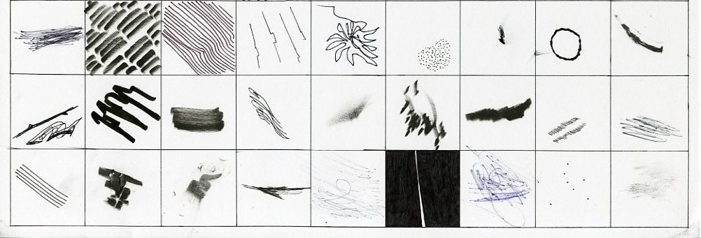
Currently, I enjoy copying and experimenting with new techniques. I find it useful to visit galleries with a notebook and pen to study and practice different line techniques and formal arrangements that appeal to me. In doing so, I’ve found many new ways of approaching art that I wouldn’t have otherwise. After testing out new formal techniques, I often become inspired to use them in new and unprecedented ways. I’ve gotten onto a kick of lettering humorous or inspiring phrases I hear throughout my day, and model the letter styles after similar ideas seen via artists on social media.

Short Story Assignment

Write a reflection of both short stories, specifically address the mood of each and how they made you feel.

Nick Hornby’s “Nipple Jesus” is an account of a man named Dave who is tasked with guarding a controversial art work that’s just been released to the public. The short story takes the reader through Dave’s initial shock and disgust at the piece, to his growing interest in the work, to his eventual love for it (and hatred of those who dislike it). Reading the story was a bit shocking initially, and I was captivated by the numerous incidents that occurred following the painting’s release. Dave’s rough language and harsh worldview provided an interesting filter for reading this story. I felt like I was listening to a culturally-ignorant friend describe a work of art. It was very interesting to me, seeing Dave’s progression of understanding the work, only to hate it again when he feels “duped” at the very end. I felt a bit duped by the artist as well, after becoming so attached to the idea of something proper being made up of something considered improper. I developed this whole theory of Martha’s piece around this social statement, only to be told there was no social statement.

Raymond Carver’s “Cathedral” is an account of a man whose wife has a friend come to visit. The friend is blind, which makes the husband uncomfortable. He’s never met a blind person before, and has little patience or desire to engage with the man. Throughout the evening, the husband tries to find ways to entertain himself and feels awkward around the guest, due to his disability. It isn’t until the wife falls asleep in front of the TV that the husband is forced to engage with the man, and after interacting with him, finally becomes comfortable with him present. He actually enjoys the task of drawing the cathedral with the guest. I felt discomforted by the husband throughout the story, until the very end. His comments about the blind man made me cringe, and I felt angry at the husband for being uncomfortable. He seemed almost ignorant. His journey towards acceptance of something new to him reminds me of Dave’s journey with the shocking artwork. I felt a sense of relief at the end of this passage, that the issue between the husband and his discomfort around blindness had been resolved to an extent. It isn’t until he closes his eyes and puts himself in the man’s shoes that he can really begin to appreciate and understand the other, much like Dave had to do with the art–and as we all do when confronted by something new that makes us uncomfortable. At first.


ARTS 1311 Reading #2

Reading 2 | Mad Scientists!? 

1. Based upon the reading how are priorities set for specific projects? Or in other words, what is it that determines the guidelines for given projects?

In determining the guidelines for specific projects, concept is key. Before creating (or curating) a body of works, the concept must be there. It is only after this crucial step that the concept can then be explored through the works.

According to the interview on page 186 in Design and Art, the choice of the person making the works is also a crucial element to a project (whether it’s to be published or exhibited, etc). Here, Elliman explains that a greater freedom and exploration of an idea can be found in commissioning works by a particular person, rather than “editing down” from a large bag of works.


2. How does the artist/ designer approach decision making differently or do they?

Mathias Augustyniak claims that the designer has an easier time making decisions than the artist, who is “weighed down by the burdens of art history.” Design, on the other hand, has fewer constraints and can thus take on the idea of art with a sense of nonchalance. Åsa Nacking offers a different approach, arguing that he chooses to work as an artist to make creative decisions because of the freedom it offers. He, on the other hand, sees art as “a space in which to experiment, free from the bonds of convention.”


Personal Reflection

1. How do you make decisions? Are they based upon anything substantial? Why or why not?

I tend to make decisions based upon aesthetic. In this way, it could be said that I may lean more towards design than art. I enjoy creating works that are visually engaging and well-balanced. While these attributes can easily apply to both design and art, after reading these six articles I find myself identifying more with the concept-to-creation pattern of the designer. However, I don’t think I base my decisions off of anything meaningful or substantial. At the end of the day, I am still obsessed with style over artistic message. Finding meaning in my own work has always felt insincere. I create for personal and mass visual appeal.


2. How do you know when something is “good” or working?

I tend to feel like something is working, or “good”, when I begin to feel inspired by it. My process is often a building, a layering, that leads in directions I’m not initially aware of. Something will seem good to me when I can look at it and think “I want to keep going.” I get excited, and feel almost overwhelmed by the emotion of continuing. It often requires lots of starting, stopping, and restarting; a critical look at the balance between visual elements; and flipping the piece upside down to get a fresh perspective on form.

3. How do you rework projects to make them work?

I touched upon this earlier–my tendency in reworking projects is to view from different perspectives to create a more fuller experience. My initial approach is usually through my own eyes. I create for myself. That usually only goes so far, before I begin to hit a creative wall, so to speak. I then must force myself to stop, take a step back, and critically look at what is wrong. Once I can identify the “wrong(s)” of the project, I can edit back and continue to create. This process will continue until it works. If I still cannot seem to identify the issue, rotating the image and referring to the negative space has never failed me (yet).

ARTS 1311: Visual Dictionary

Value - name
value – Katy

Our definition: Value is the variety of shades between light and dark.

Official definition: Value is the proportion of lights and darks.

unity / variety - name
unity / variety – Aly

Our definition: Unity and Variety is finding the balance between boredom and chaos in an artwork.

Official definition: Unity is similarity, oneness, togetherness, cohesion. Variety is visual diversity to avoid an unintended monotonous composition and hold the viewer’s interest.

time / motion - name
time / motion – Aly

Our definition: This is having a sense of movement, of energy flow, a sense of direction. Can also be four-dimensional.

Official definition: Actual and implied are two aspects of time.

texture - katy
texture – Katy

Our definition: Variety in a physical plane; tangible (whether actual or implied)

Official definition: Texture can be physical, it can be a visual illusion, or even invented.

symmetrical balance - lexi
symmetrical balance – Lexi

Our definition: A composition that has two sides that mirror each other.

Official definition: Visual or actual equilibrium of two halves of a composition mirroring each other in size/shape and placement of elements in art.

space - name
space – Aly

Our definition: The amount of depth; relation between objects in the fore-, middle-, and backgrounds.

Official definition: Space is the area within or around an area of substance: positive / negative, compression / expansion, activated, entering.

shape - name
shape – Katy

Our definition: Two-dimensional objects.

Official definition: Shape is a flattened enclosed area.

scale / proportion - lexi
scale / proportion – Lexi

Our definition: Having distinctions in size relative to multiple objects.

Official definition: Scale is the comparative size of an element of art or object in relation to other objects and expectations about what is normal. Proportion is the relationship of the size of parts to each other and to the whole artifact or image.

rhythm - lexi
rhythm – Lexi

Our definition: Repeated, implied motion in art that mimics the auditory sense.

Official definition: Rhythm is a sense of movement, whether regular, irregular, pattern, or grid.

radial balance - lexi
radial balance – Lexi

Our definition: A composition or object that mirrors itself from 360 degrees.

Official definition: Radial symmetry is equilibrium achieved by elements emanating from a point, usually the center of a composition.

plane - vivian?
plane – Vivian

Our definition: A linear surface that can be rotated 360 degrees.

Official definition: A plane is a 3D form that has length and width but with minimal thickness.

mass - name
mass – Vivian

Our definition: The density of an (actual or implied) object.

Official definition: Mass is a solid 3D form.

line - katy
line – Katy

Our definition: A building block that varies in thickness and quality.

Official definition: Line has quality (thick, thin, broken), can be implied or actual, and has linear networks (cross-contours, psychic line).

light - aly?
light – Aly

Our definition: How color hits an object; the casting of shadows.

Official definition: Light can enhance or obscure, affect emotions, entice us to enter, create mystery, can even be the sculptural medium.

emphasis - lexi
emphasis – Lexi

Our definition: A method used deliberately by the artist to draw the viewer’s eye towards one specific element.

Official definition: The arrangements of elements of art to make some areas the primary focus of a viewer’s attention.

color - name
color – Vivian

Our definition: Different shades on the visual spectrum.

Official definition: Color has hue, saturation and value. By adding white to a color, you achieve a tint. By adding gray, you achieve a tone. By adding black, you achieve a shade.

asymmetrical balance - lexi
asymmetrical balance – Lexi

Our definition: A design tactic in which elements of the piece are deliberately put into an unequal balance with each other.

Official definition: Asymmetry creates equilibrium among visual elements that do not mirror each other on either side of axis. (Depending, design can be quite dynamic or chaotic.)

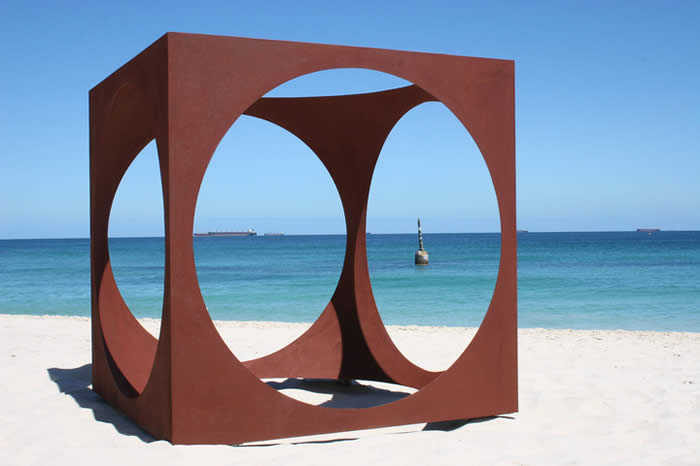
Sculpture-by-the-Sea-509-Mark-Grey-Smith-within-2009
volume – Vivian


Our definition: a 3D object

Official definition: Volume refers to an enclosed area of 3D space.

ARTS1311 Reading #1

Reading Questions

1. What is the purpose of a designer, do they always work for a stakeholder? 

The purpose of a designer is to create solutions to everyday problems, whether is be visually-based, digitally-based, or physically-based (or a combination therein). The designer works with a team of individuals in creating a vision for a product or visual design. Production costs, functionality, availability to consumers, marketability, and aesthetic appeal are just a few issues the designer must overcome to be successful. With so many moving parts, the designer cannot function in isolation, as George Nelson insists. The designer, unlike the artist, must always work for a stakeholder. Kees Dorst expands on this, explaining that “in design, your goals are partly determined by others, the stakeholders, because the things you create must fulfill some practical purpose in the wider world.” This is different, he explains, from the artist, who is free in their creation because “they do not aim for any practical application but strive to influence the feeling or thinking of an audience.”


2. Is the artist always a self-expressive narcissist? 

I don’t think that the artist is always a self-expressive narcissist necessarily, but this does certainly seem to be the trend. This is especially evident in the claims set forth by Rick Poynor, of designart being a “one-way street.” There are no design galleries celebrating past and current designers and their works, no newspaper or online reviews of current and upcoming design, no major periodicals that have gained any sort of traction. Whether this is in fact due to a historical preference of art over design remains to be seen. What is clear is that if design is in fact merging with art, as Poynor suggests, there is a need to give it more adequate representation. As a result of this issue, the artist does indeed come across as a narcissist.


3. Can the designer/artist exist?

According to Donald Judd, the designer/artist can exist, but he stresses the importance of keeping the two ideas separate. He writes that “I am often asked if the furniture is art, since almost ten years ago some artists made art that was also furniture. The furniture is furniture and is only art in that architecture, ceramics, textiles, and many things are art. We try to keep the furniture out of art galleries to avoid this confusion, which is far from my thinking.” I agree with this stance, as the purpose of art is not to be functional. George Nelson explains this idea a bit further in stressing that “functional sufficiency is no guarantee whatever of good design.” So art in and of itself cannot function as design.

That being said, Judd himself is an excellent example of the designer/artist. One can be both, so long as one understands the need to separate the two. Art can inspire design, but it cannot become design. Joe Scanlan, who considers himself both a designer and an artist, provides further examples of other like-minded individuals experimenting with “design art,” as he calls it: Jorge Pardo, Tobias Rehberger, Heimo Sobering, Gregor Schneider, Angela Bulloch, and Franz West, to name a few. Scanlan argues that “[design art] attempts to expand the accessibility of art by contriving other, more pragmatic ways of engaging its reception and use.” While Scanlan believes in the ability to combine the two, he admits that “unfortunately, much design art does not function well enough to follow through on its promises…Andrea Zittel’s A-Z Living Units are so materially cumbersome and ergonomically cruel as to be laughably as anything other than art.” This statement brings us back to Judd’s original point, that while the two can exist within one mind, the ultimately are two very different fields that must be kept separate in order to each develop with any success.

Rick Poynor makes note of a peculiar phenomenon in the ever-developing world of “designart,” as he calls it. As evidenced by the media and numerous exhibitions, there seems to be some unwritten rule that allows artists for experiment in design, but not the reverse. Poynor theorizes that this is due to a long history of reviewing art (and not design).


Personal Reflection

1. What is your personal view of the difference between the designer and the artist? 

I see the designer and the artist as being two separate entities. A comment stood out to me in Norman Potter’s chapter, of how the difference between the designer and the artist can be seen in the concept of drawing. To the designer, it is used as a tool; a drawing is “a means to the end of manufacture, and their expressive content is strictly limited to the purposes of relevant communication.” To the artist, however, a drawing can be a finished product, a way of self-expressing. This example sums up my overall opinion on the difference between artist and designer. Design is painstakingly process-based, while art has fewer “rules.”

I’ve taken away from these readings that the designer and the artist can exist in one person, but the two occupations must be kept straight in one’s head to avoid creating poor work in either (or both) fields. To me, the designer is more methodical and infinitely more “business-driven.” The artist, however, seems to me less tied to formality, as art is not necessarily a solution to visual dilemmas (while design is). The artist is thus more free.


2. Which are you, why?

I am an artist rather than a designer. I see myself creating primarily to please myself, rather than to meet others’ needs. Although I see the merit in both occupations, the title of artist is more fitting to my desires and drives. Art is a necessary form of expression in my life, not the means to a production.

ARTS1311_100 Solutions

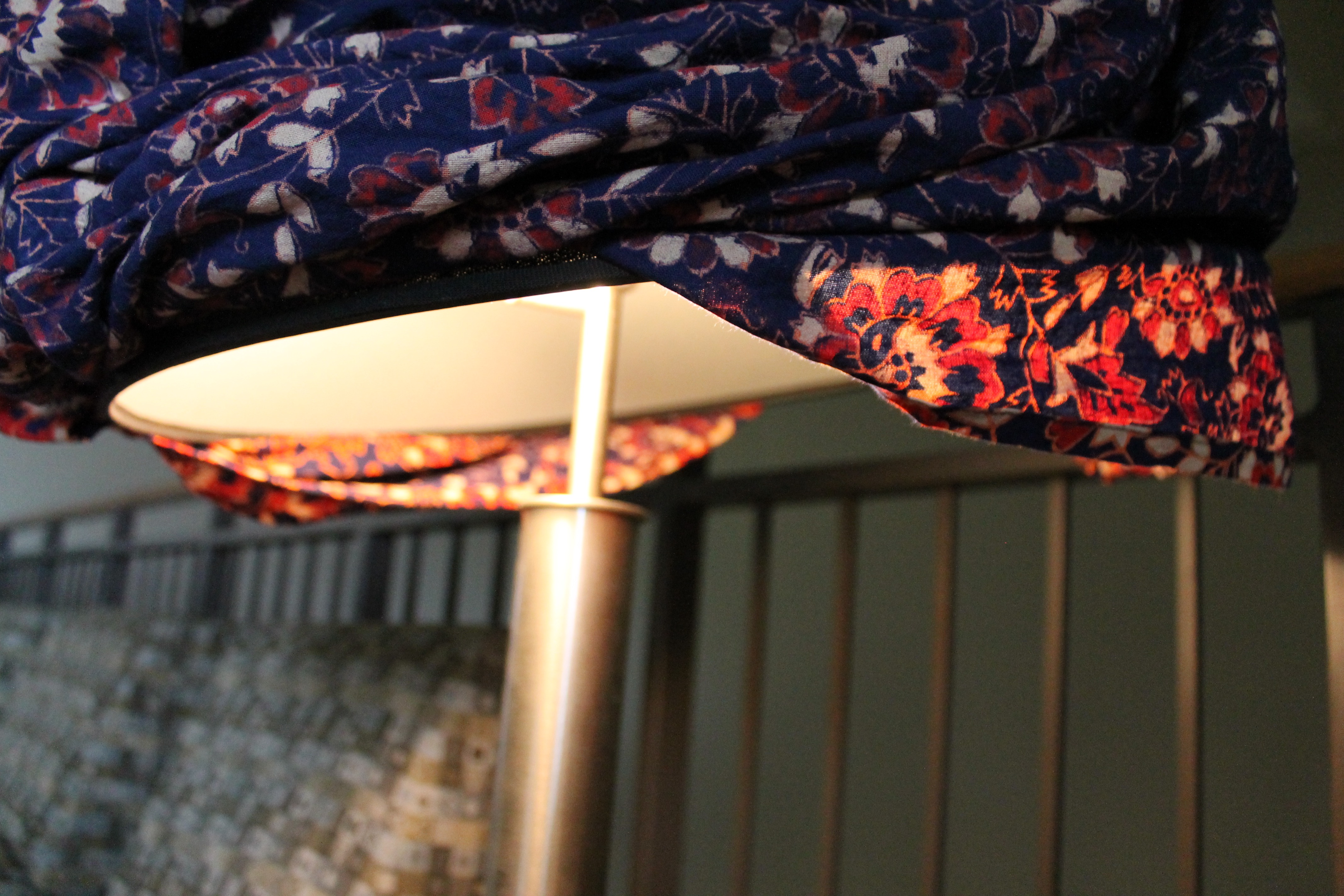
For my 100 Solutions project, I chose a 15 x 15 ft tapestry that’s been in my possession for a number of years now. I decided to use this item for its malleability and its vibrant pattern.

IMG_9241

In this first image, I replaced the “chair” with my object and set a fresh glass of ice water to indicate current use of the chair.

IMG_9265

In my second image, I used the tapestry as a tablecloth at a picnic table. I crawled under to take this shot.

IMG_9426

For my third image, I snapped a picture of a friend posing as a ghost underneath the tapestry.

IMG_9466

For the fourth image, I tied the tapestry up as a hammock.

IMG_9527

Here, I carefully folded the tapestry into a picnic basket shape, to be carried by my model for image five.

IMG_9539

In image number six, the tapestry is used as an eyeglasses’ cleaning cloth.

IMG_9544

In image seven, the tapestry has been twisted and made to look like a phone charger, about to be plugged into an outlet.

IMG_9547

After spilling a drink on the floor, as indicated by the sign, the tapestry is used to mop up the mess in image eight.

IMG_9576

In image nine, the tapestry has taken on the role of lampshade.

IMG_9600

And finally, the tapestry is wrinkled and used as mulch in image ten.

After much difficulty and back-and-forth, I decided on these ten images because I felt they were the most diverse uses for a tapestry that I found in crafting this project. Taken on the St. Edward’s campus, in a friend’s home, and in my own apartment, each place was a meaningful setting to bring such a cherished item of mine. These locations made for a more intimate photoshoot, and the lighting sources were the most flattering for the final top 10 photographs.